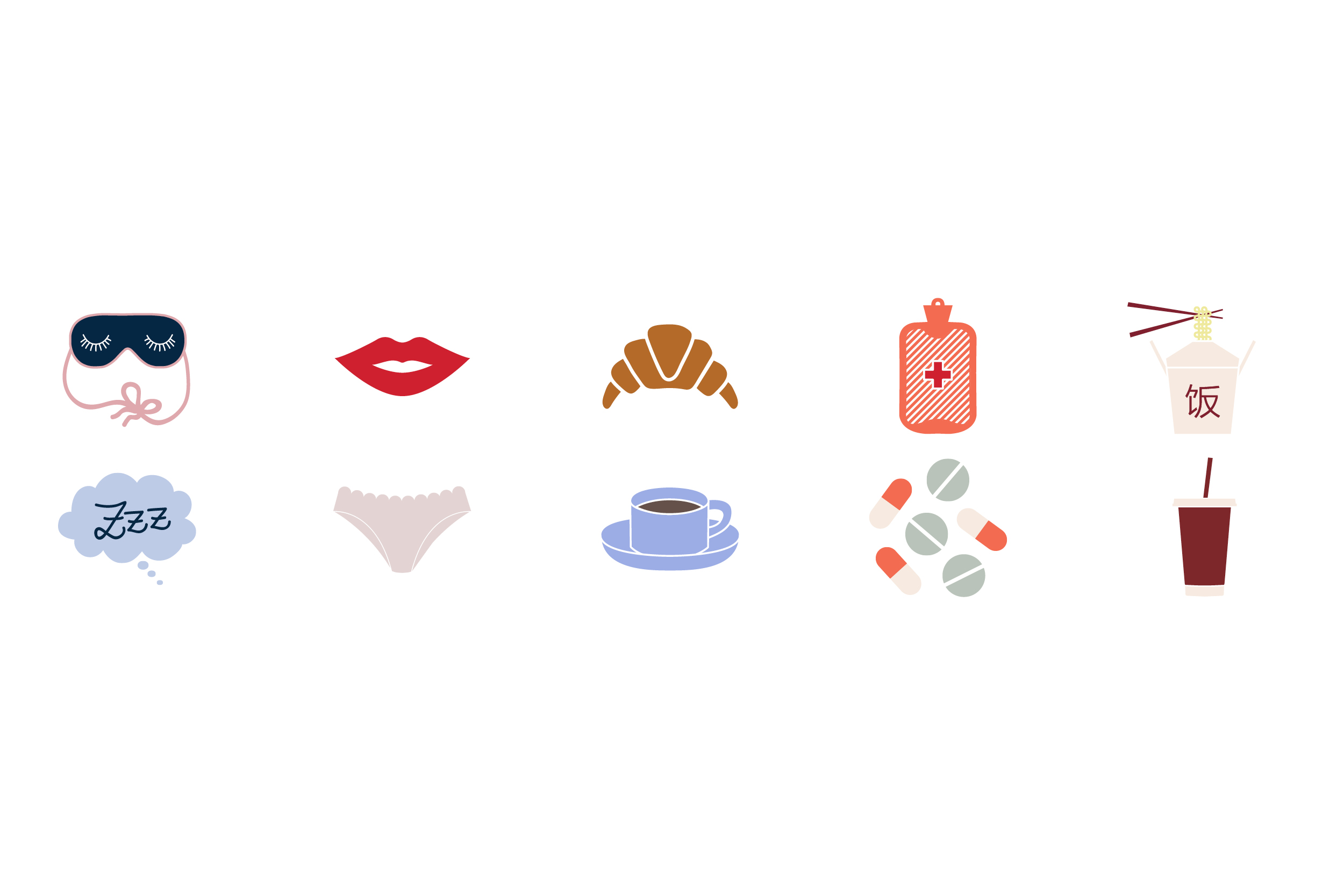
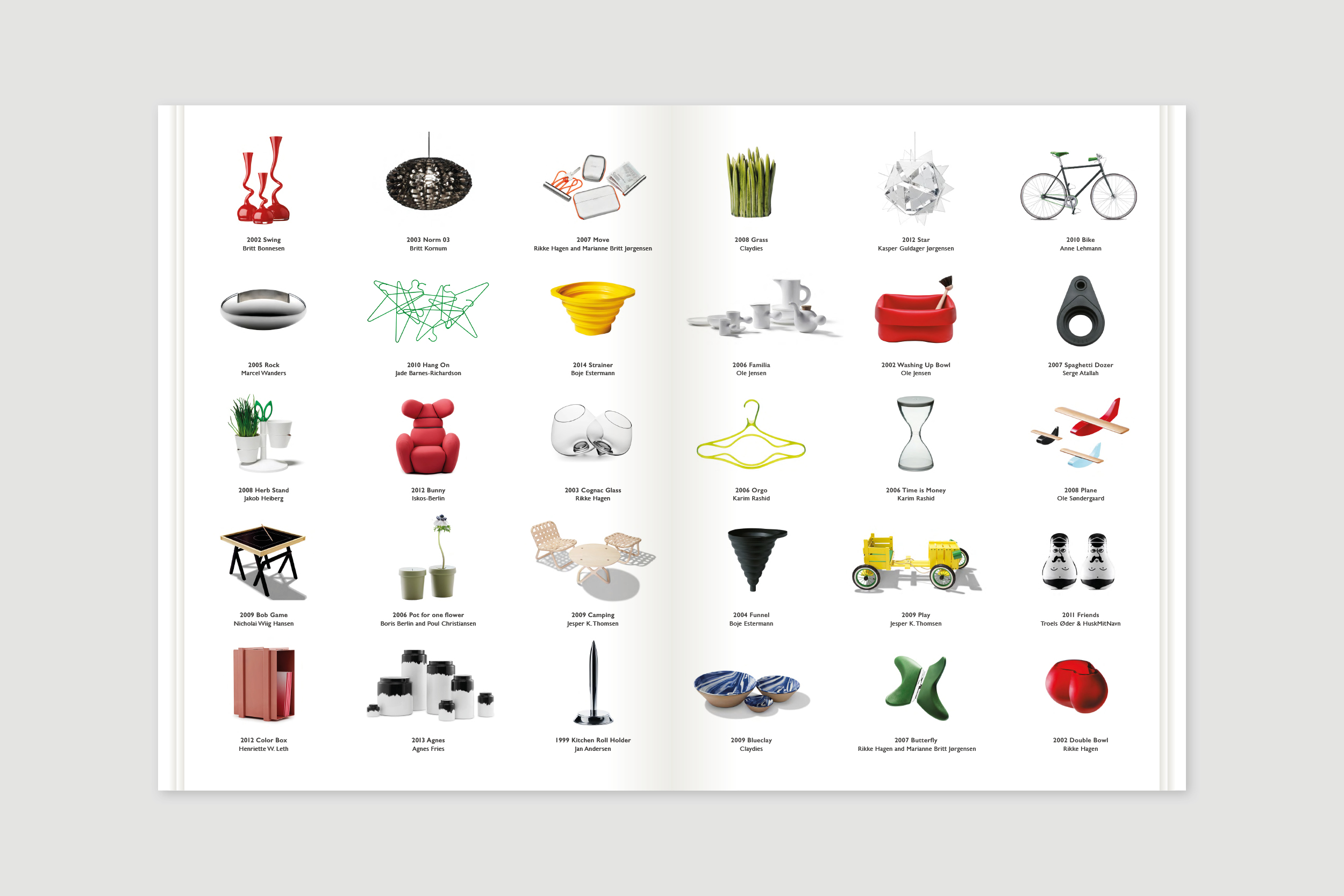
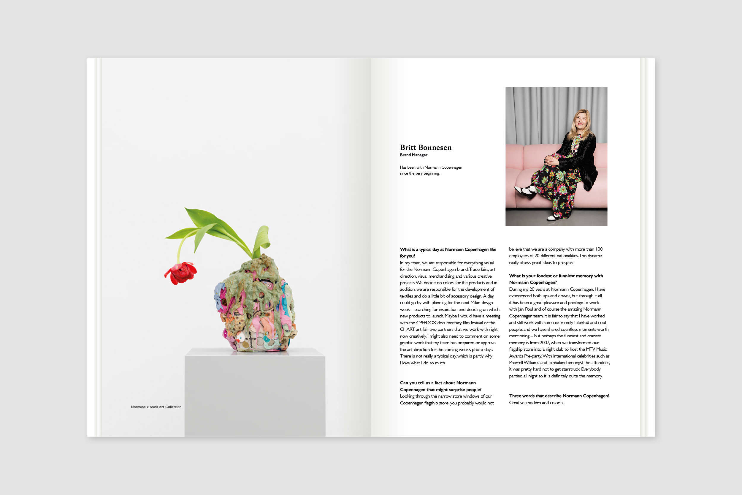
Category:
Textile Design
Category:
Product Design
Category:
Graphic Design
Category:
Graphic Design
Category:
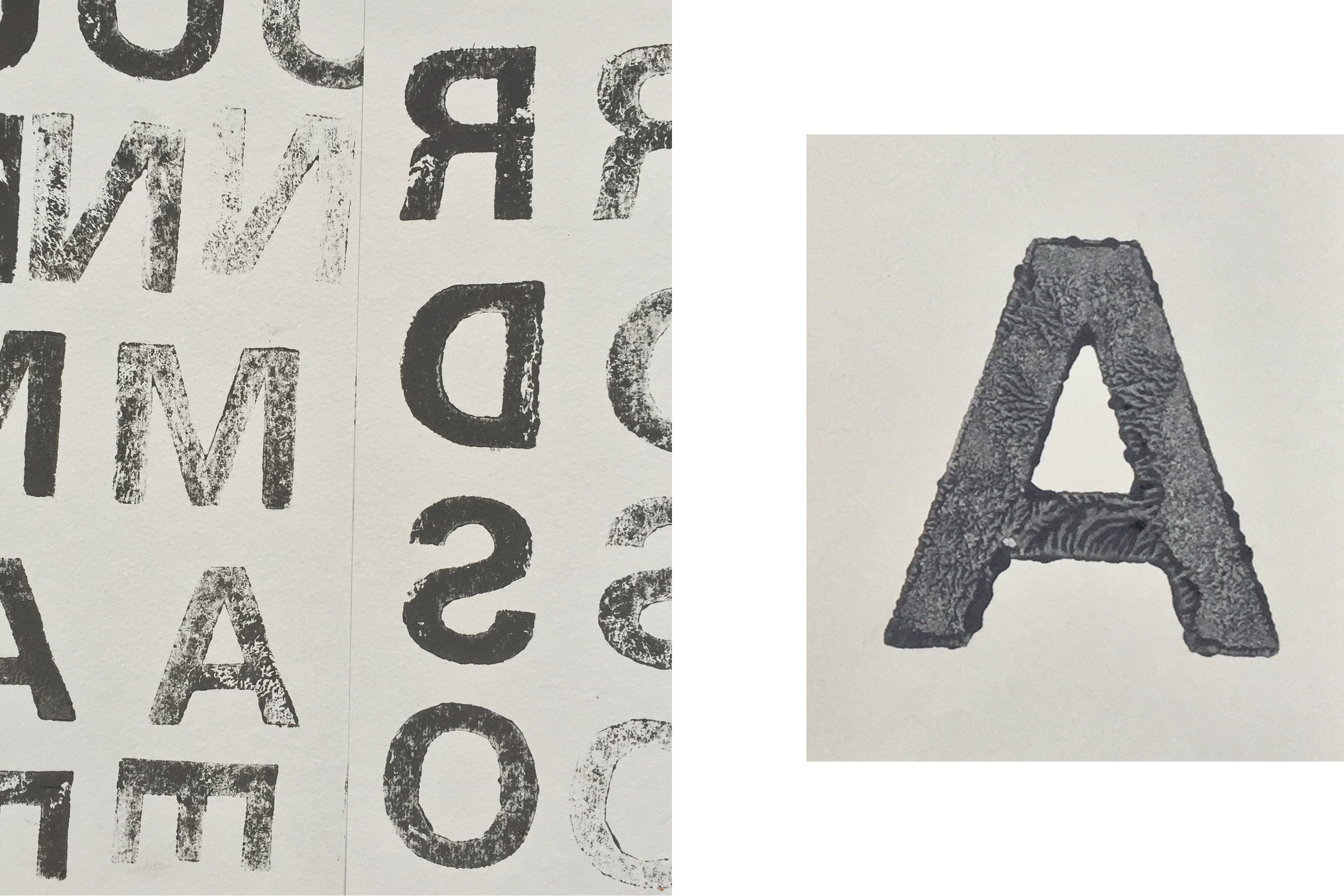
Graphic Design
Category:
Graphic Design
Category:
Textile Design
Category:
Textile Design
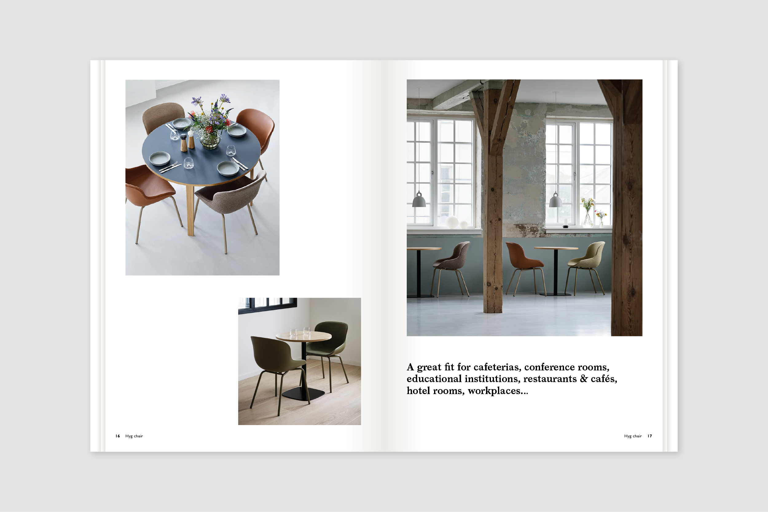
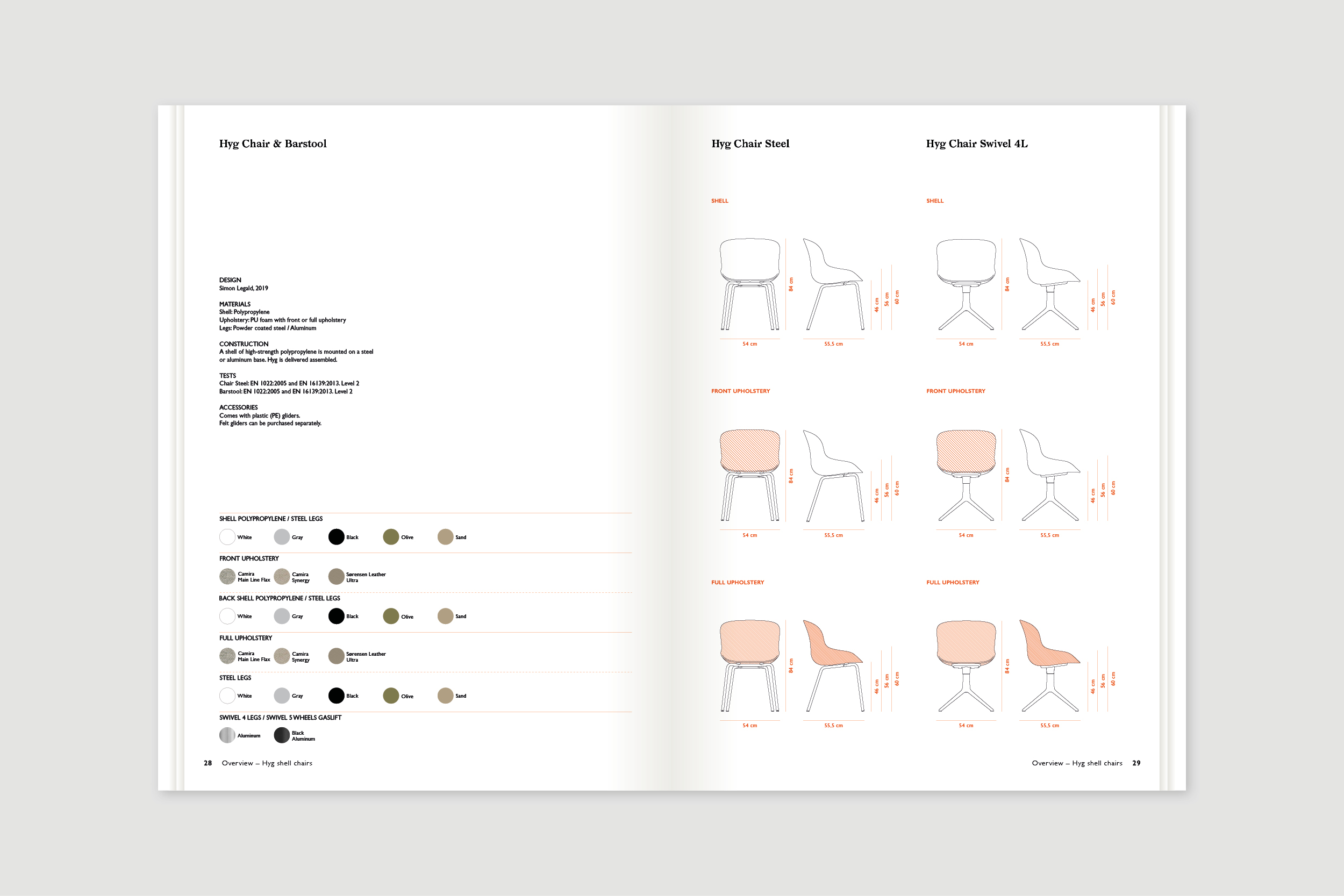
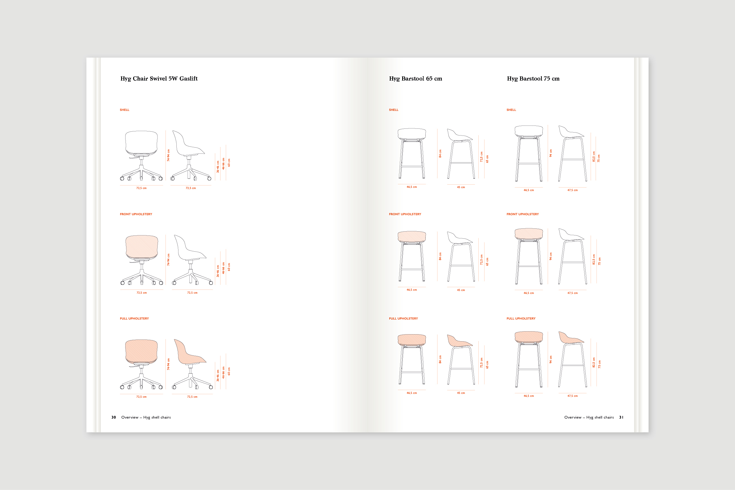
Category:
Product Design
Category:
Graphic Design
Category:
Art Direction
Category:
Visual Identity
Category:
Textile Design
Category:
Visual Identity
Category:
Brand Identity
Category:
Brand Identity
Category:
Art Direction
Category:
Visual Identity
Category:
Graphic Design
Category:
Graphic Design
Category:
Art Direction
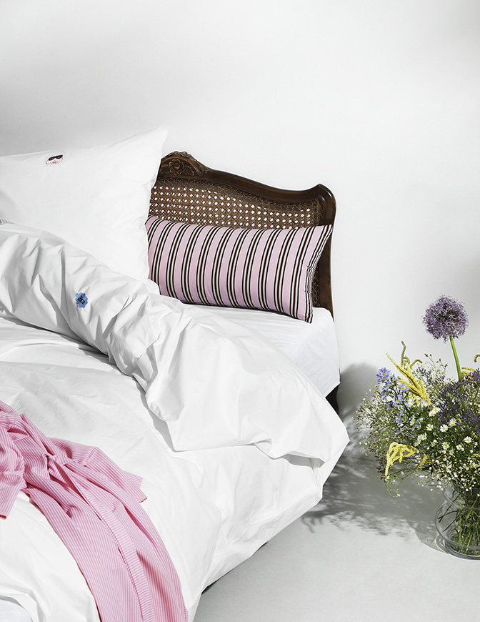
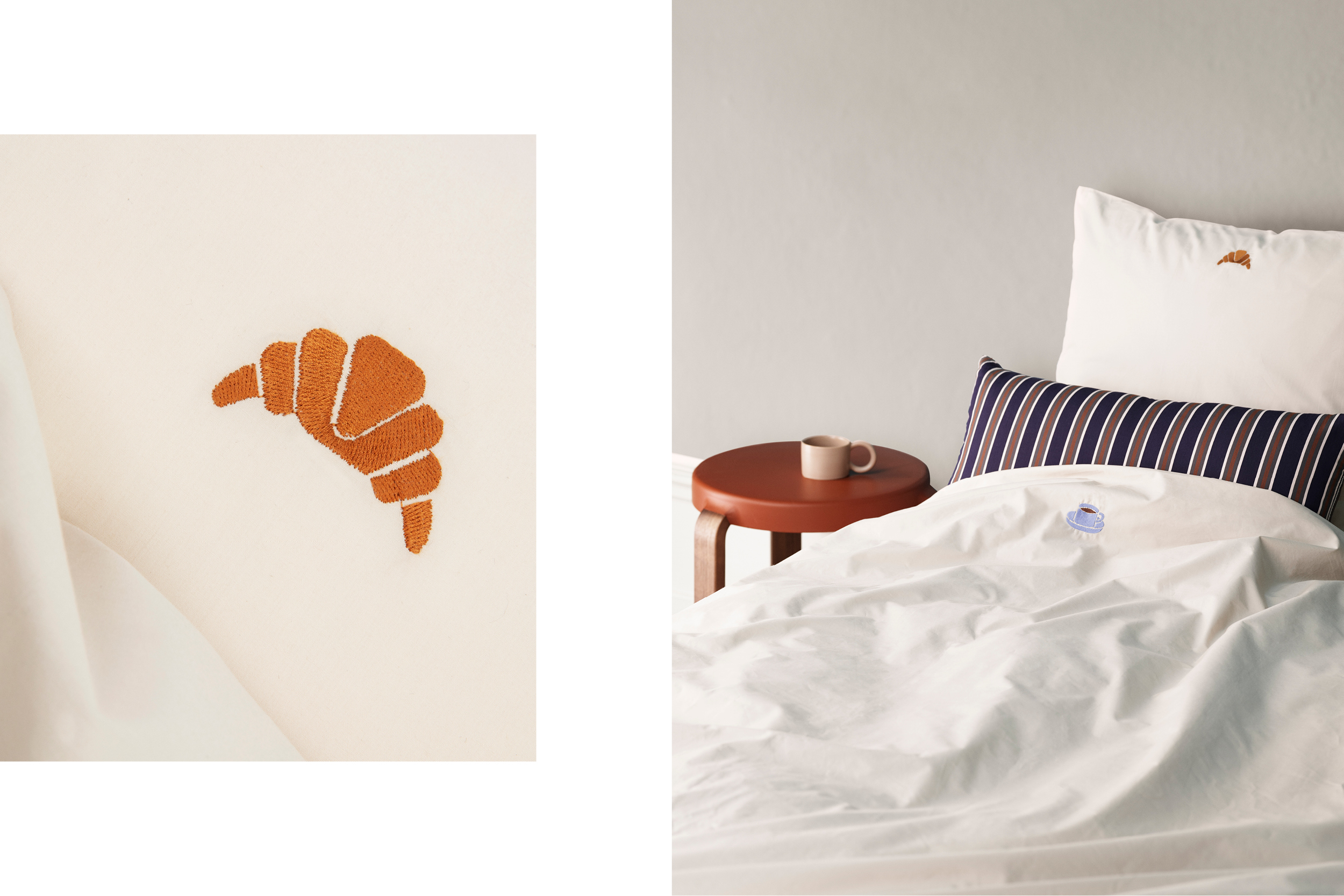
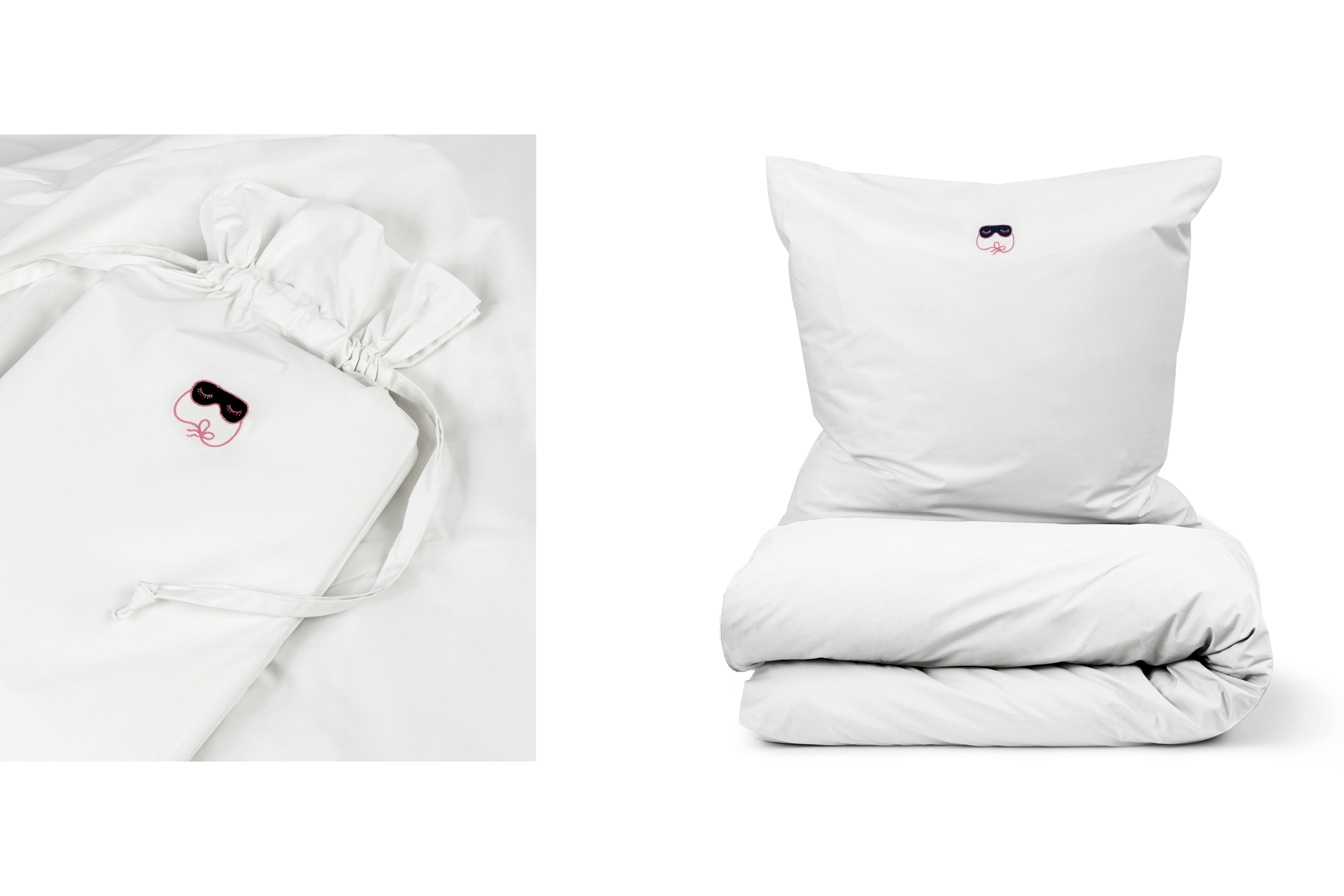
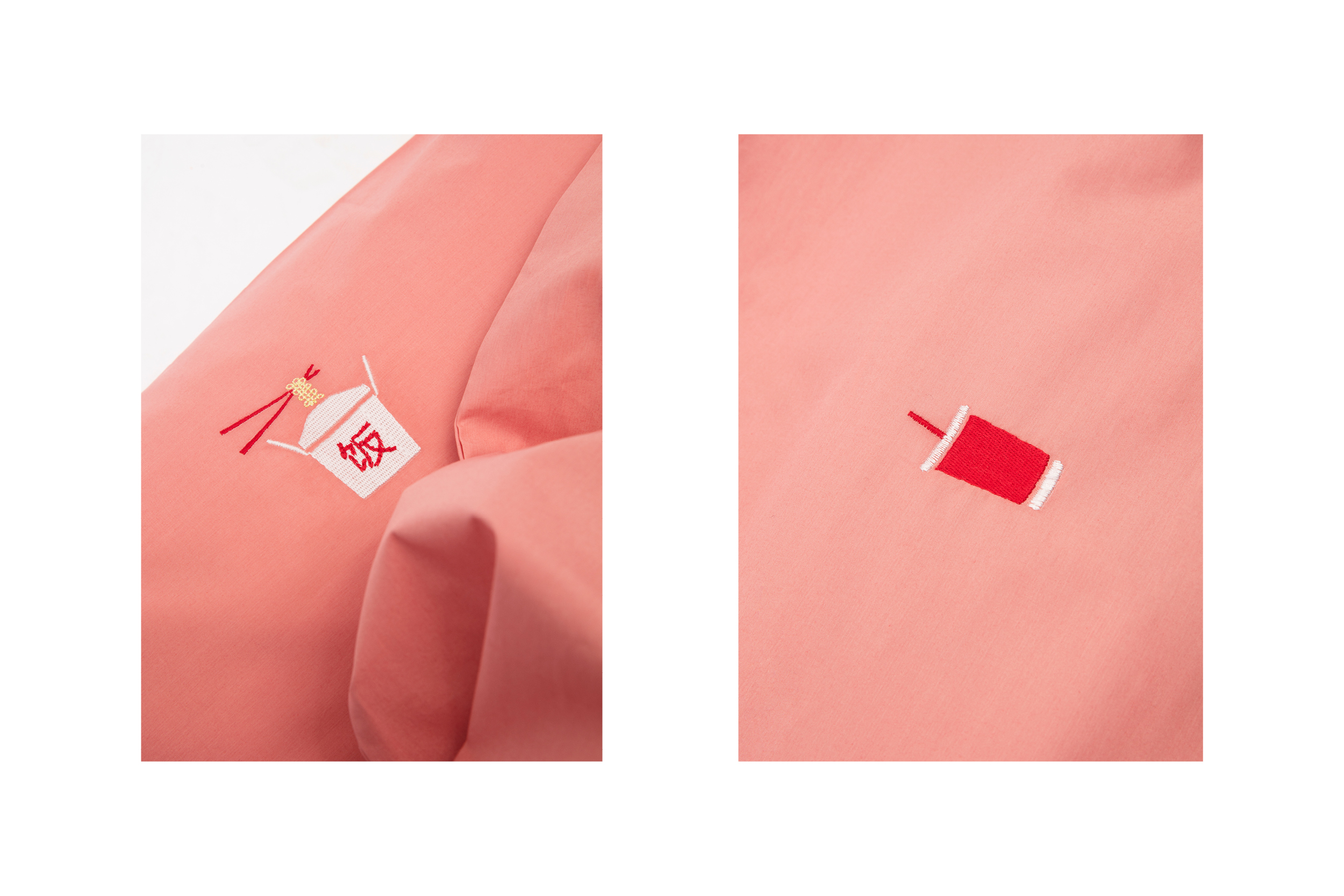
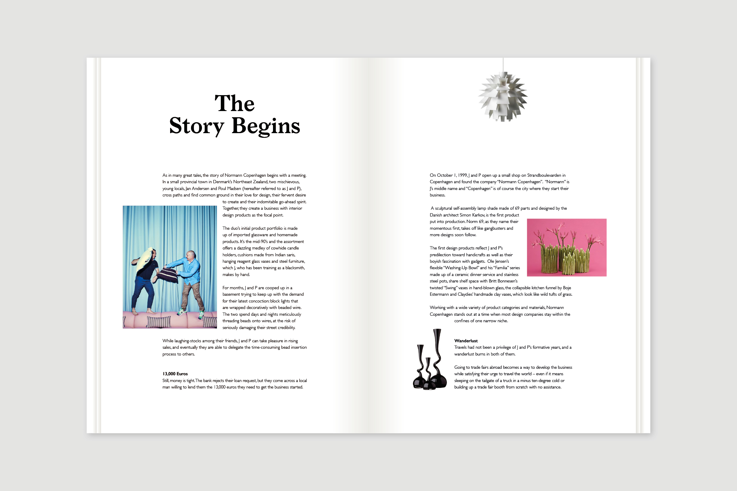
Project:
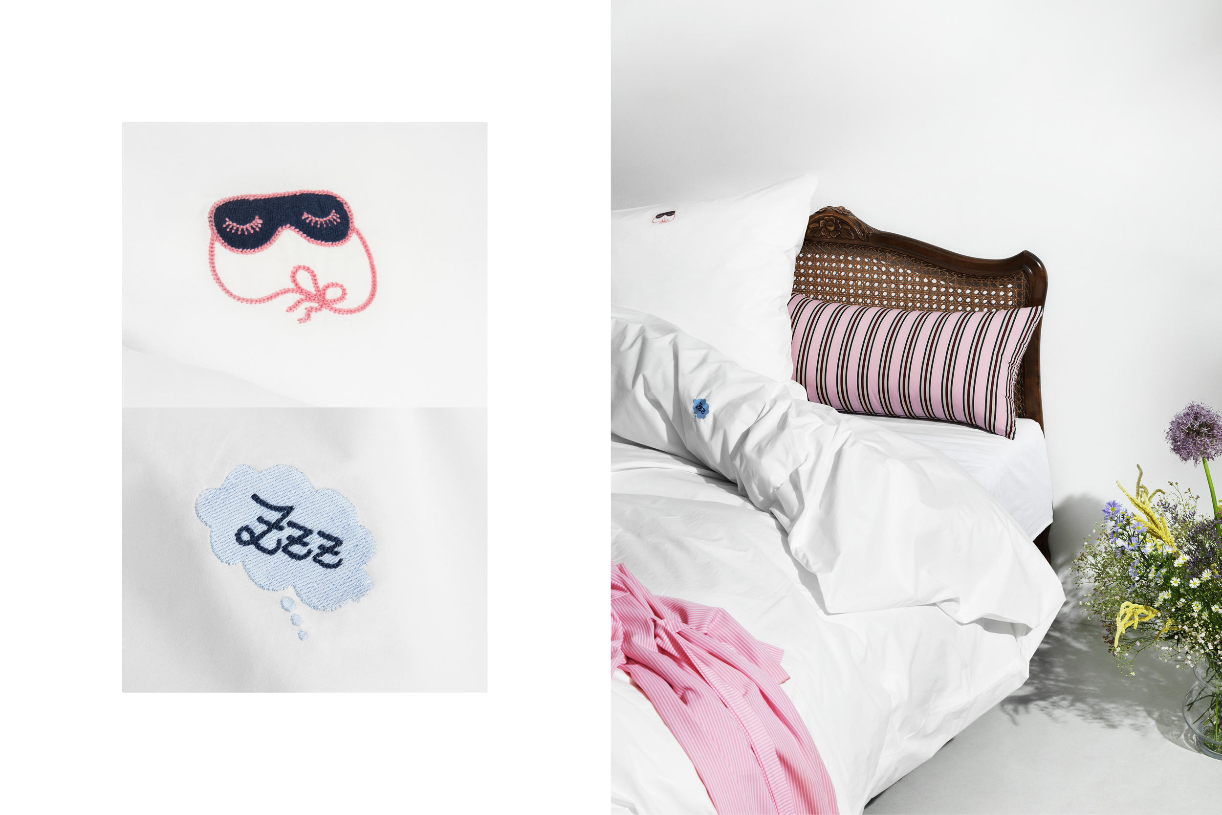
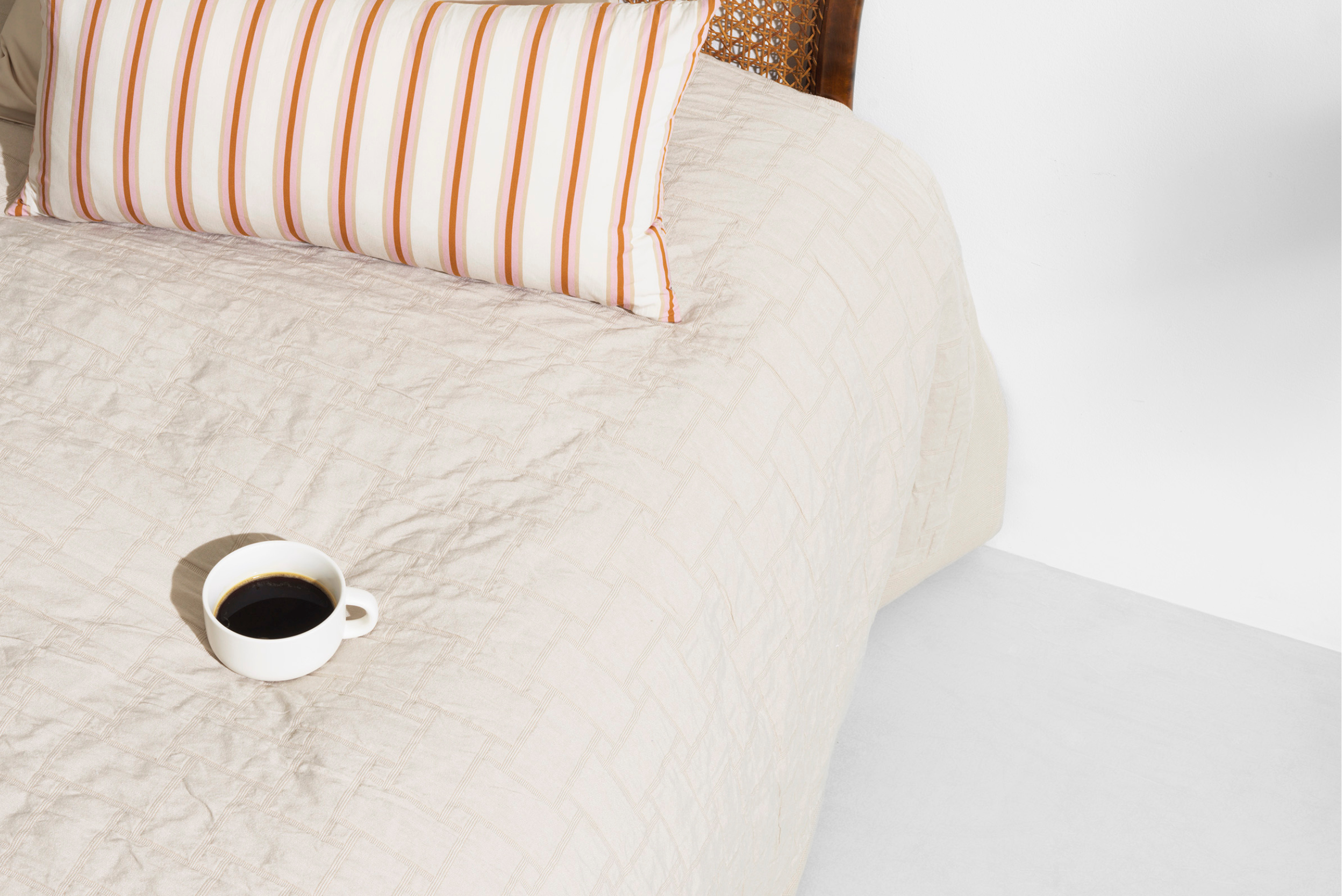
Normann Copenhagen Bed Linen and Bed Cover 2019
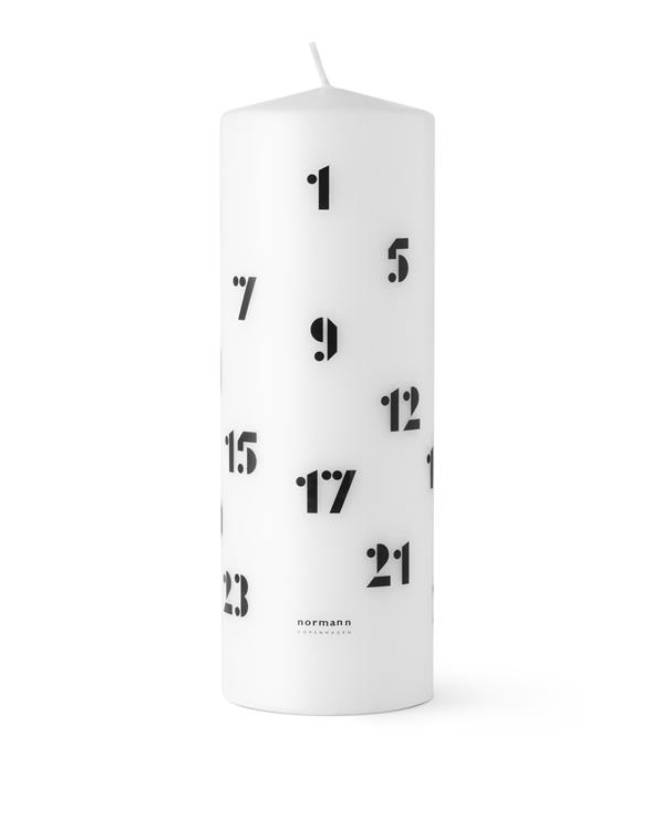
Project:
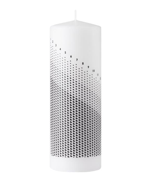
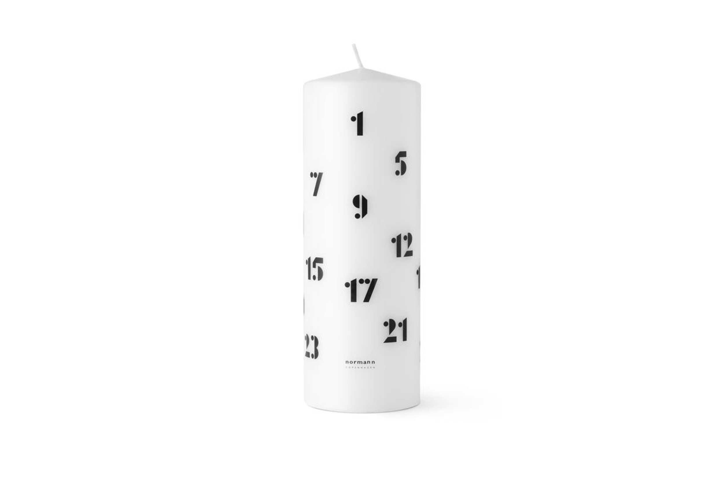
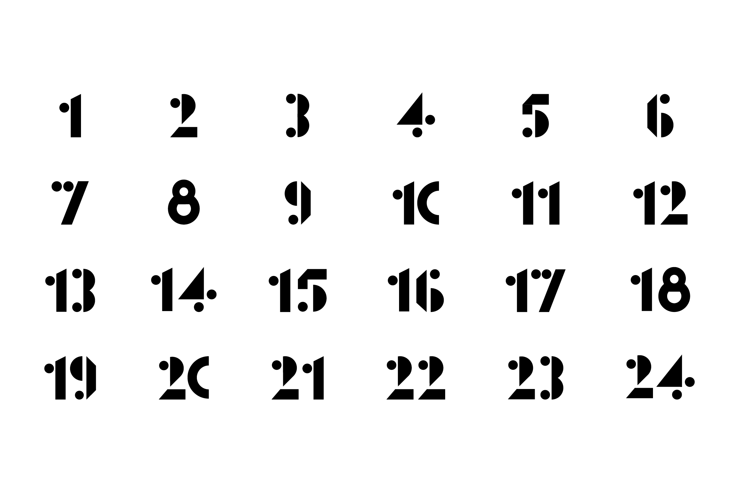
Normann Copenhagen Christmas Candle 2020
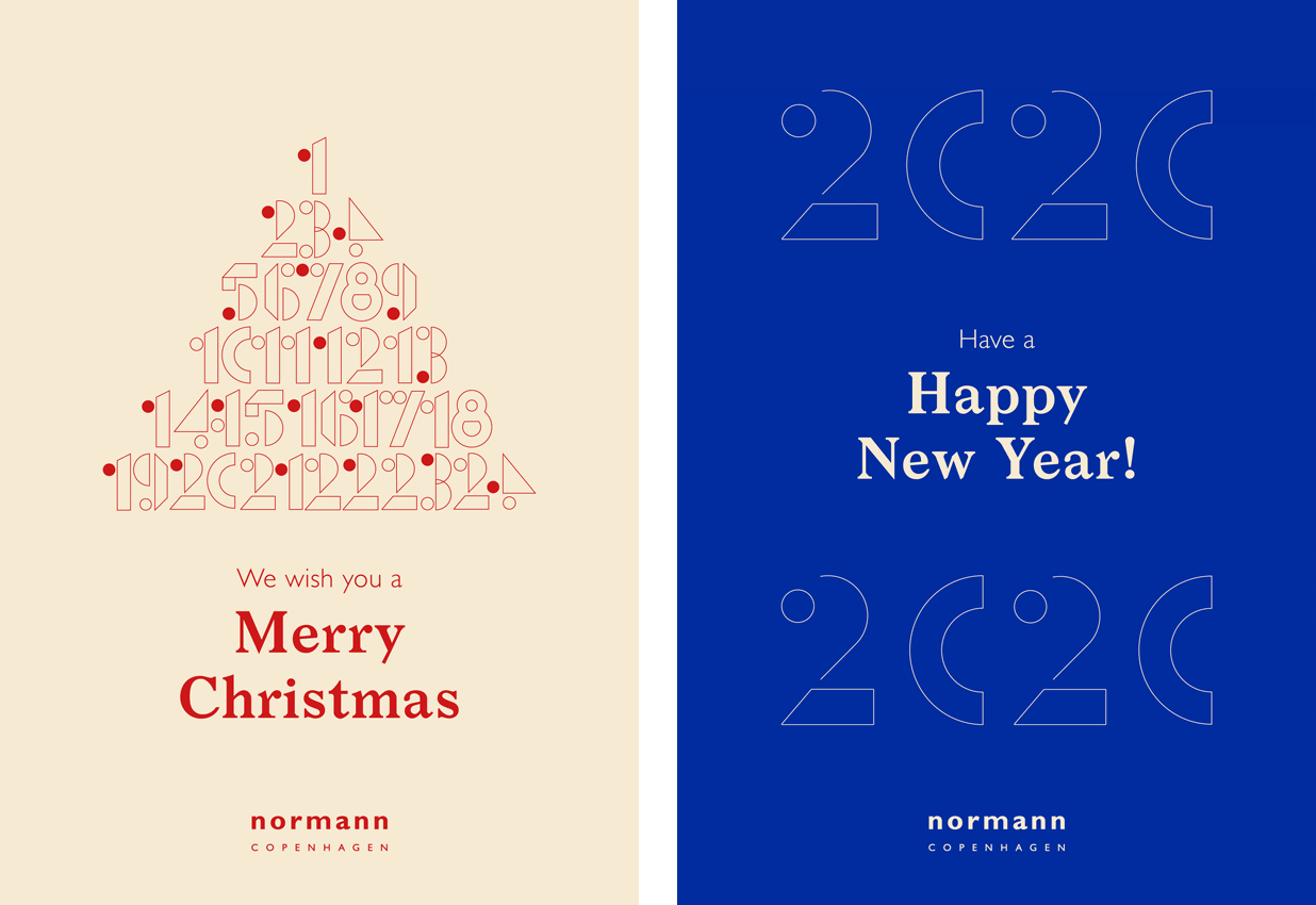
Project:
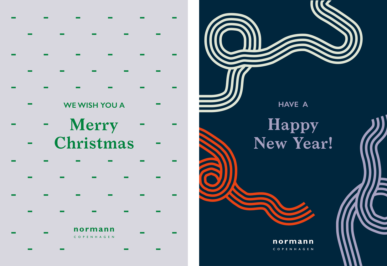
Normann Copenhagen Christmas Cards 2020
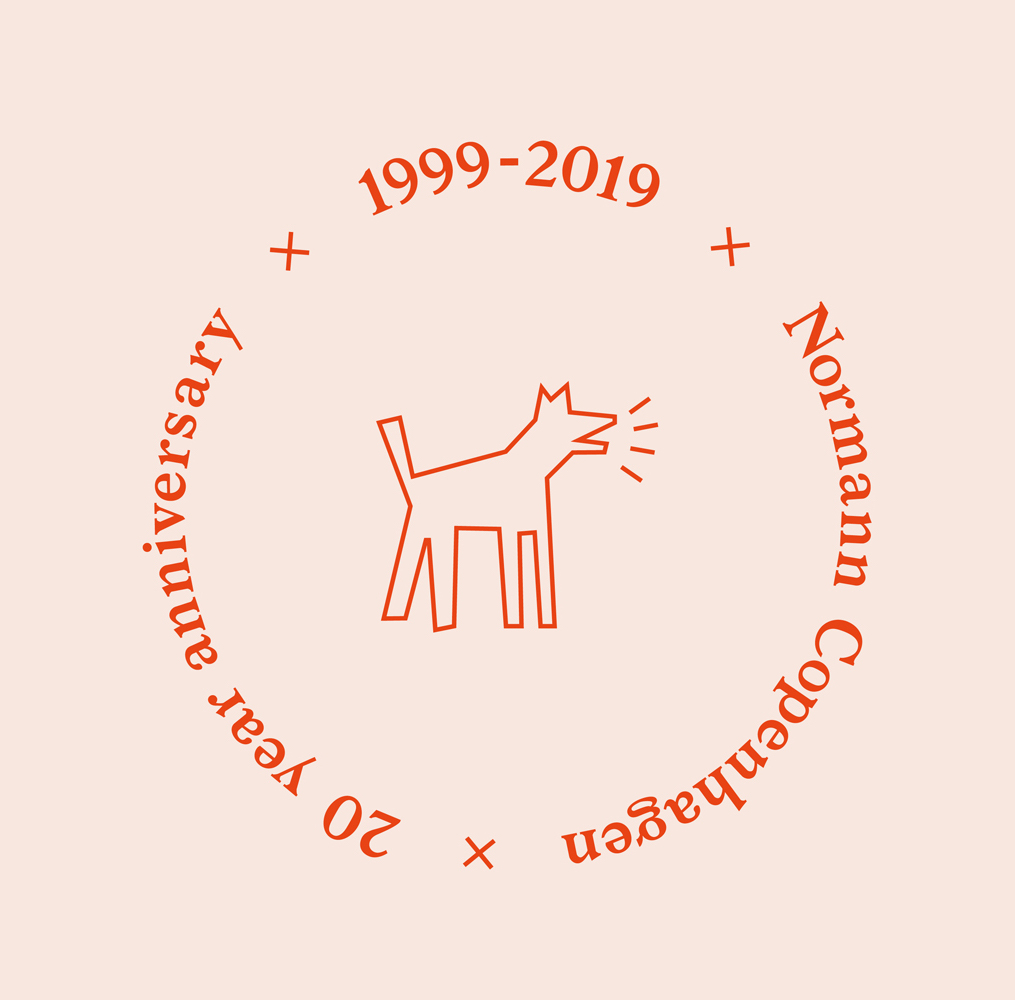
Project:
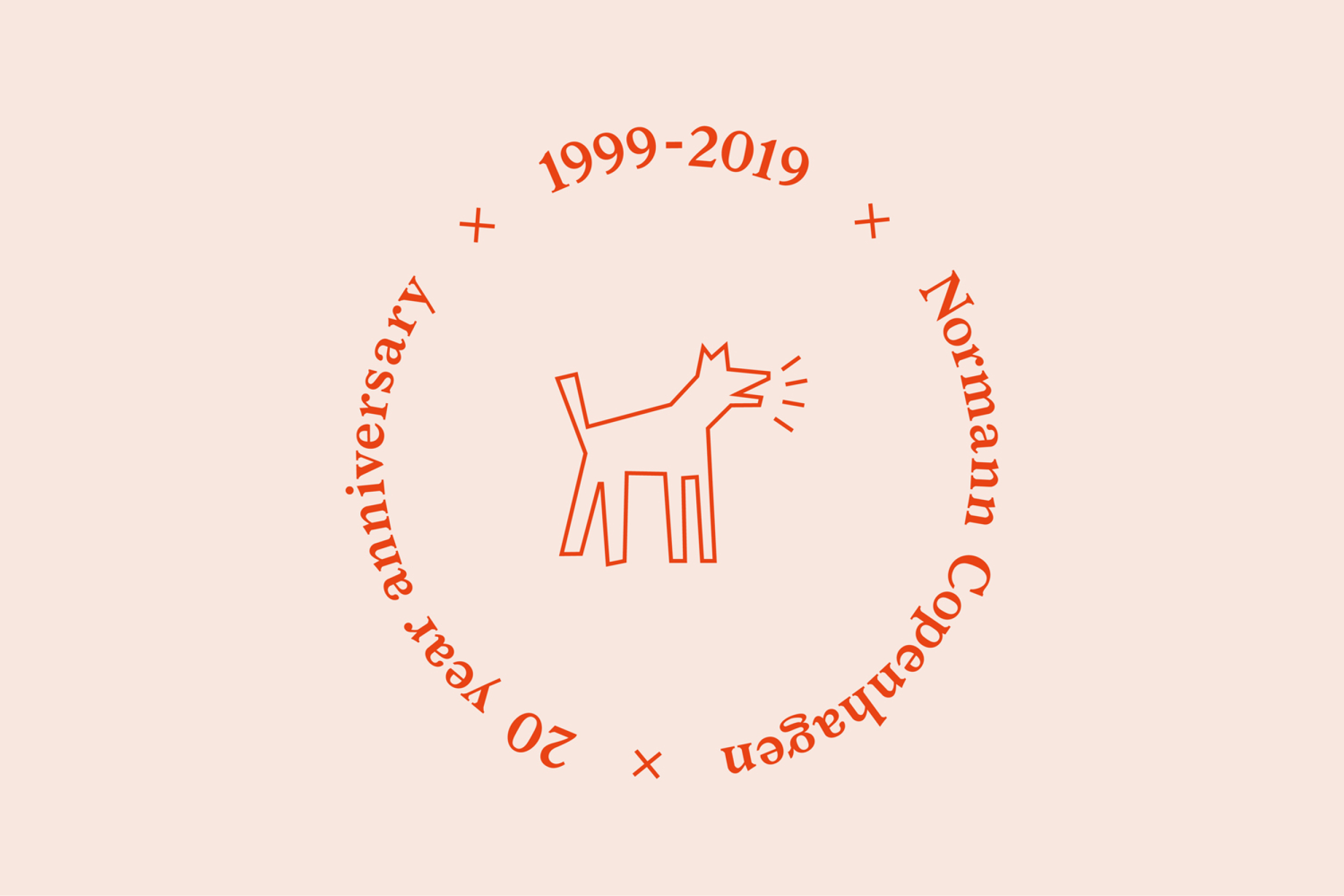
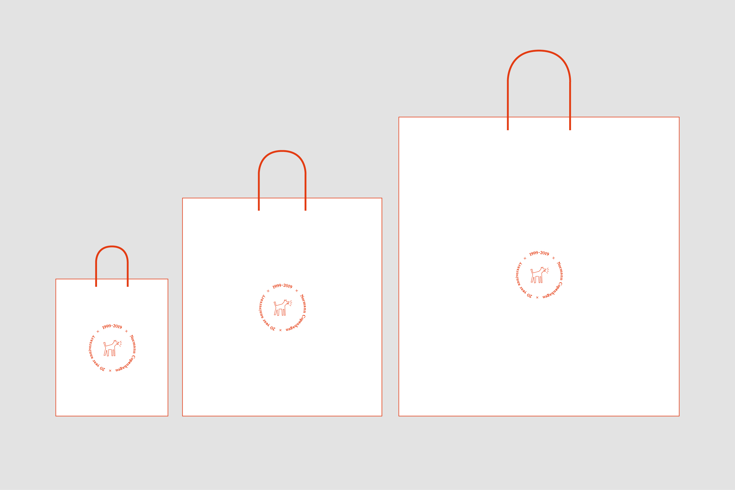
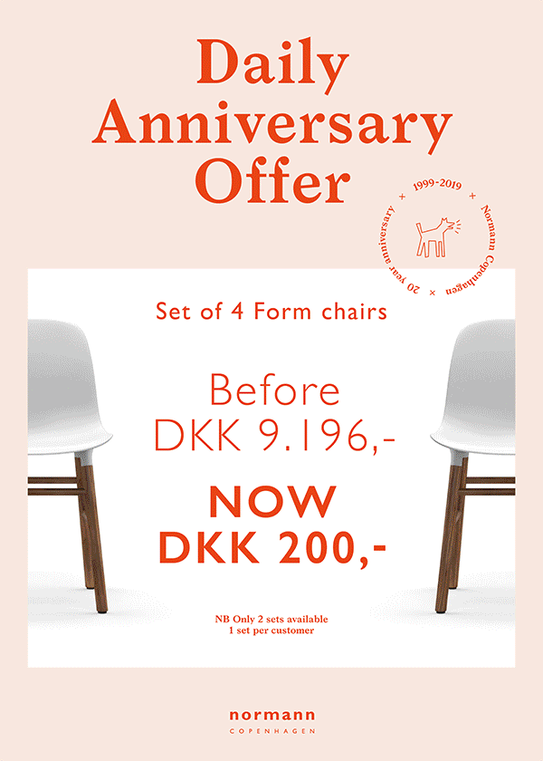
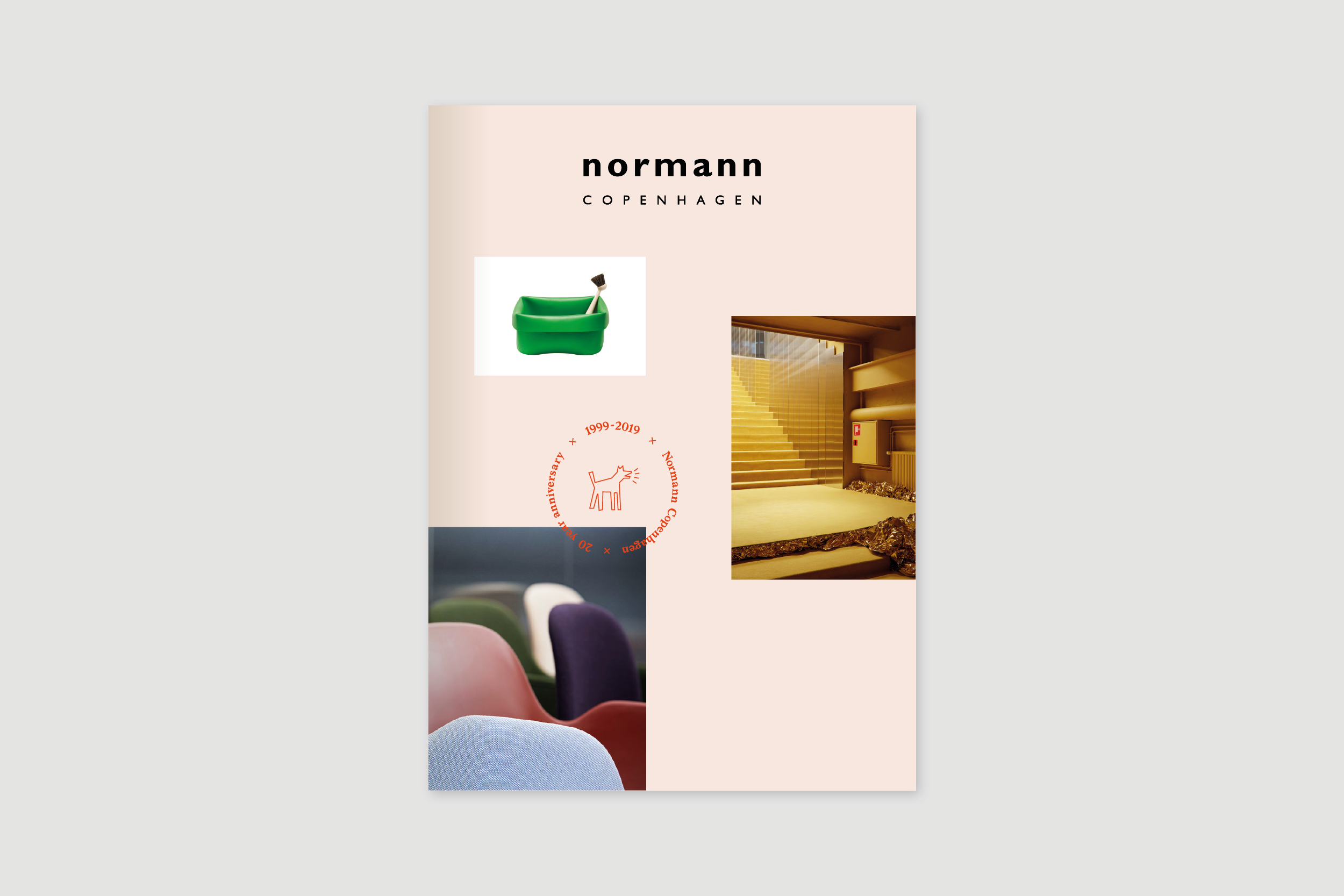
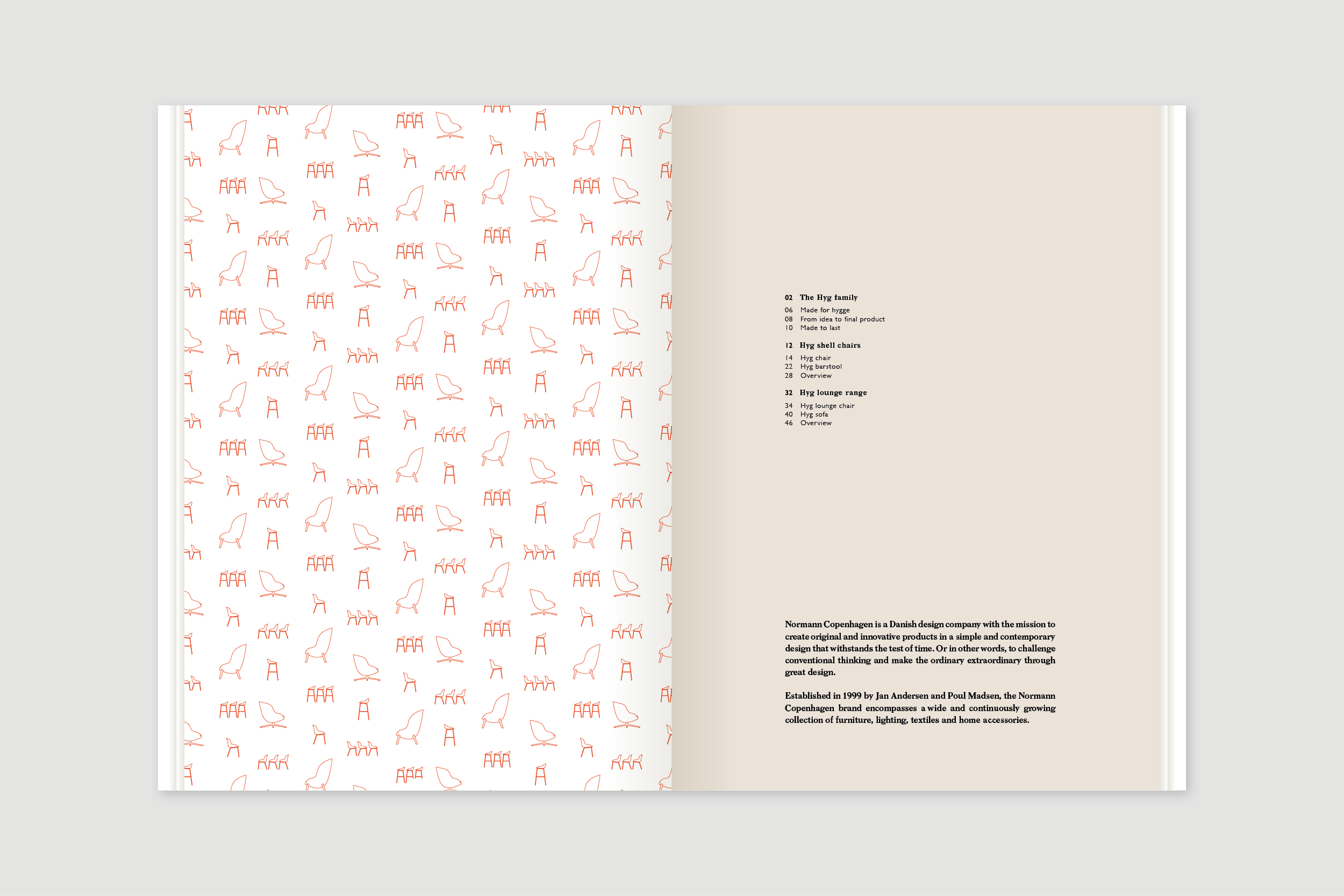
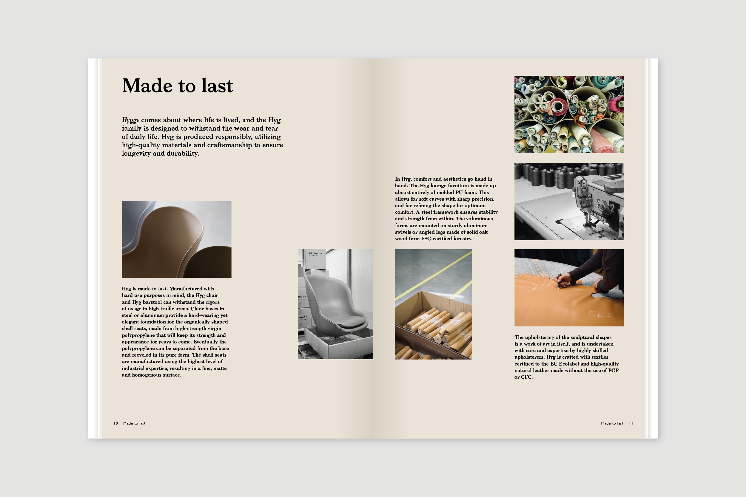
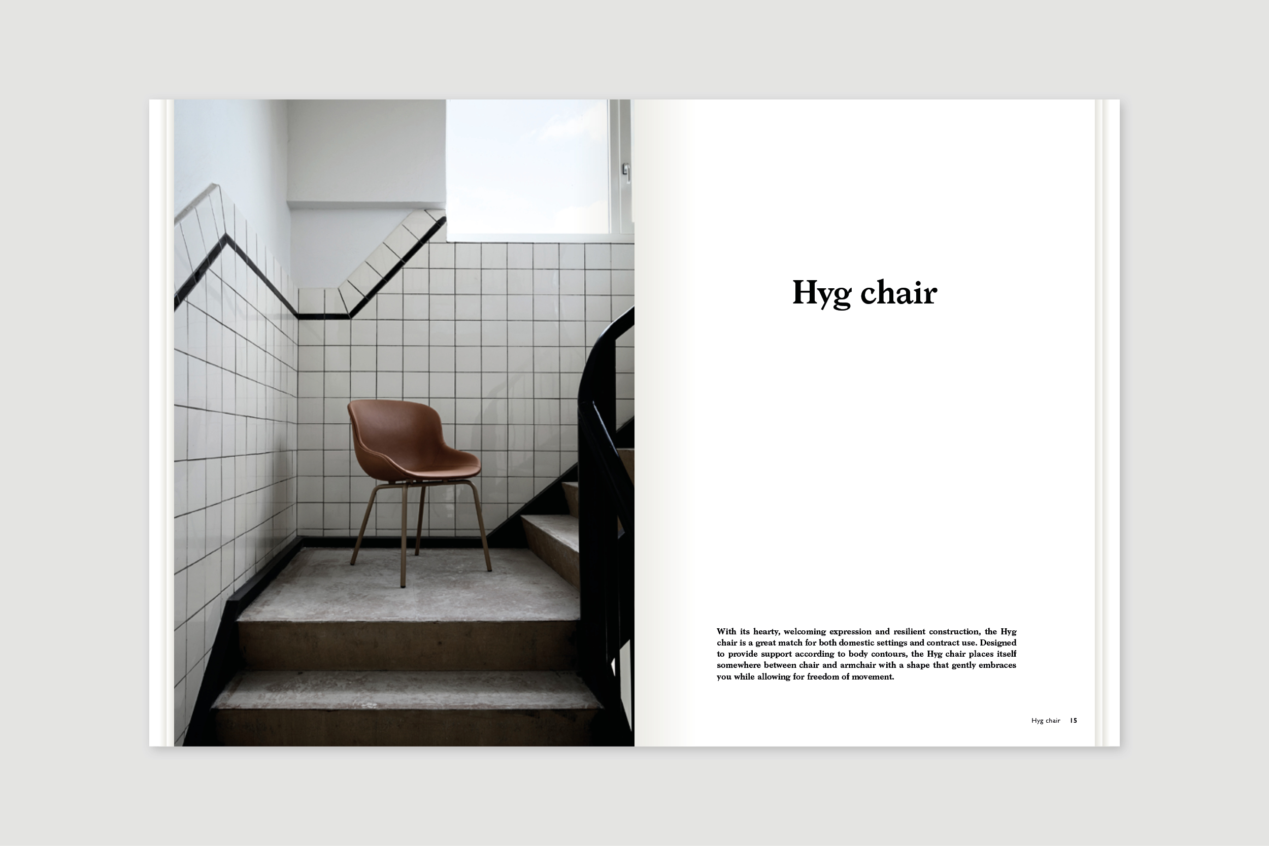
Normann Copenhagen Visual Identity 20-year Anniversary
Project:
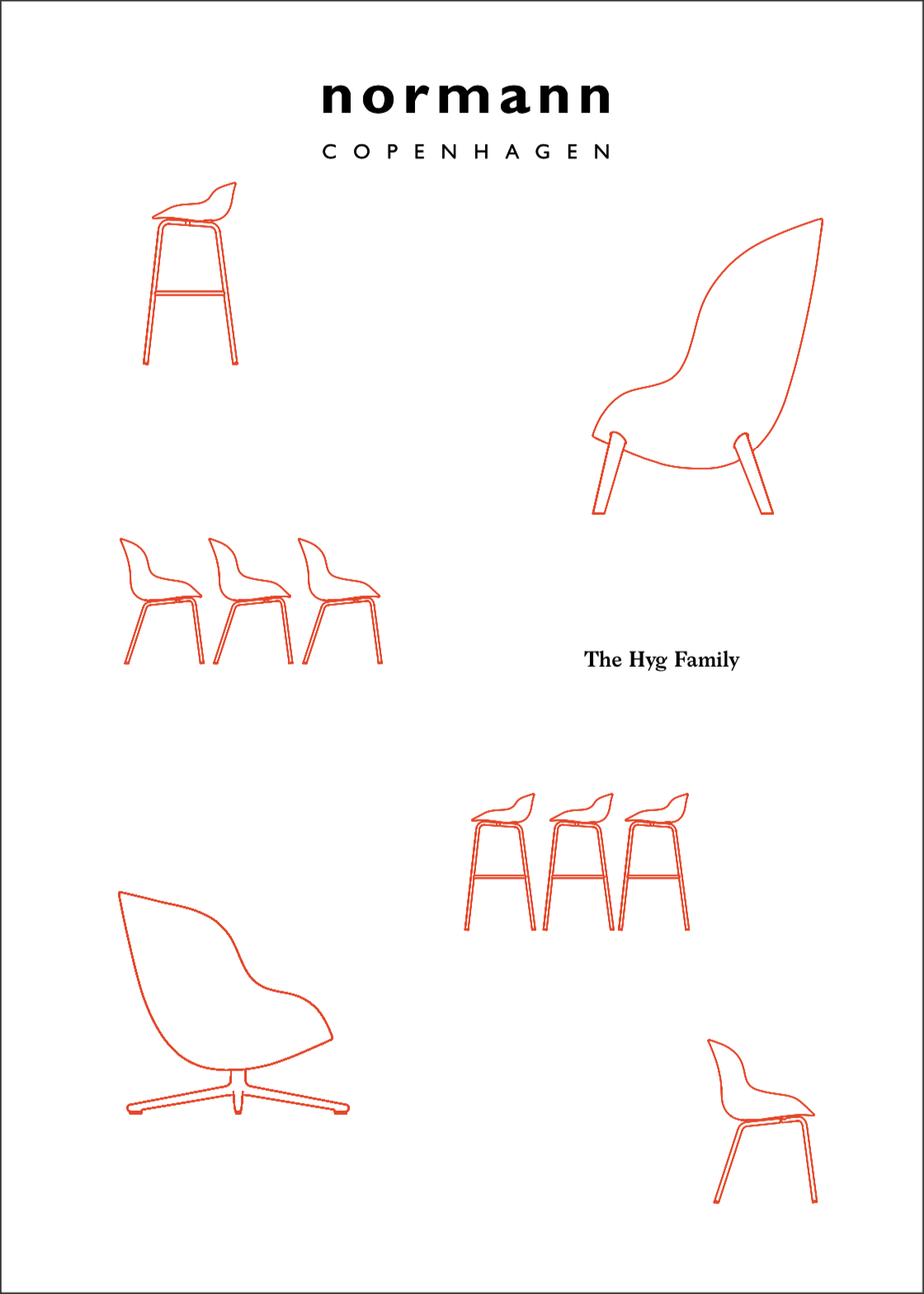
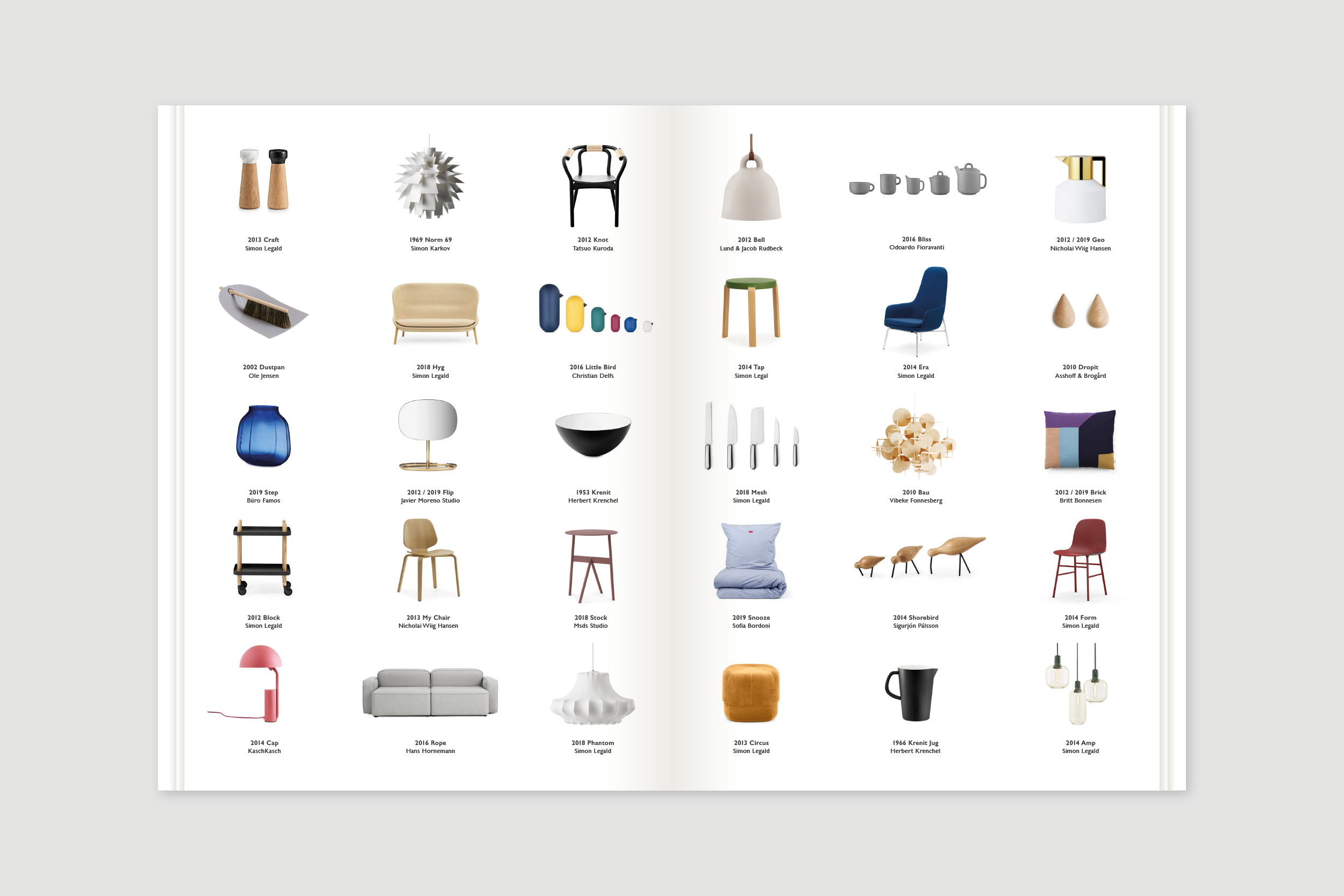
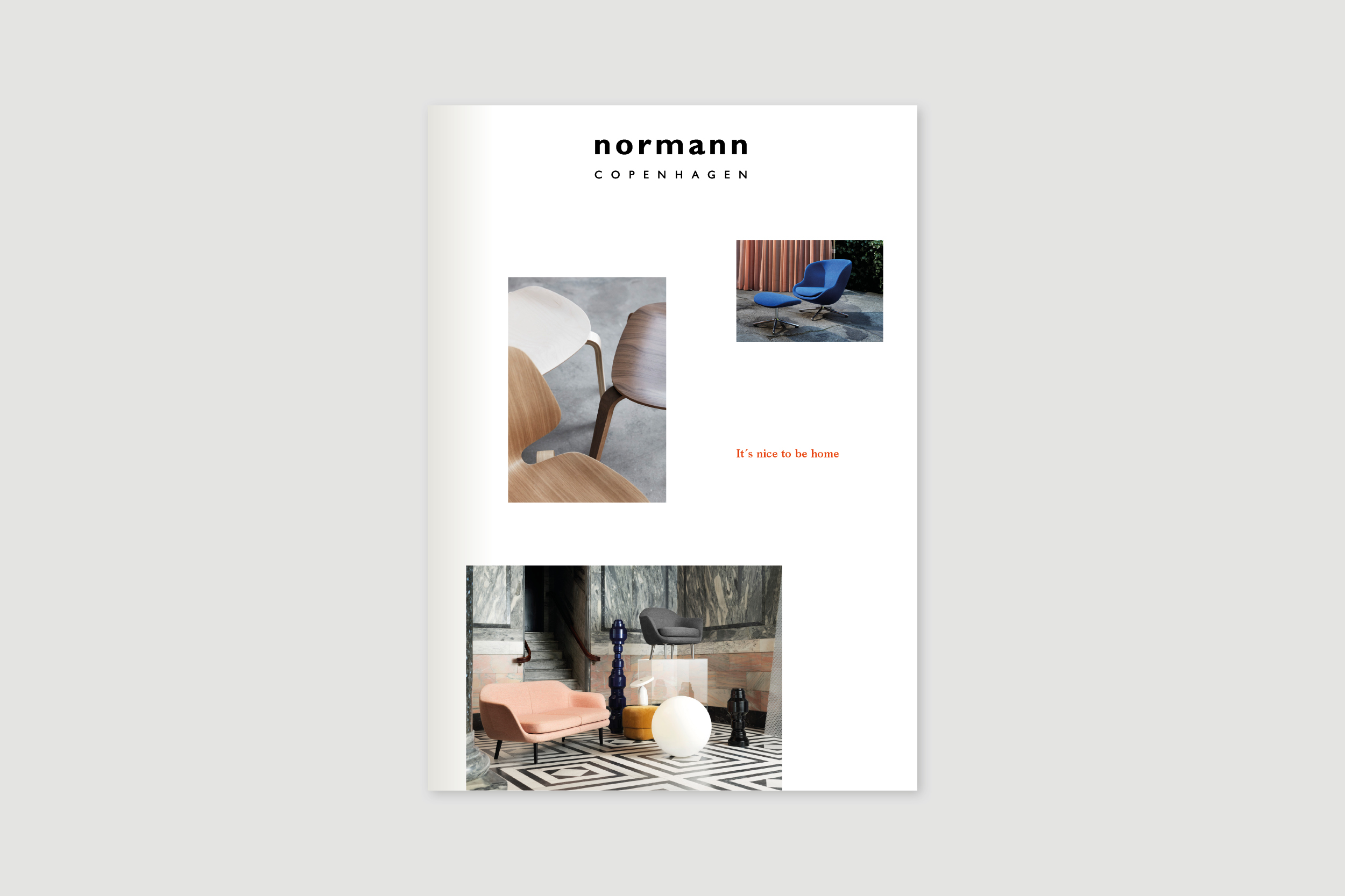
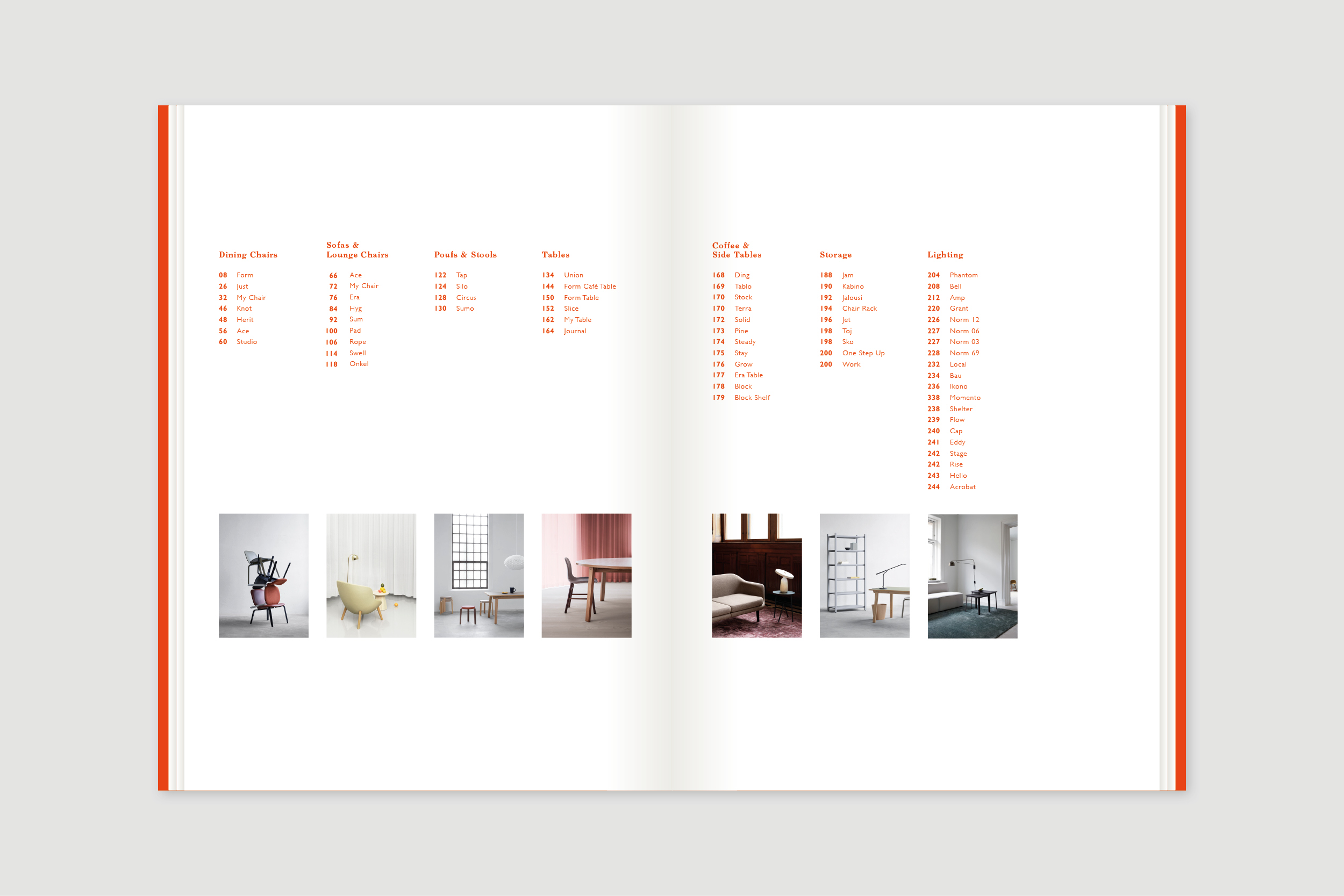
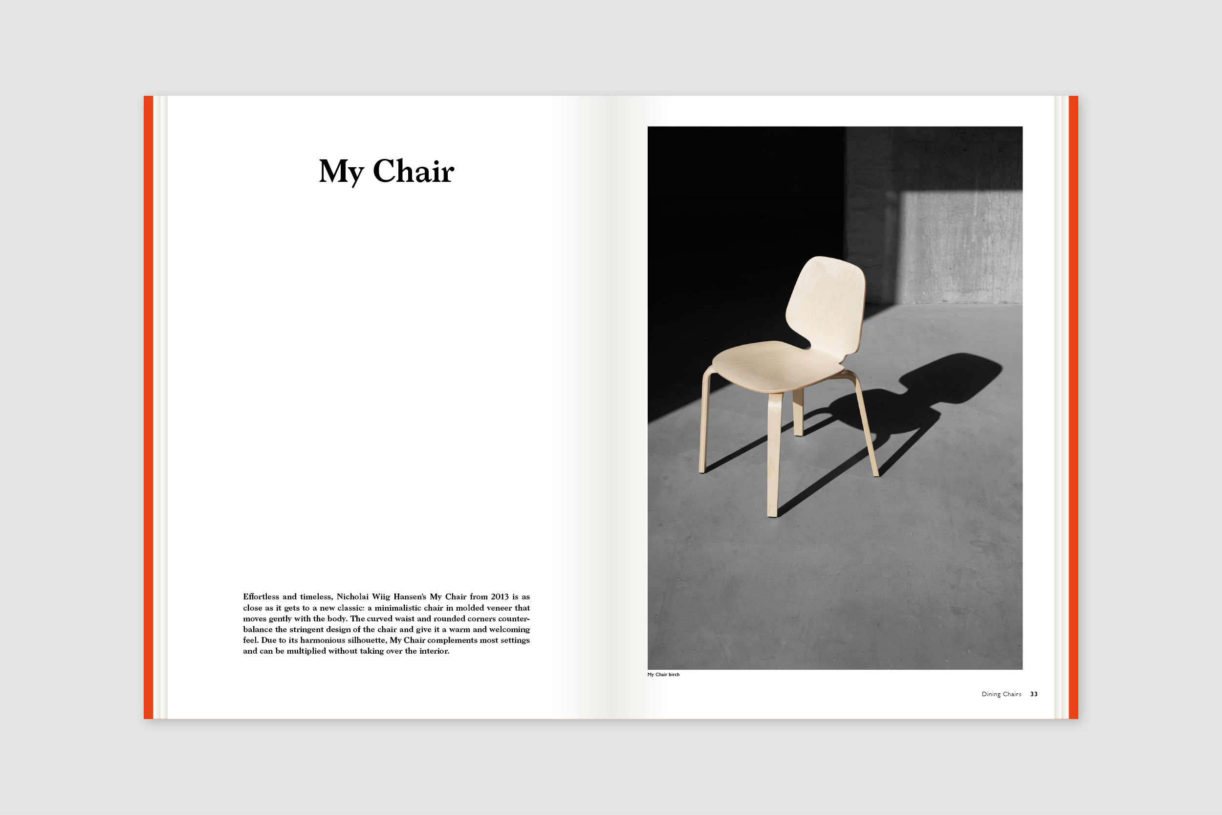
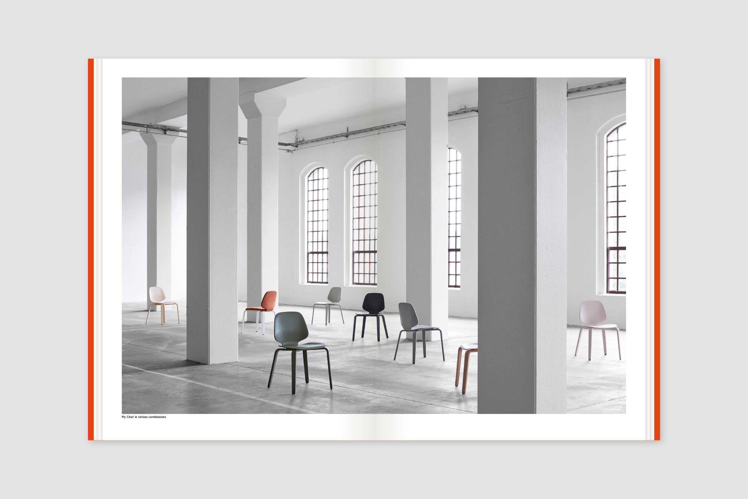
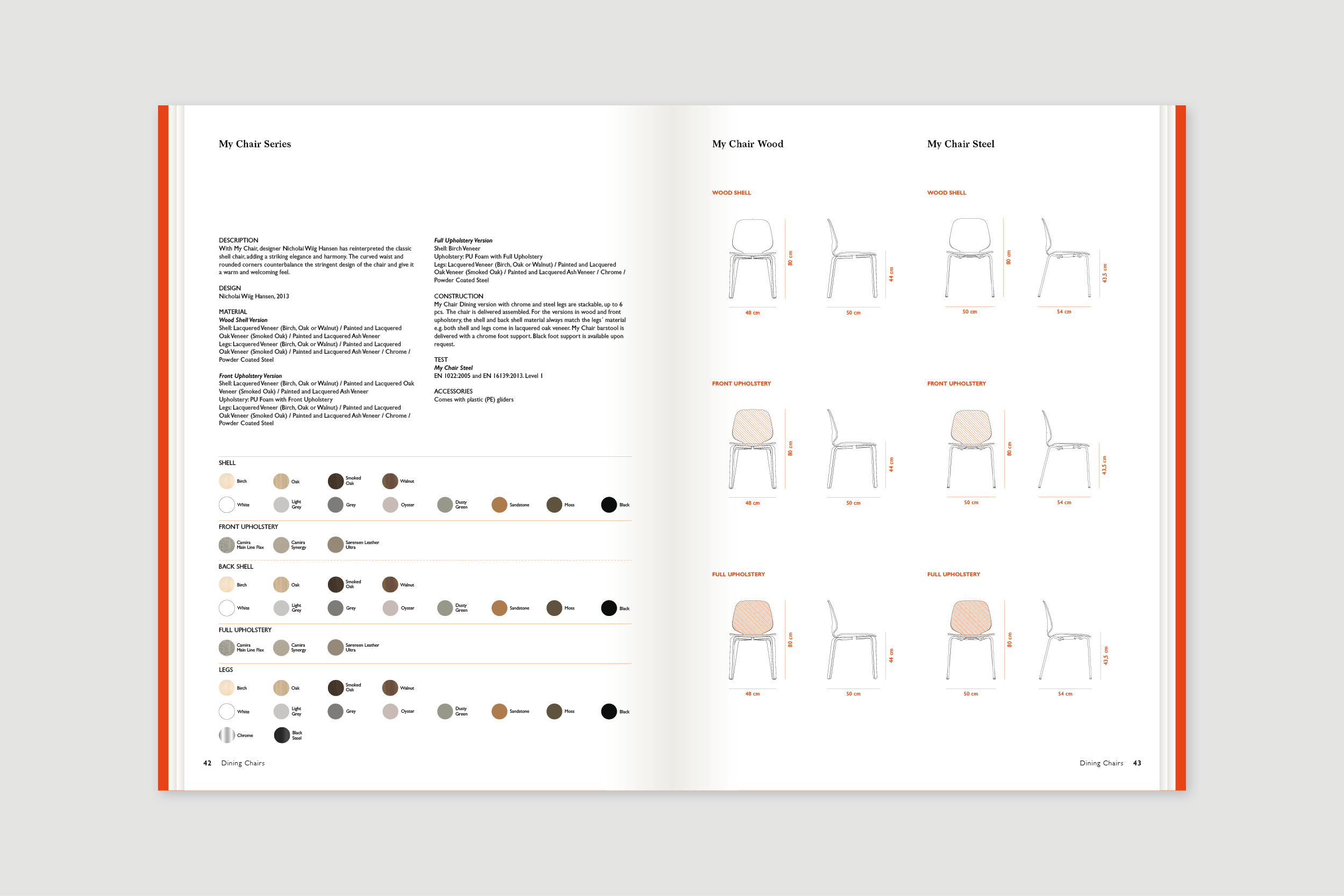
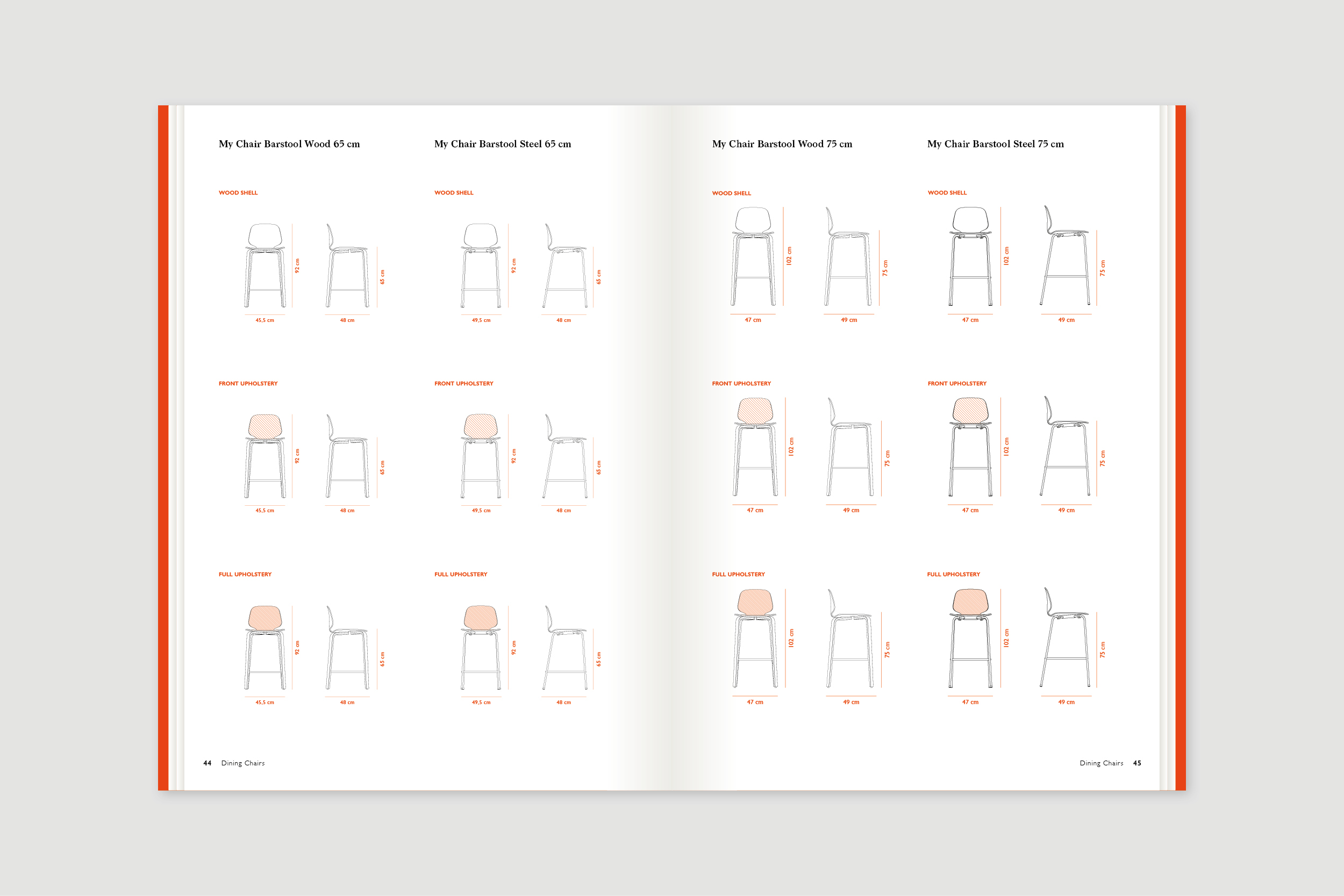
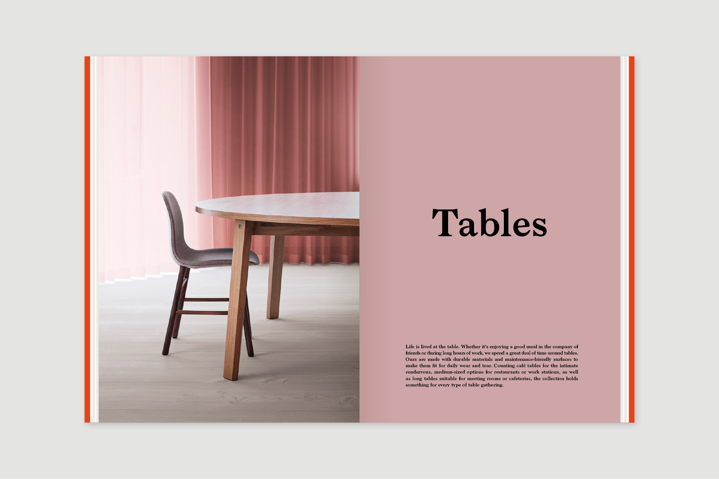
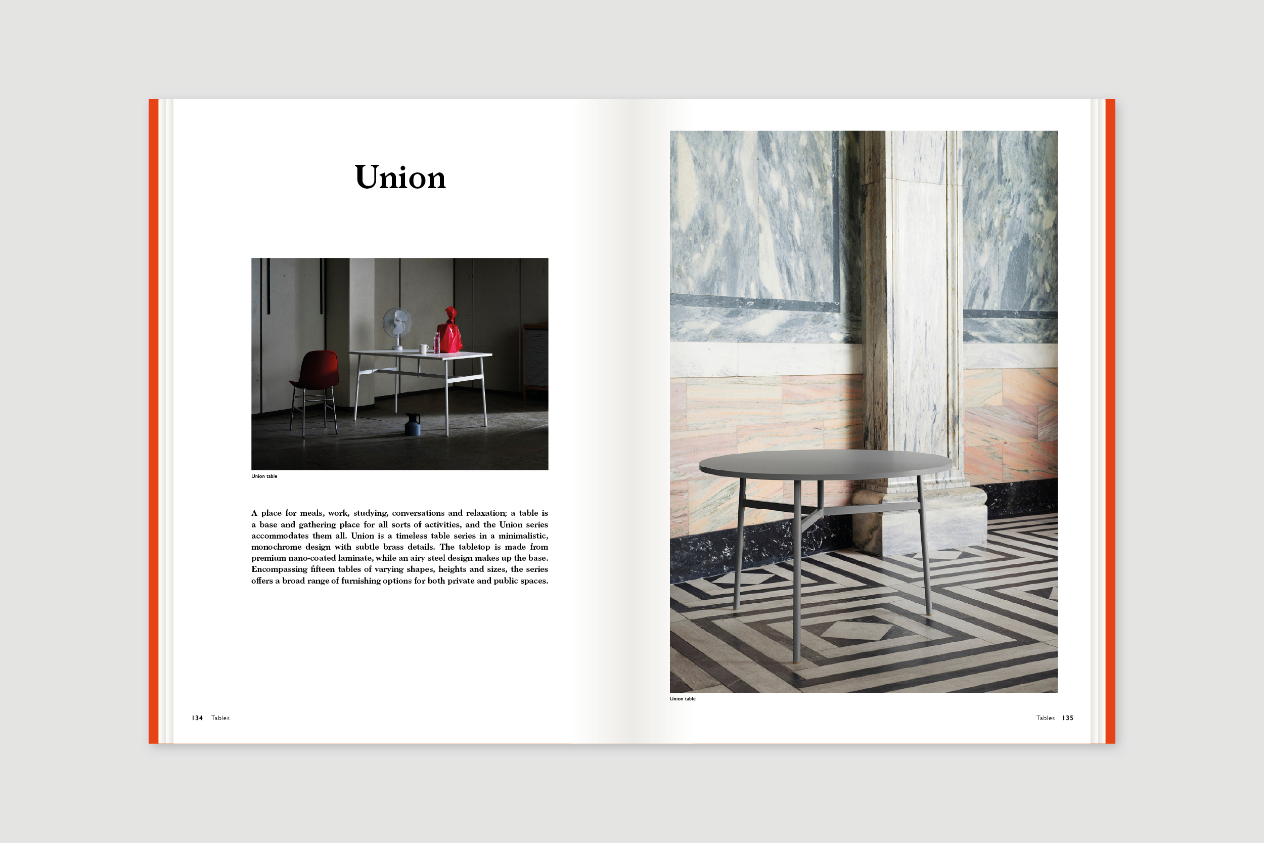
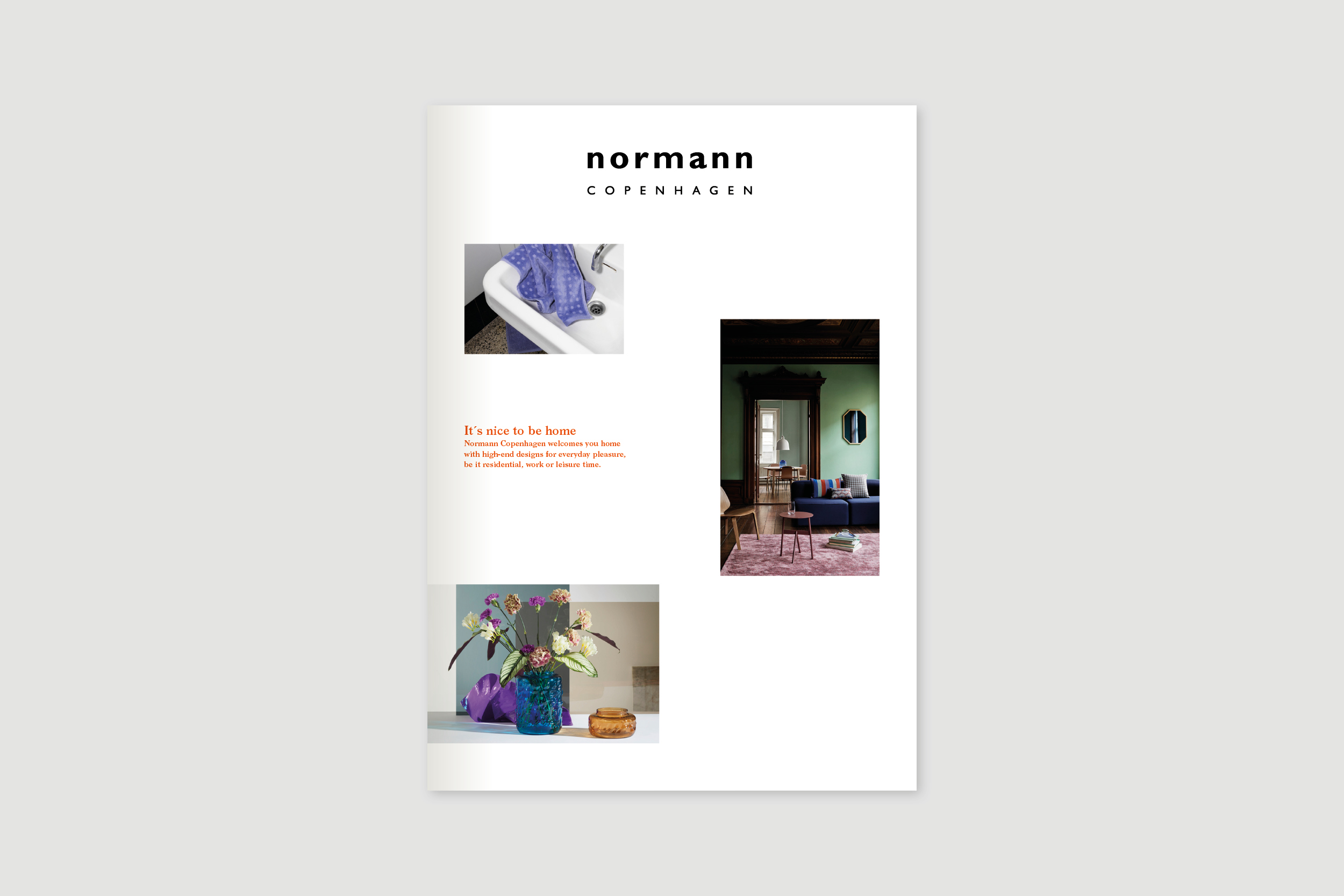
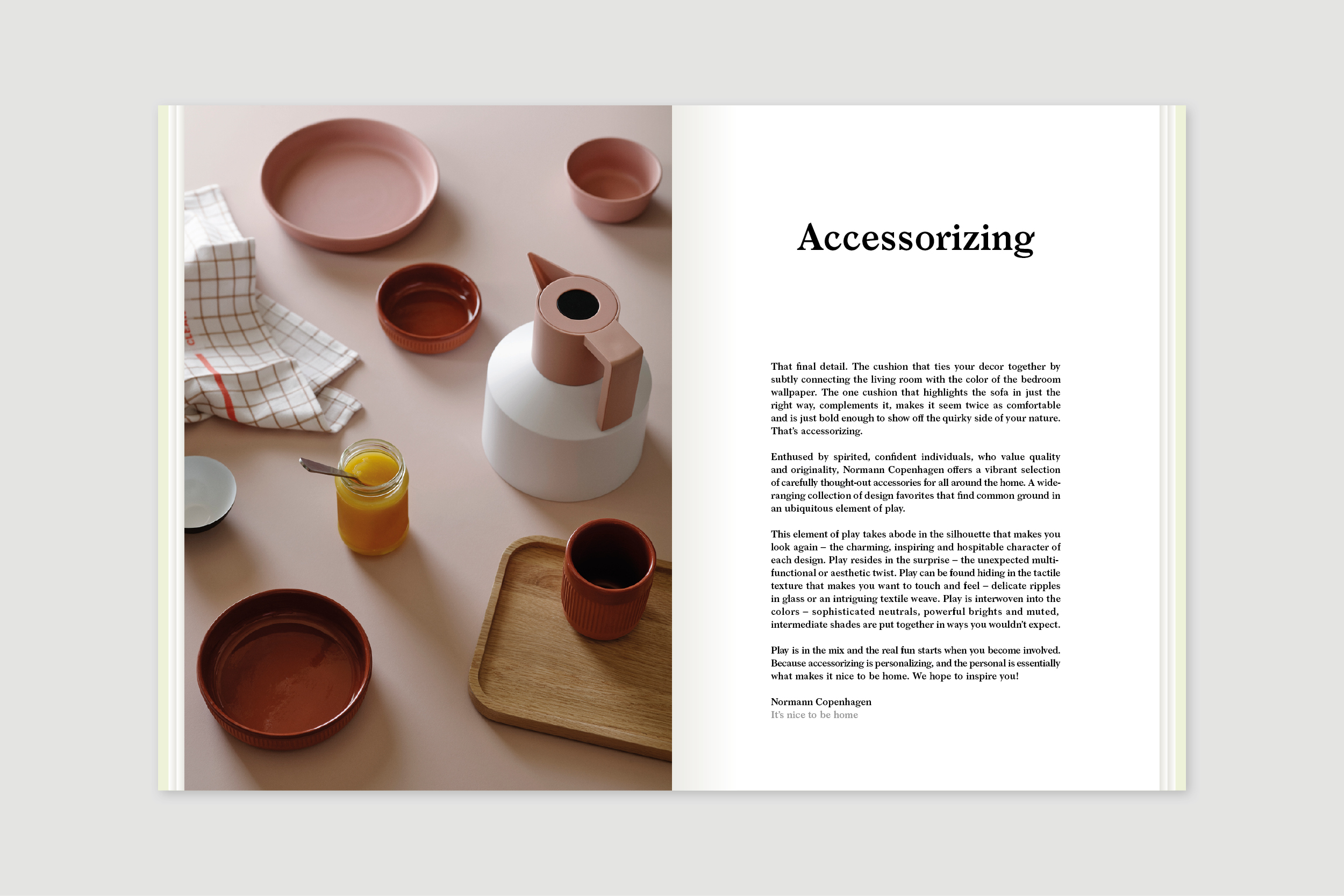
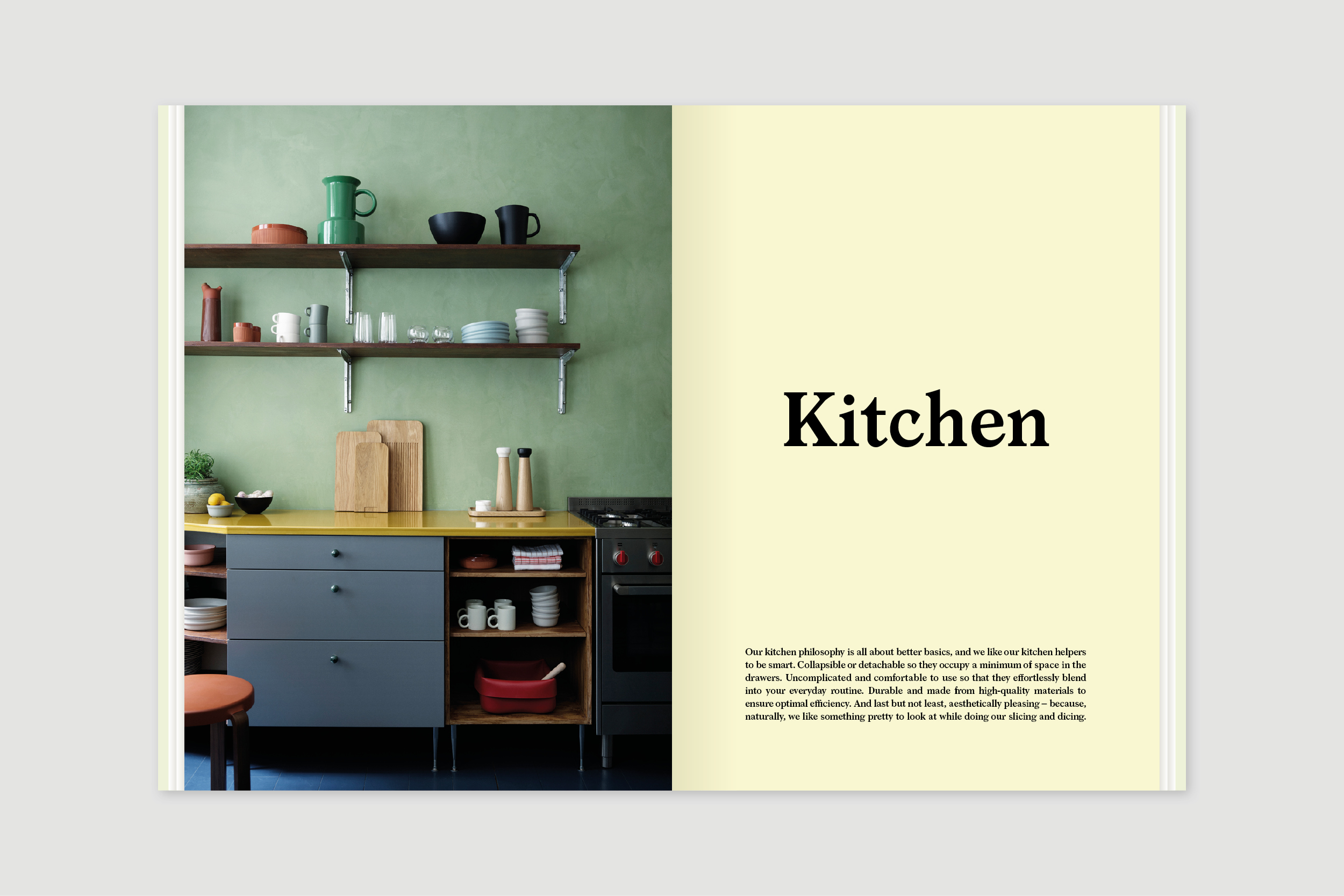
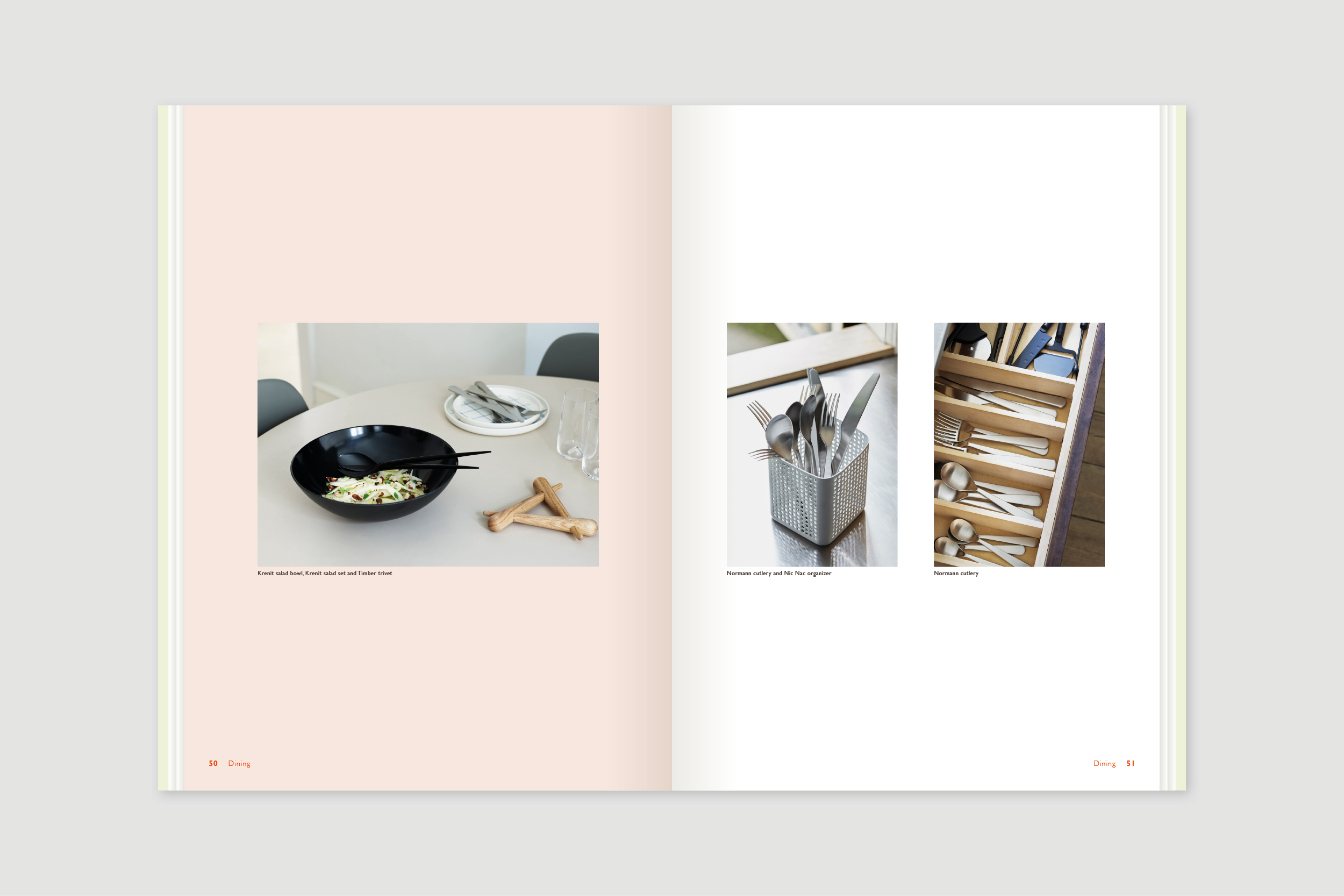
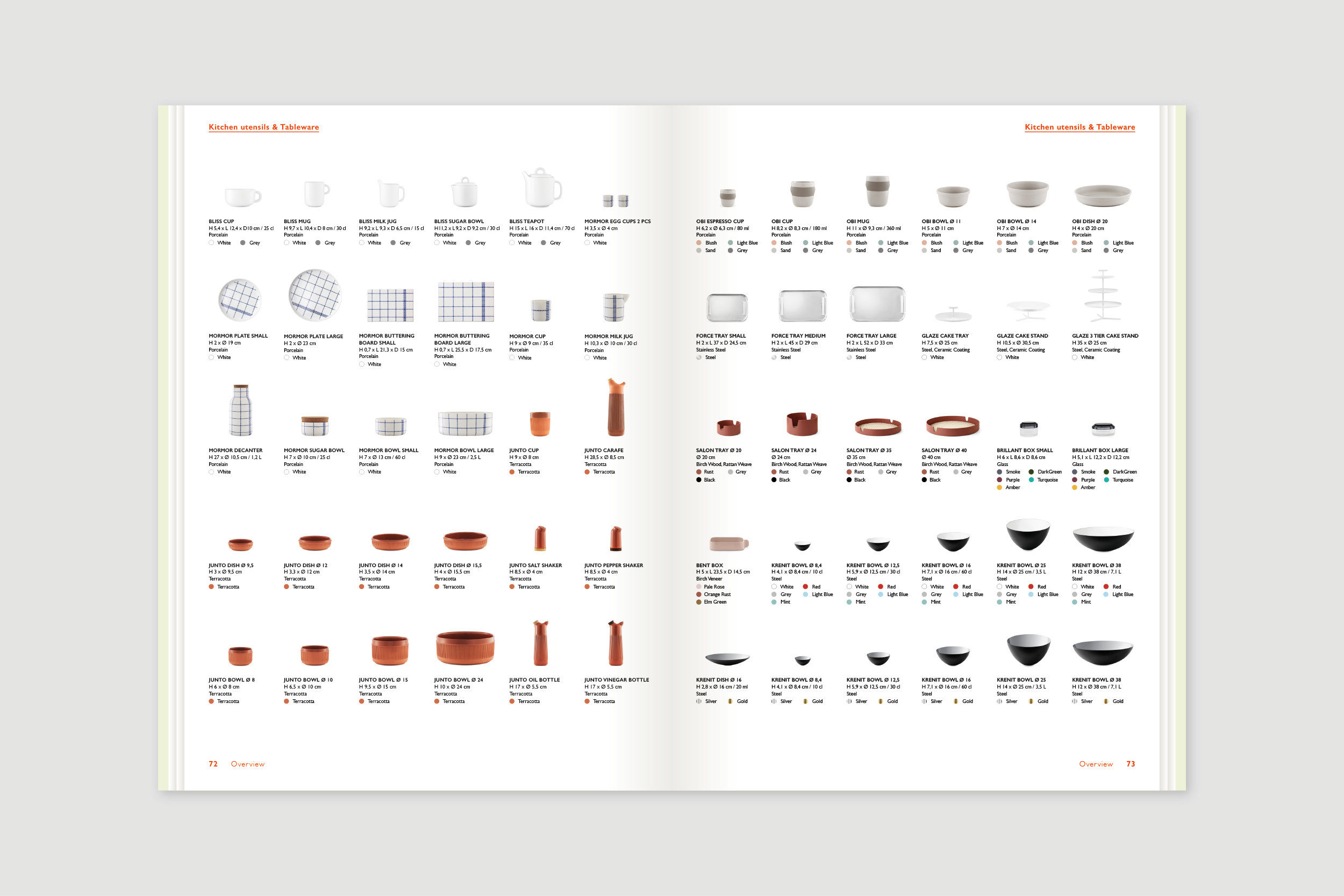
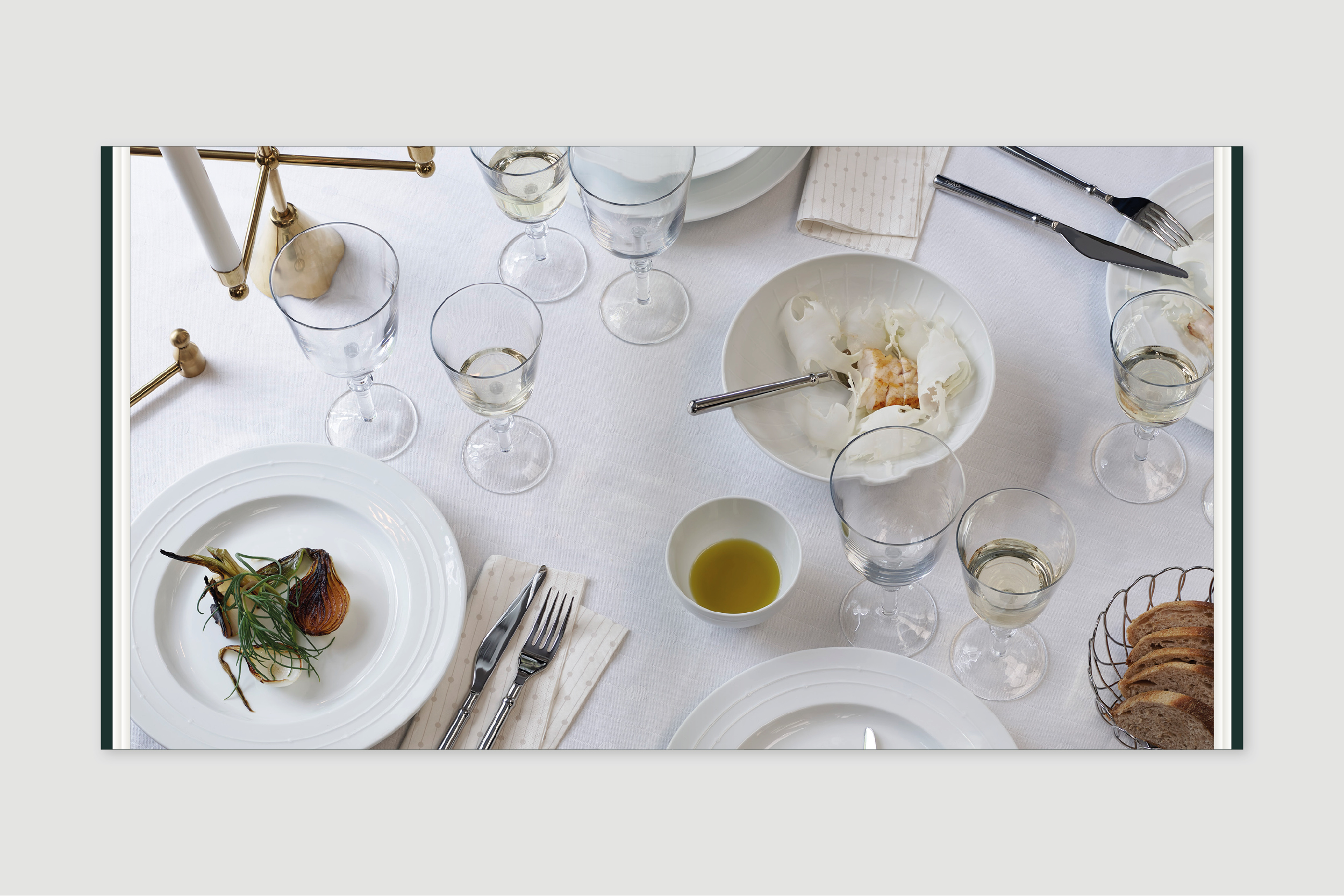
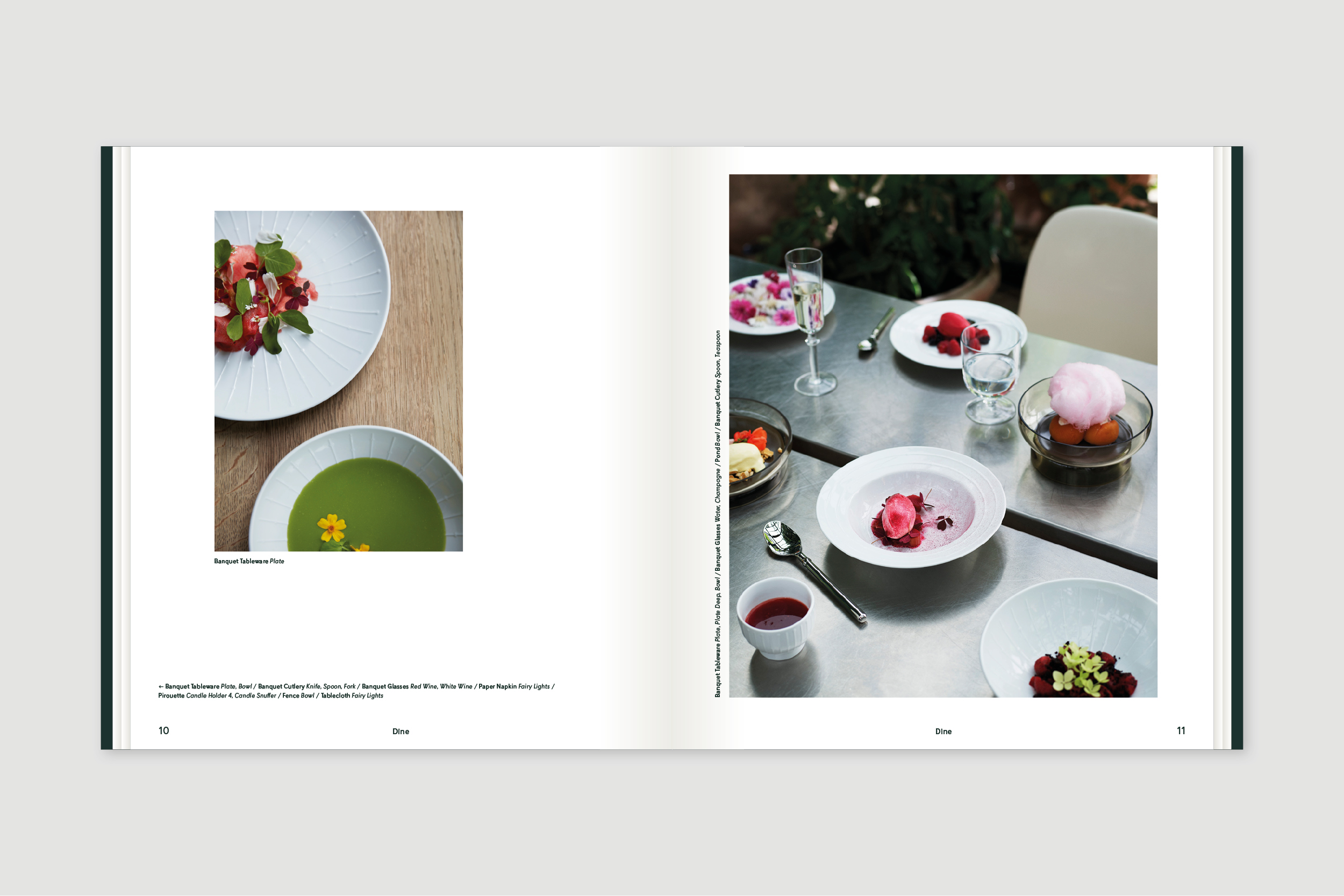
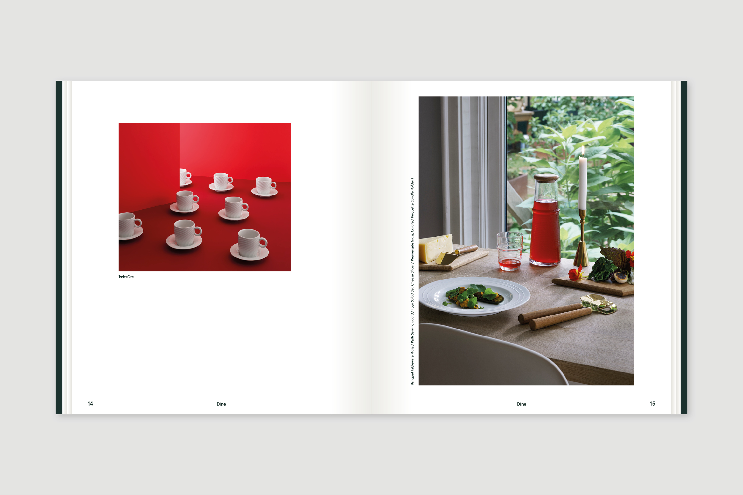
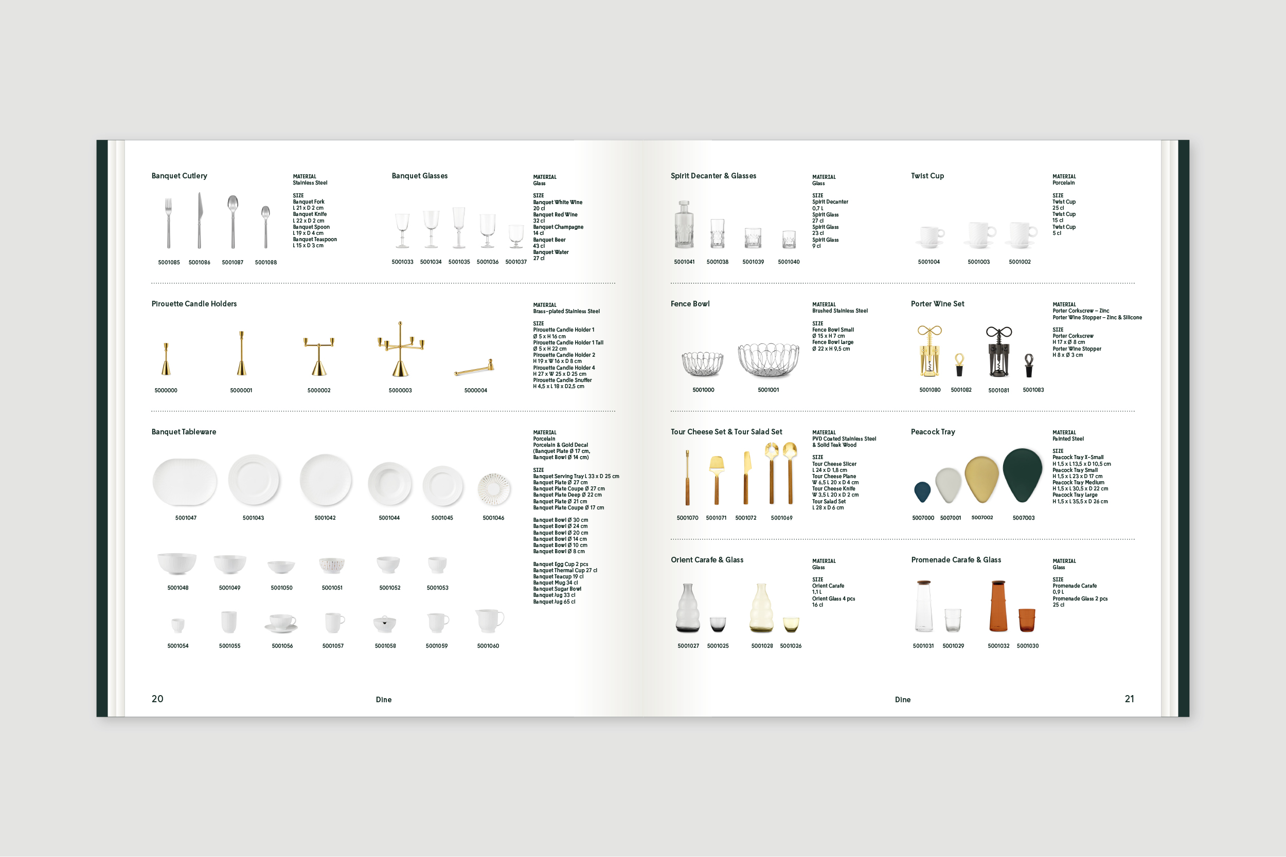
Normann Copenhagen Catalog 2019
Project:
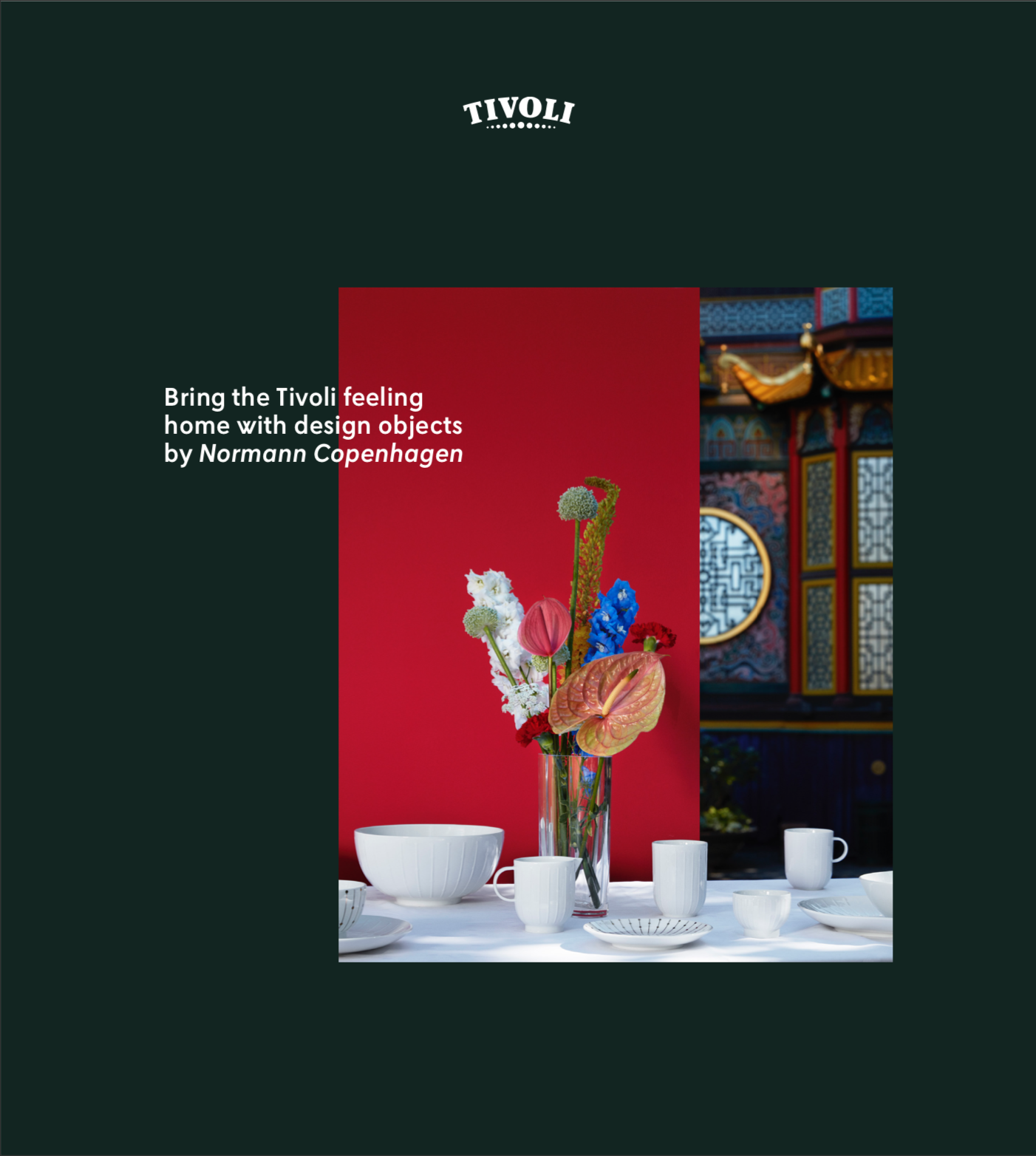
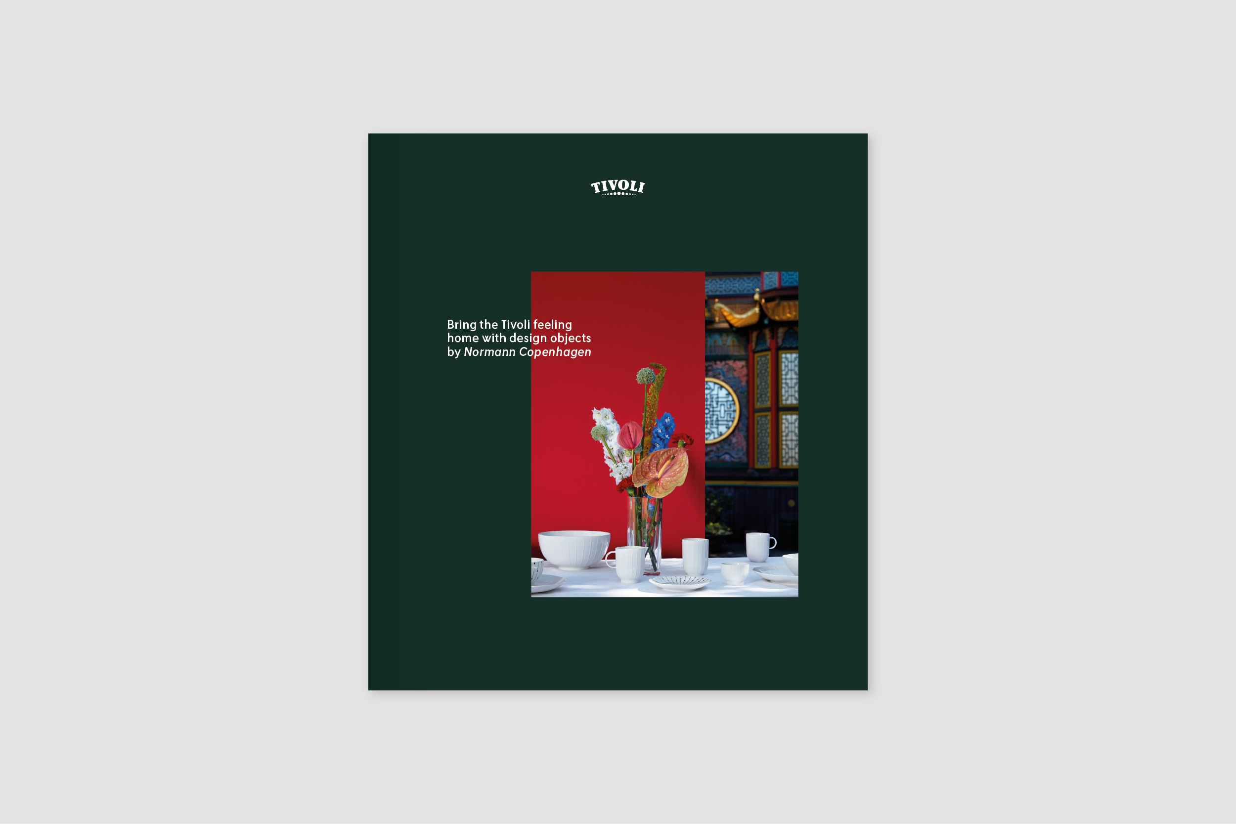
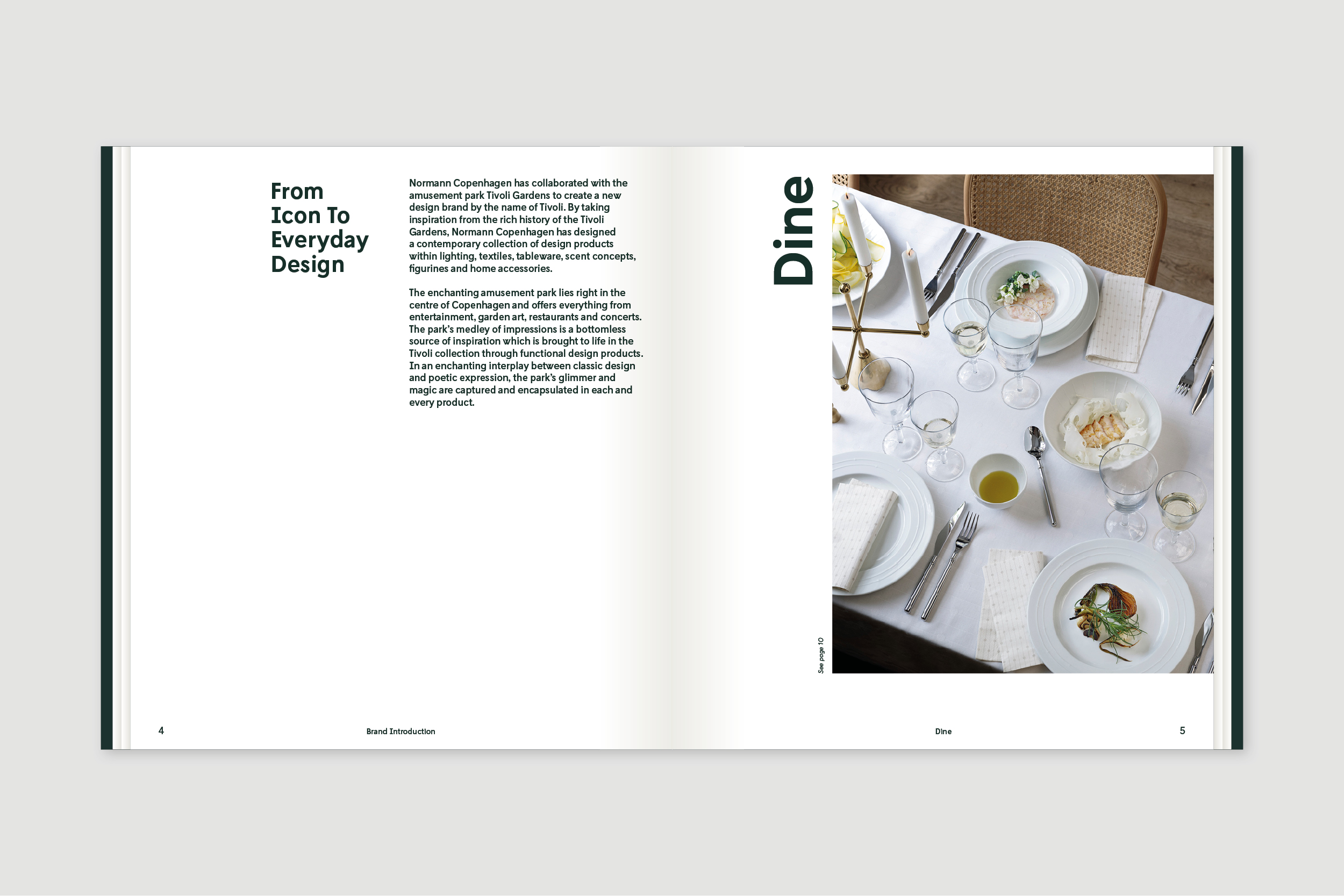
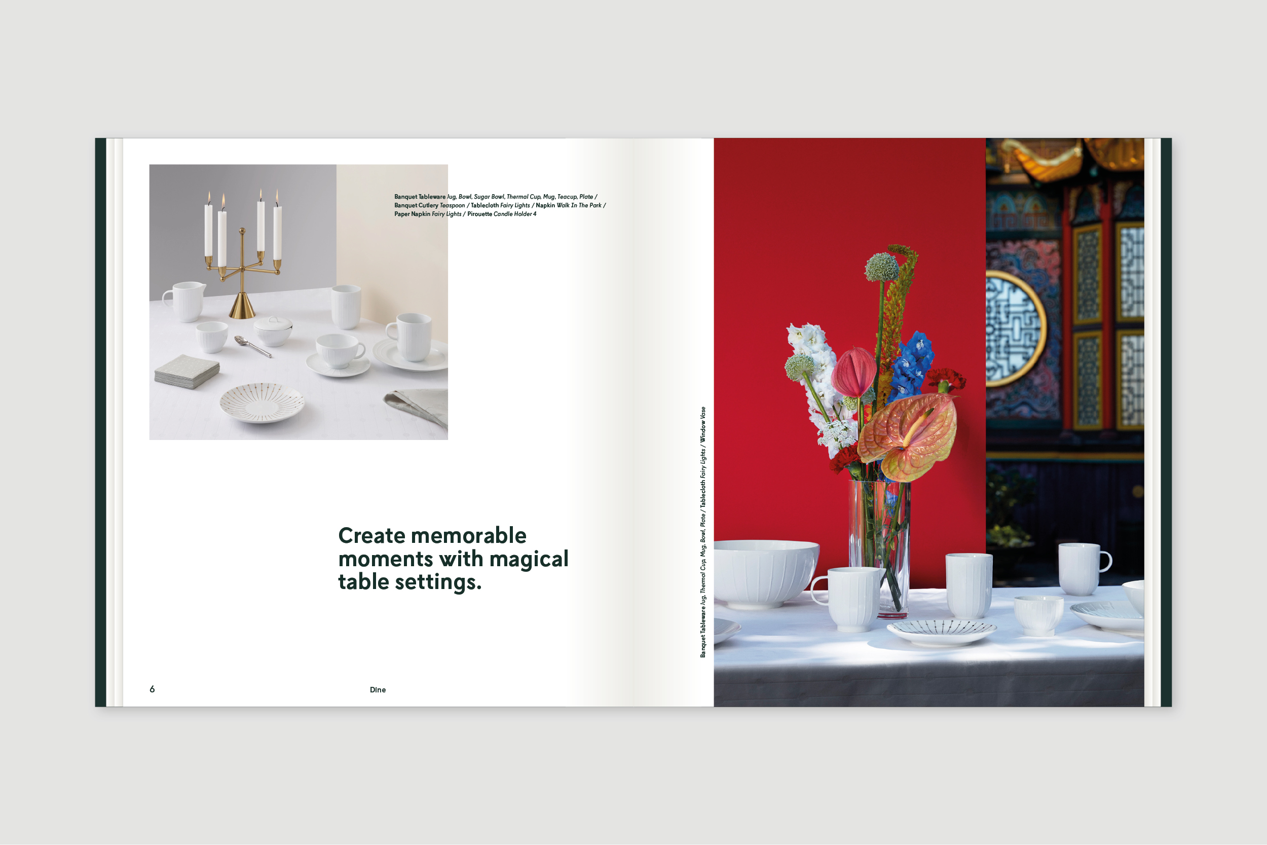
Tivoli Catalog by Normann Copenhagen 2019
Project:
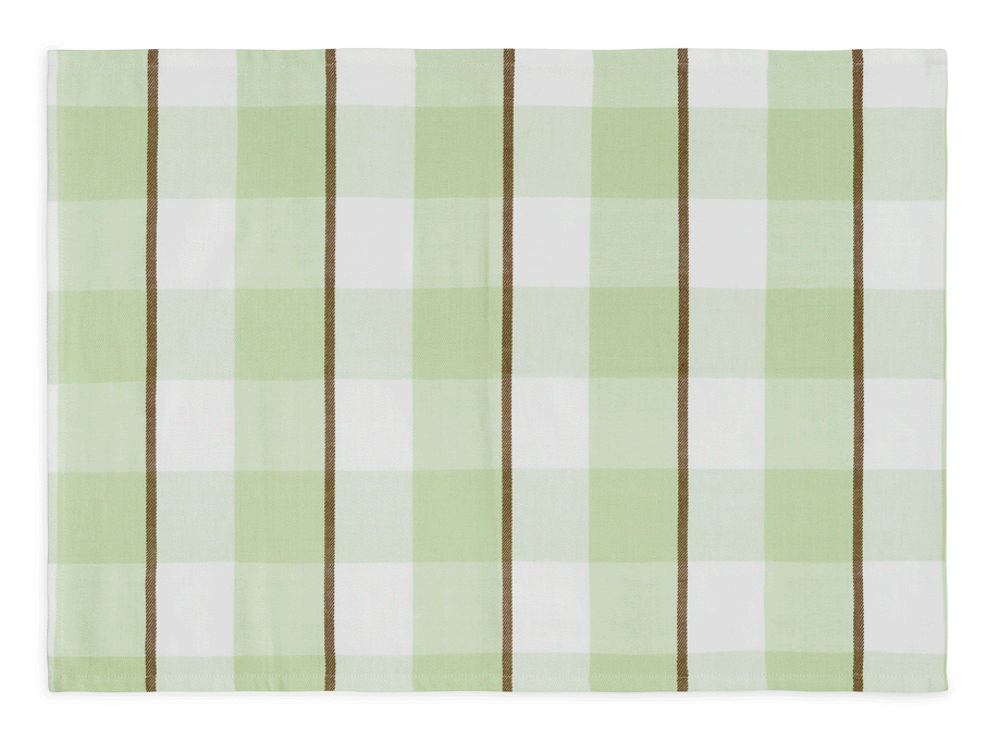
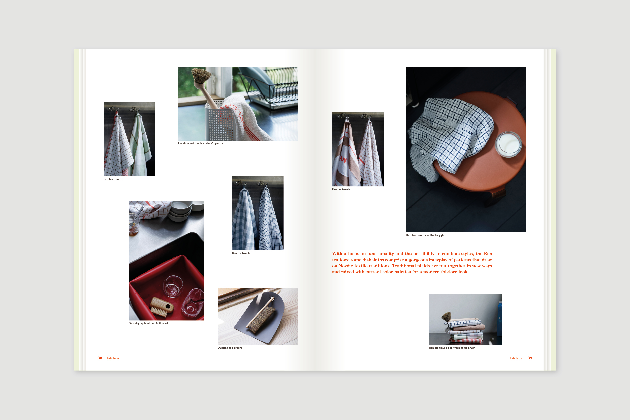
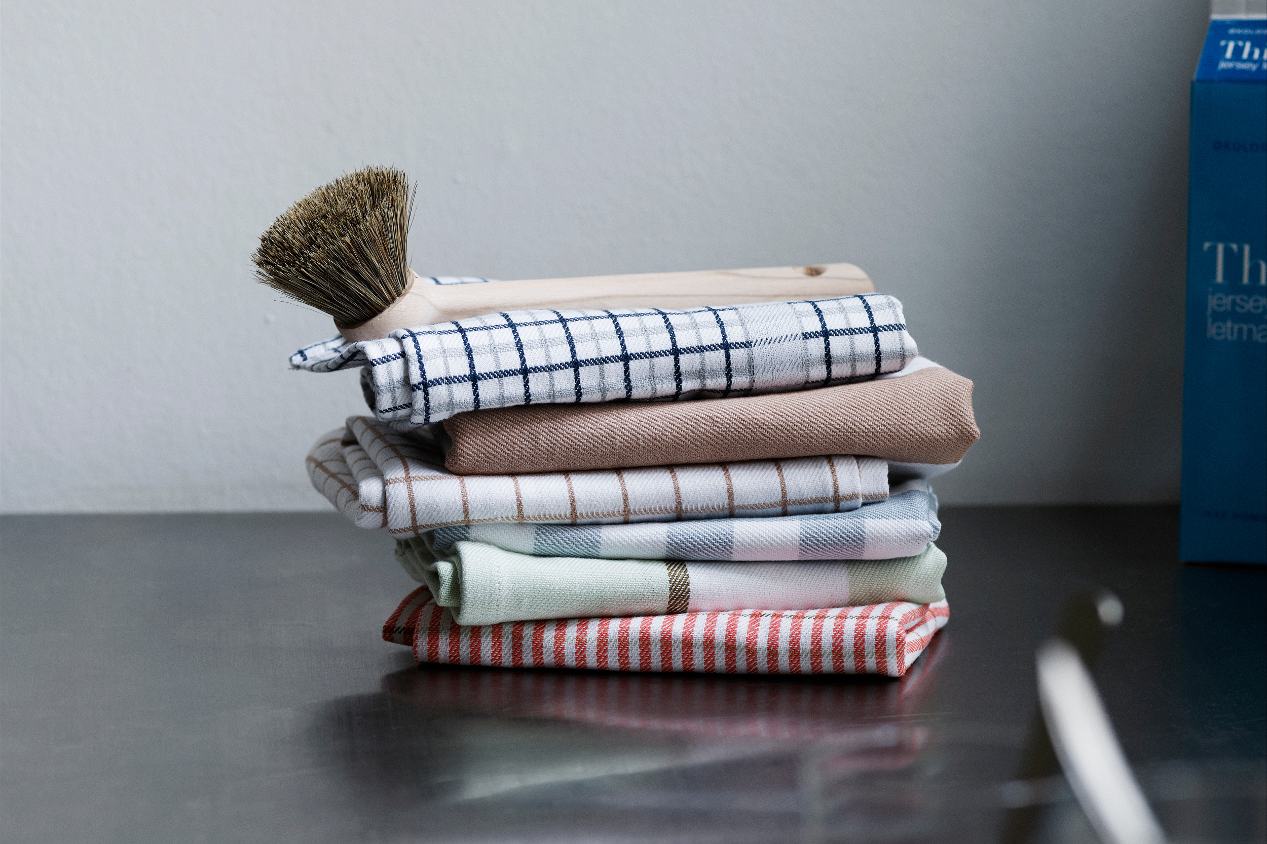
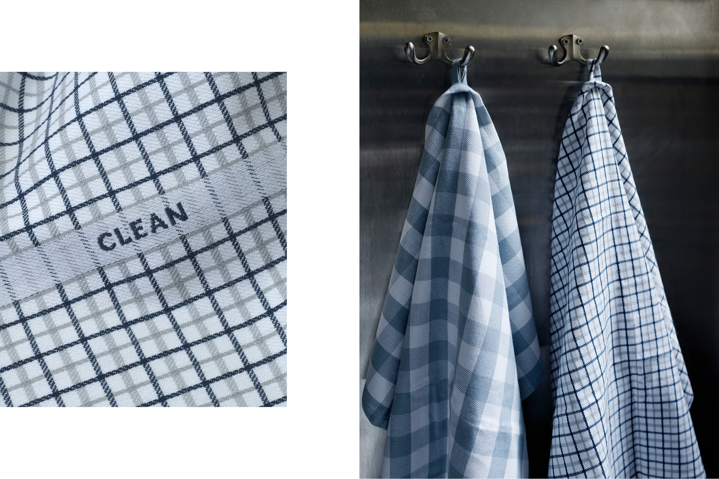
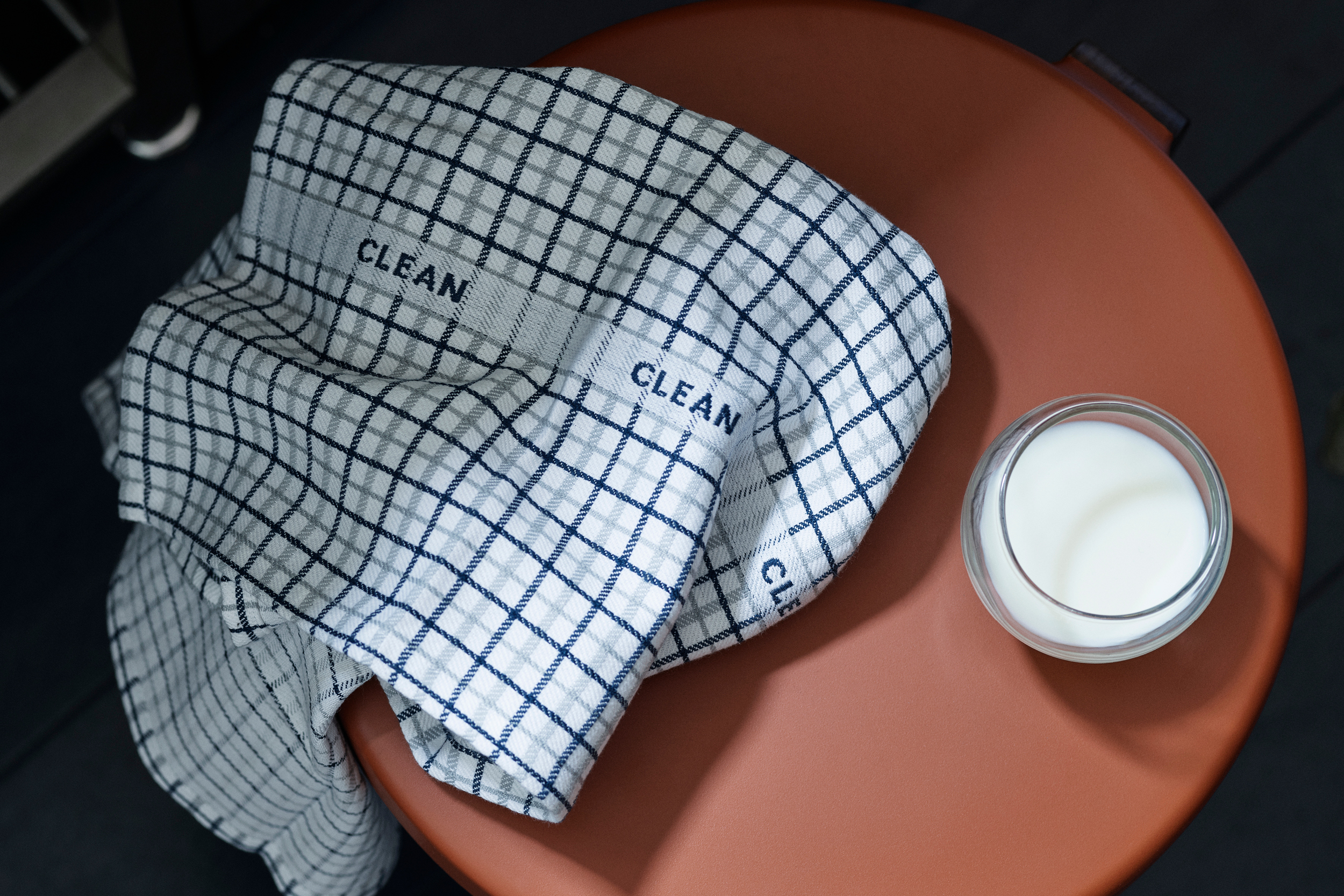
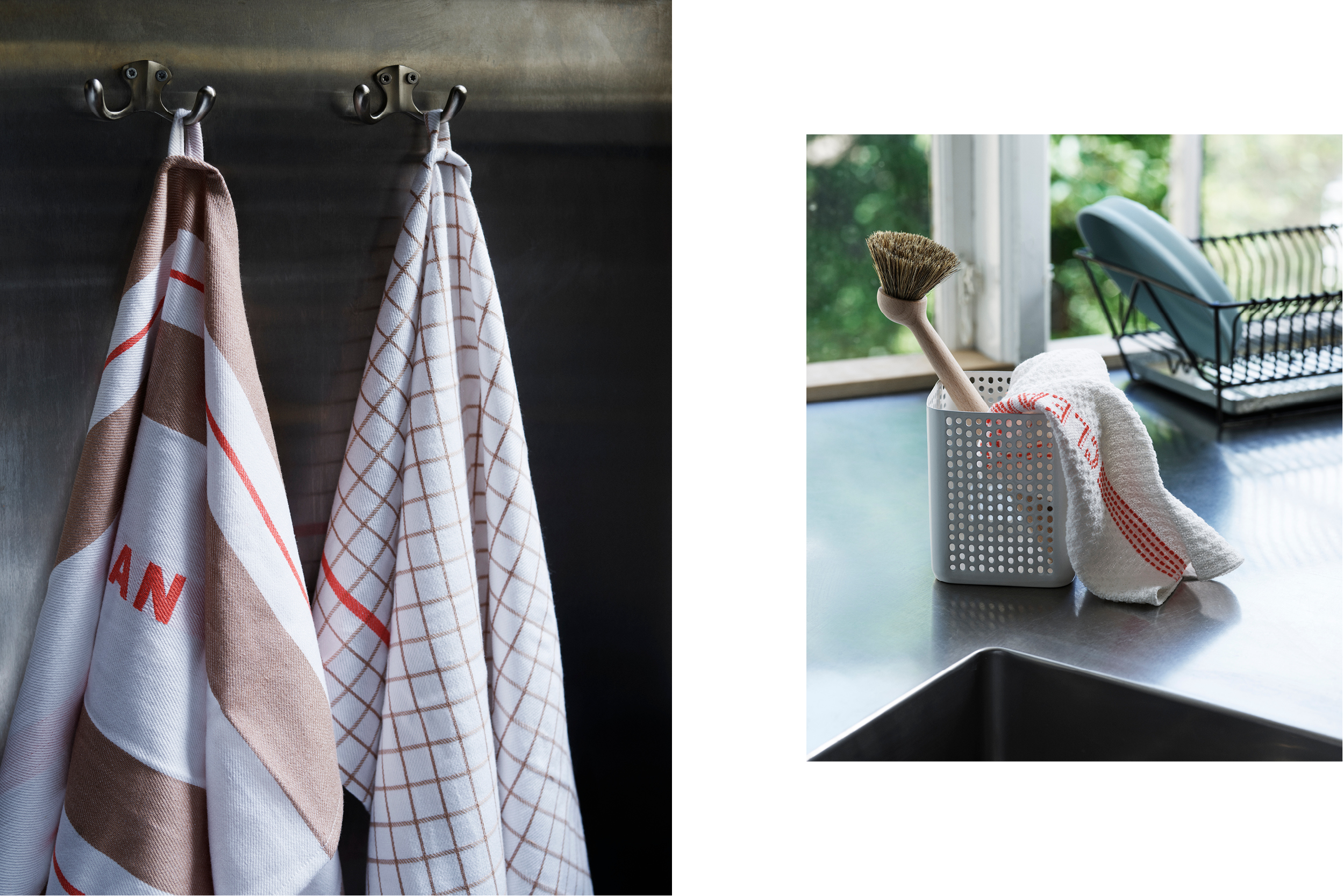
Normann Copenhagen Tea Towel 2019
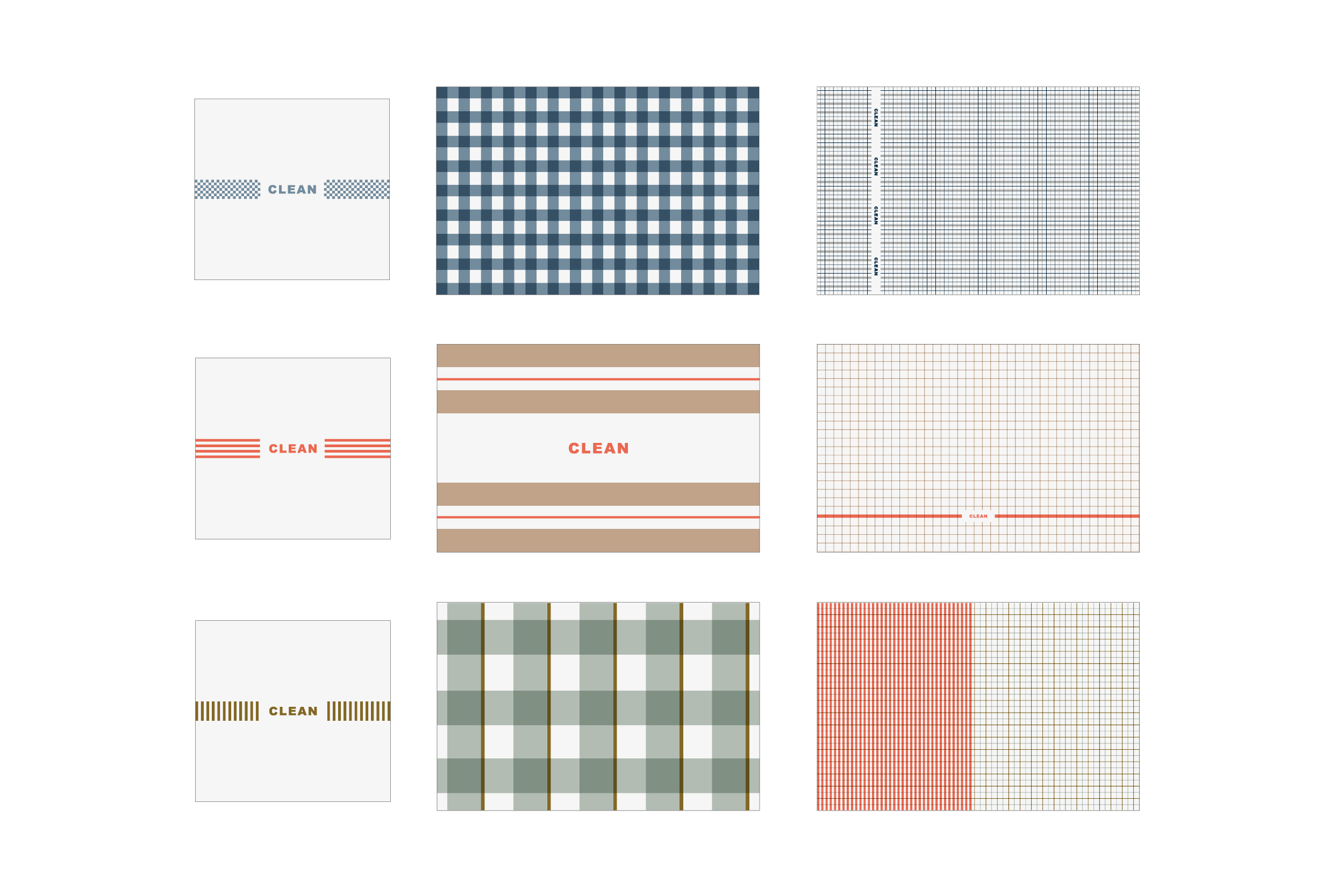
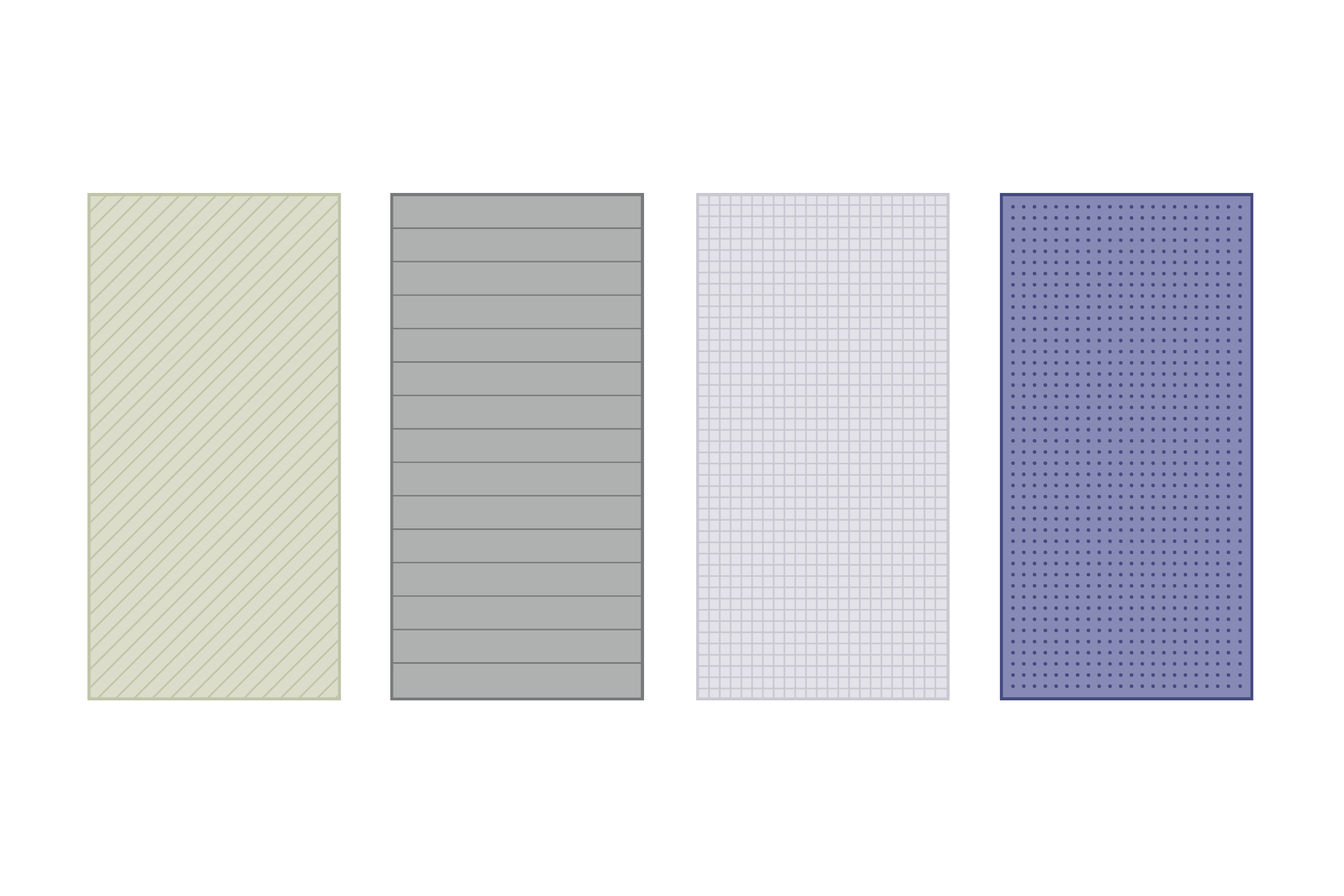
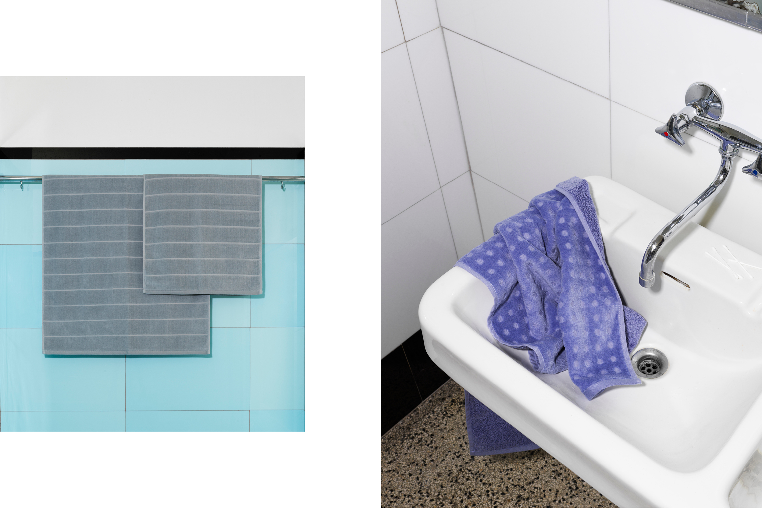
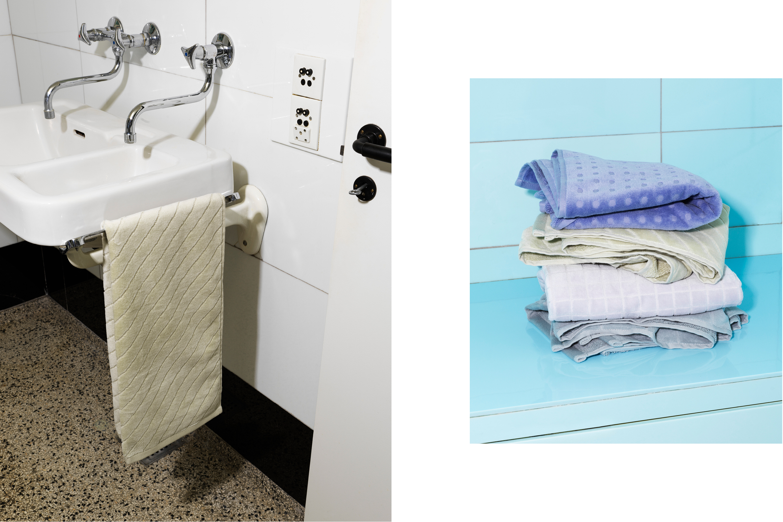
Project:
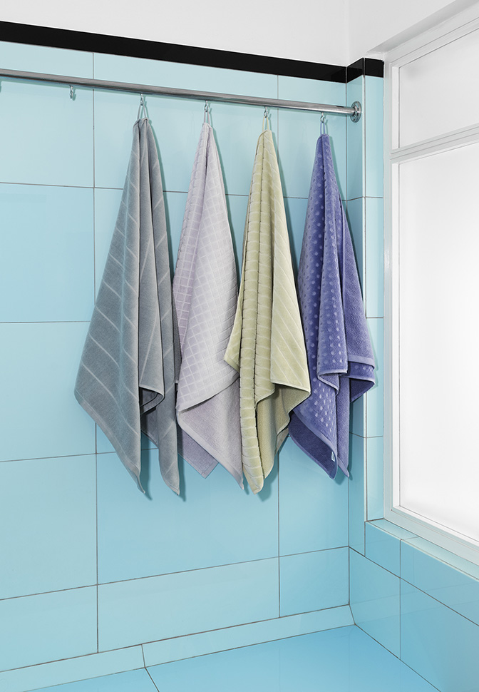
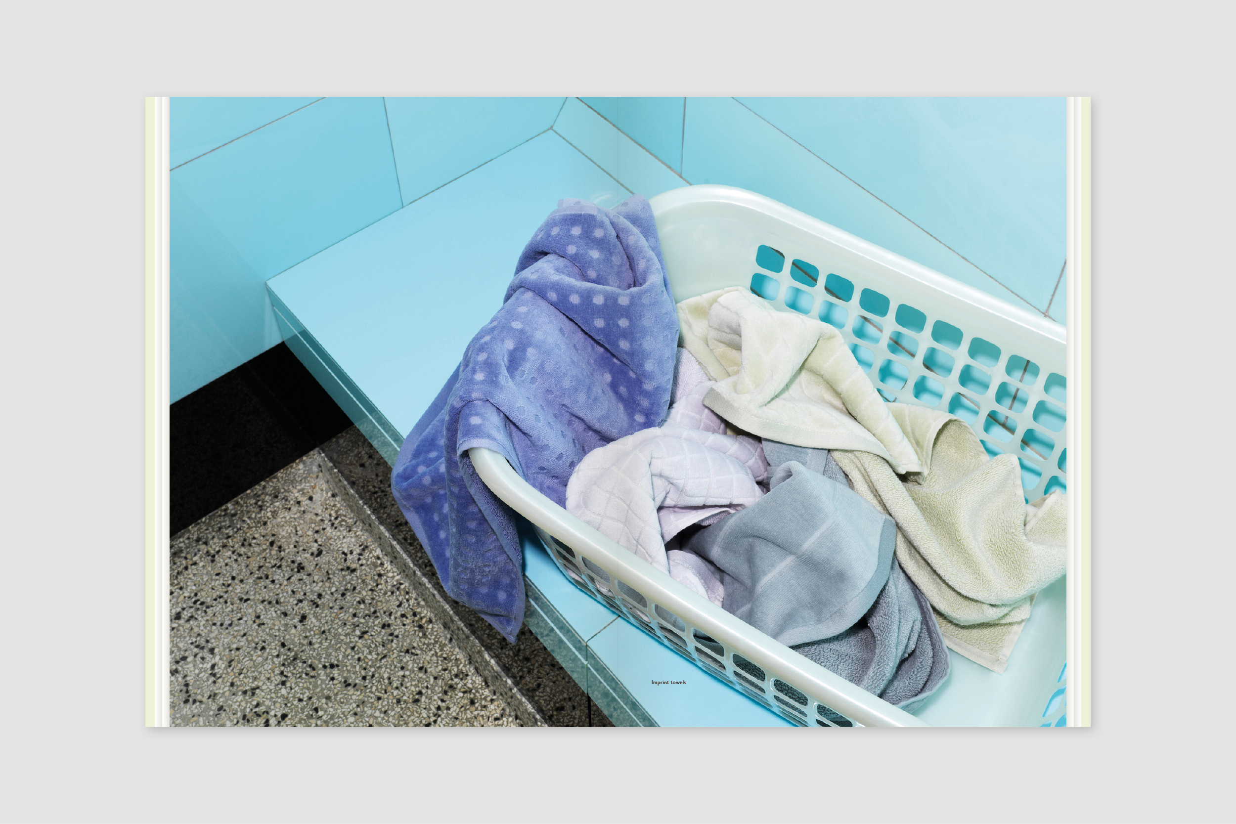
Normann Copenhagen Towel 2019
Project:
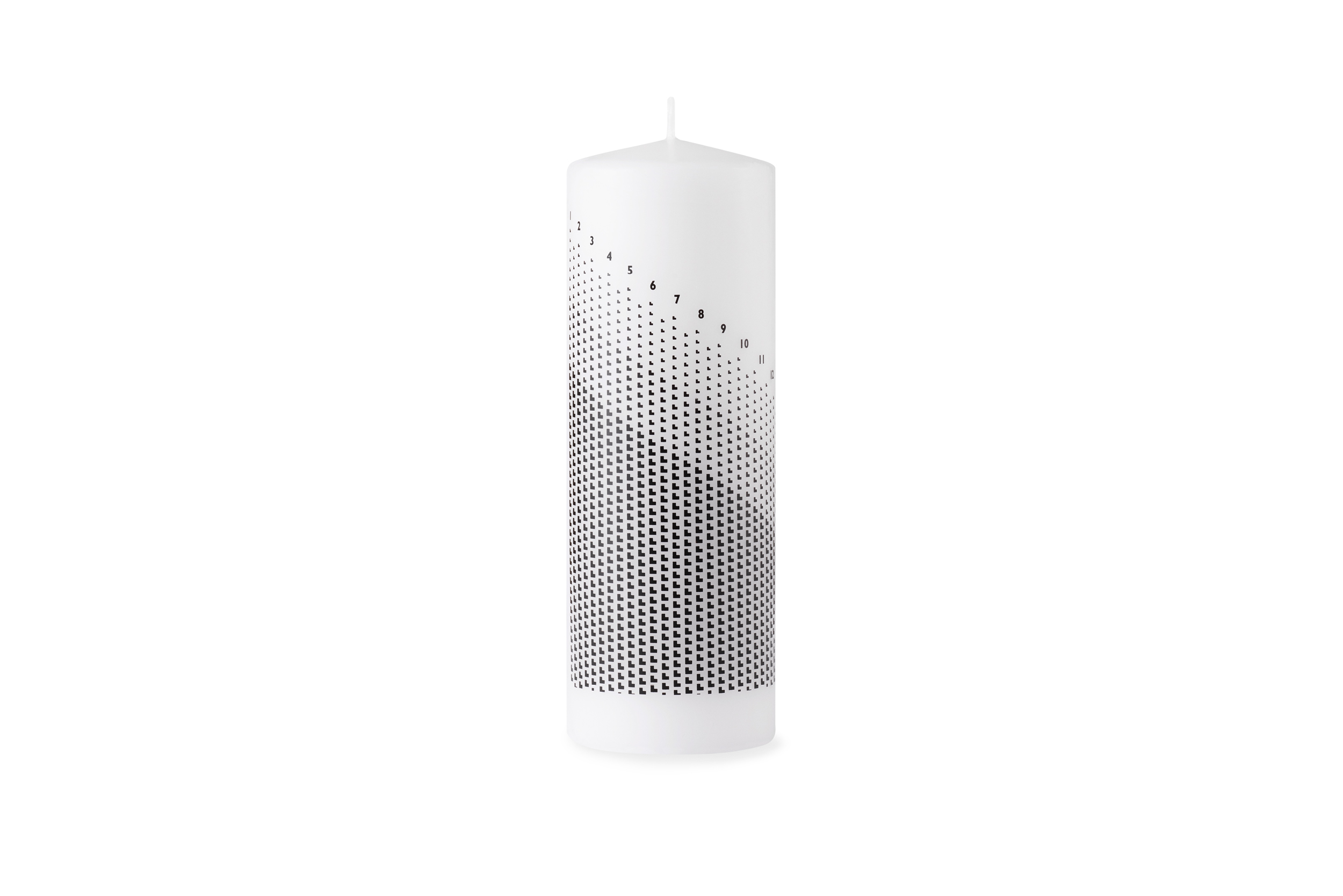
Normann Copenhagen Christmas Candle 2019
Project:
Normann Copenhagen Christmas Cards 2019
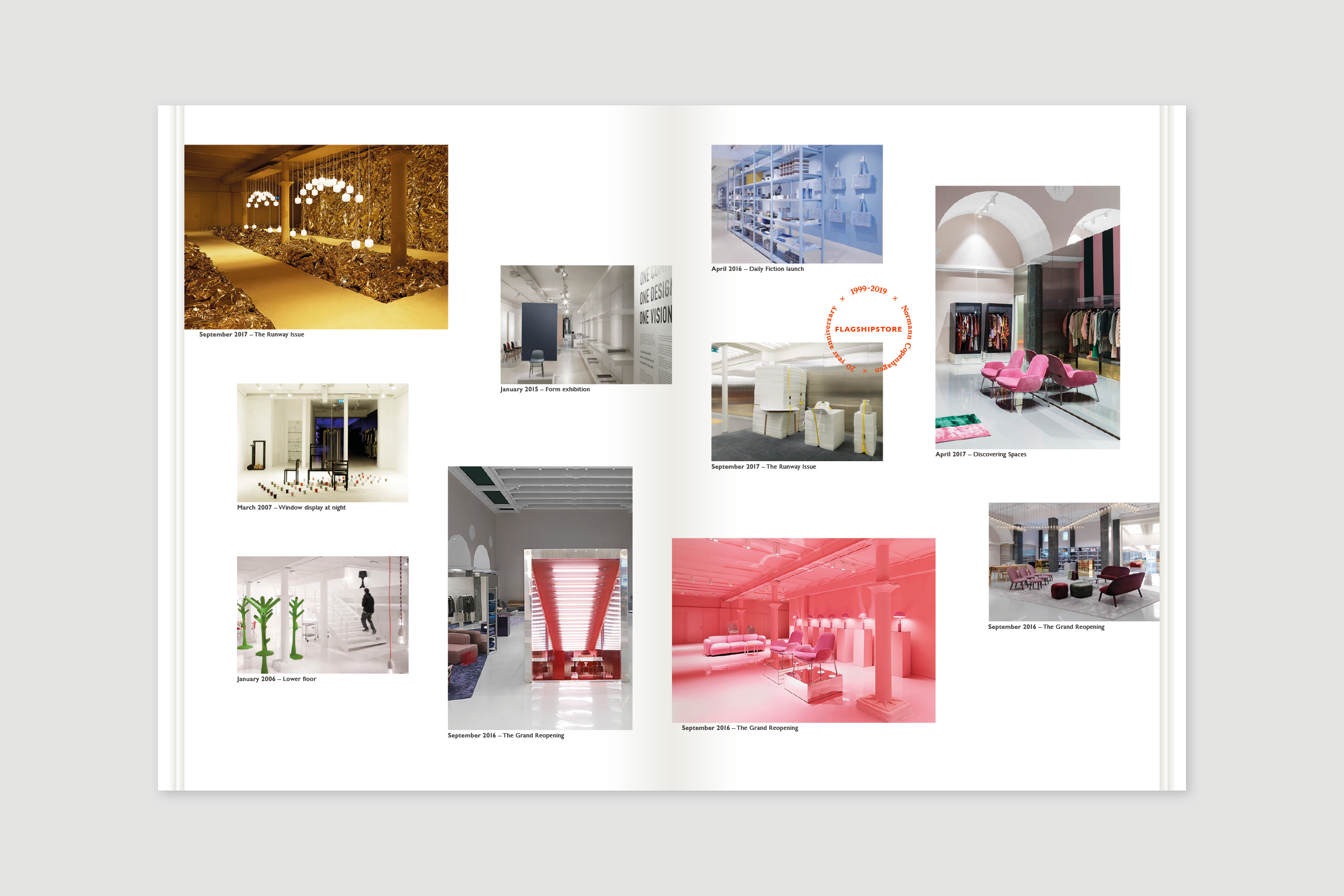
Project:
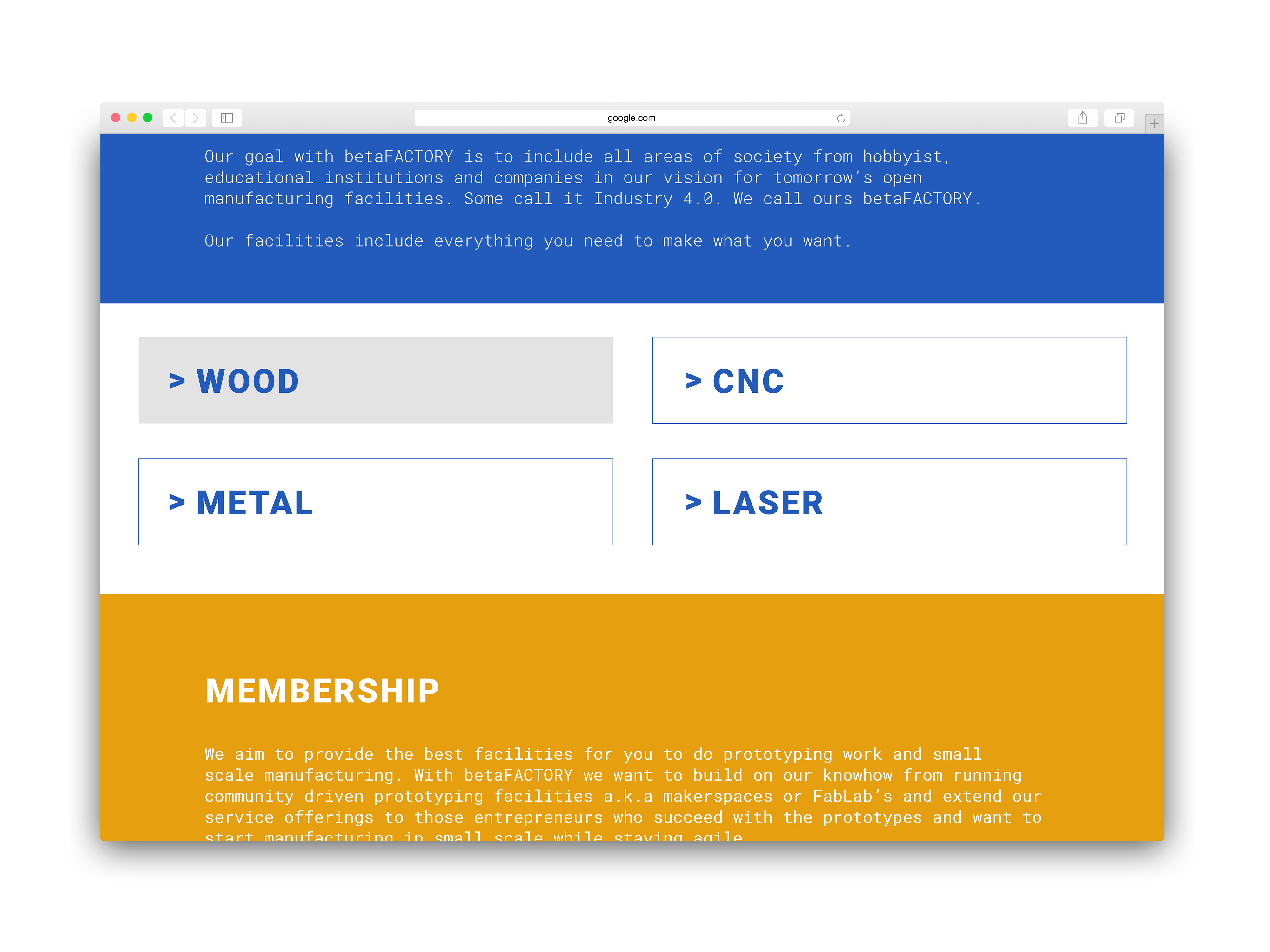
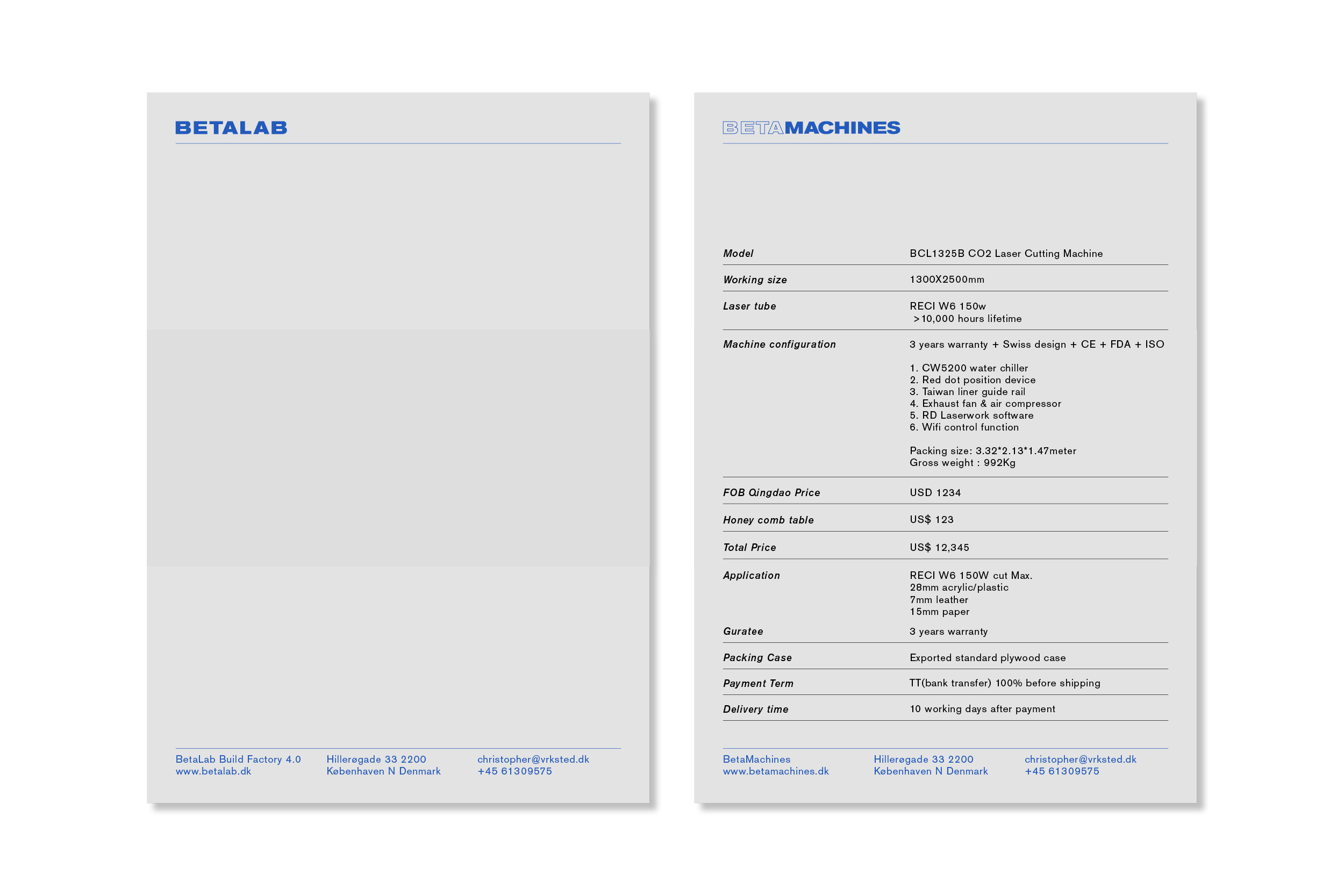
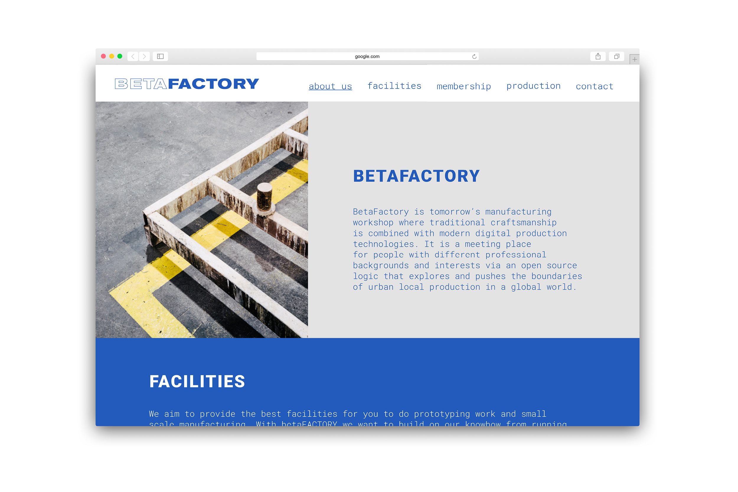
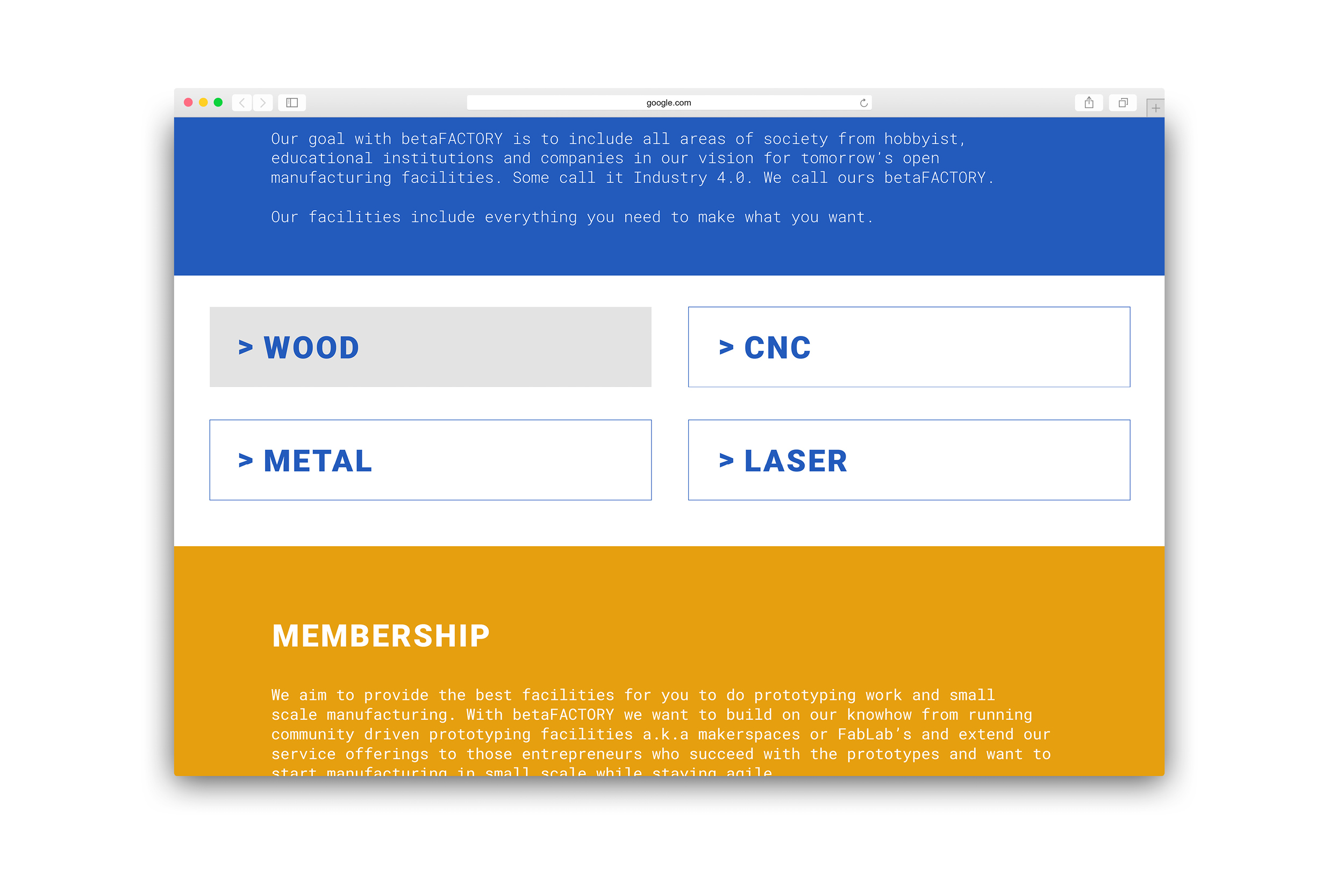
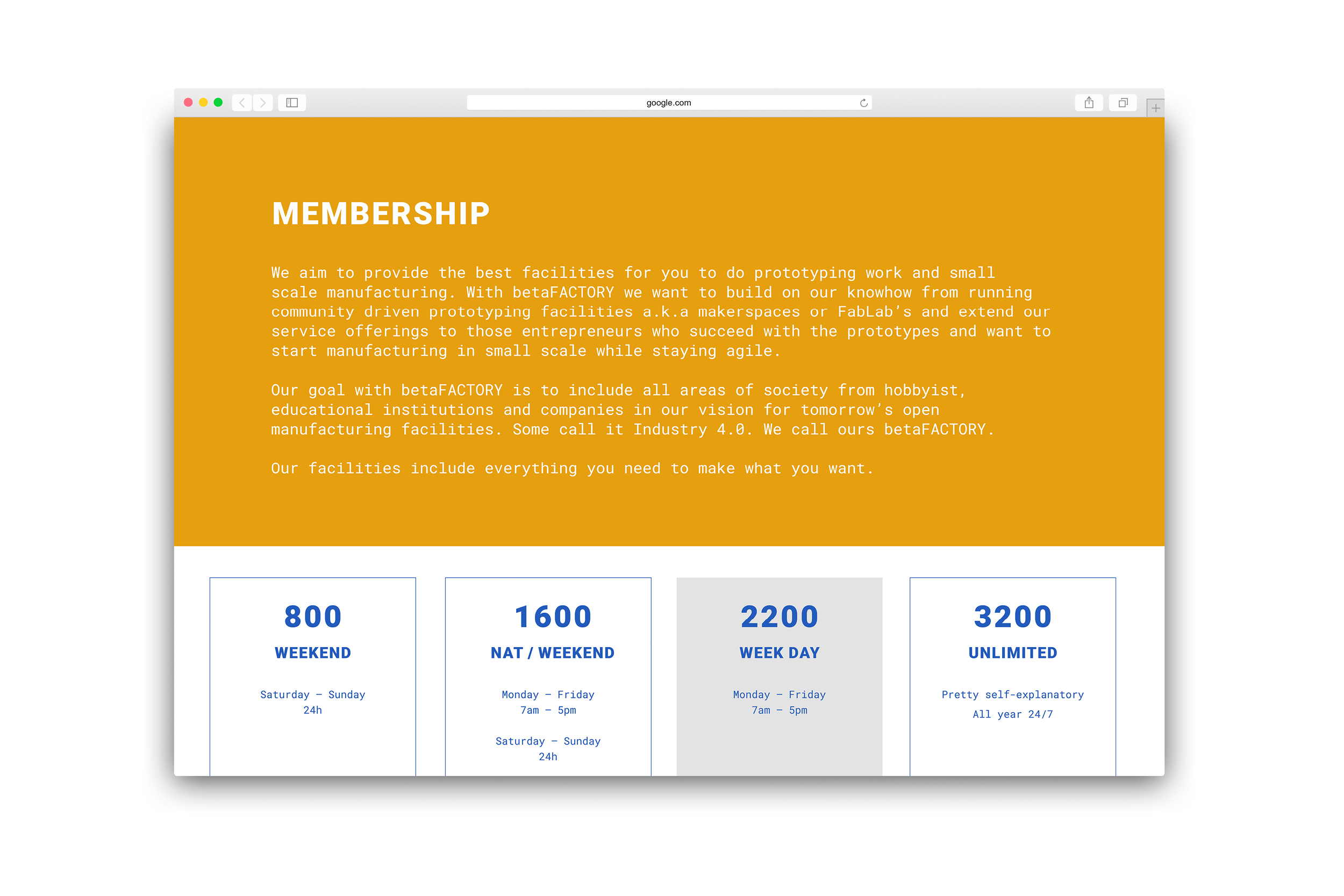
Betalab - BetaFactory 2018
Project:
Asano Nielsen Design 2017
Project:
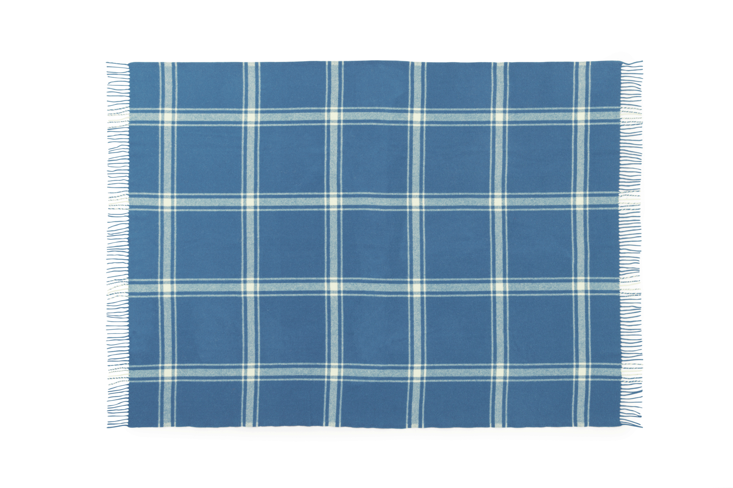
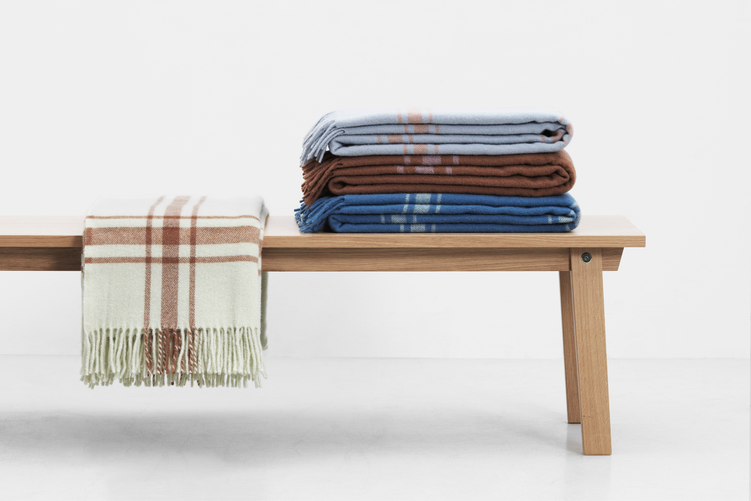
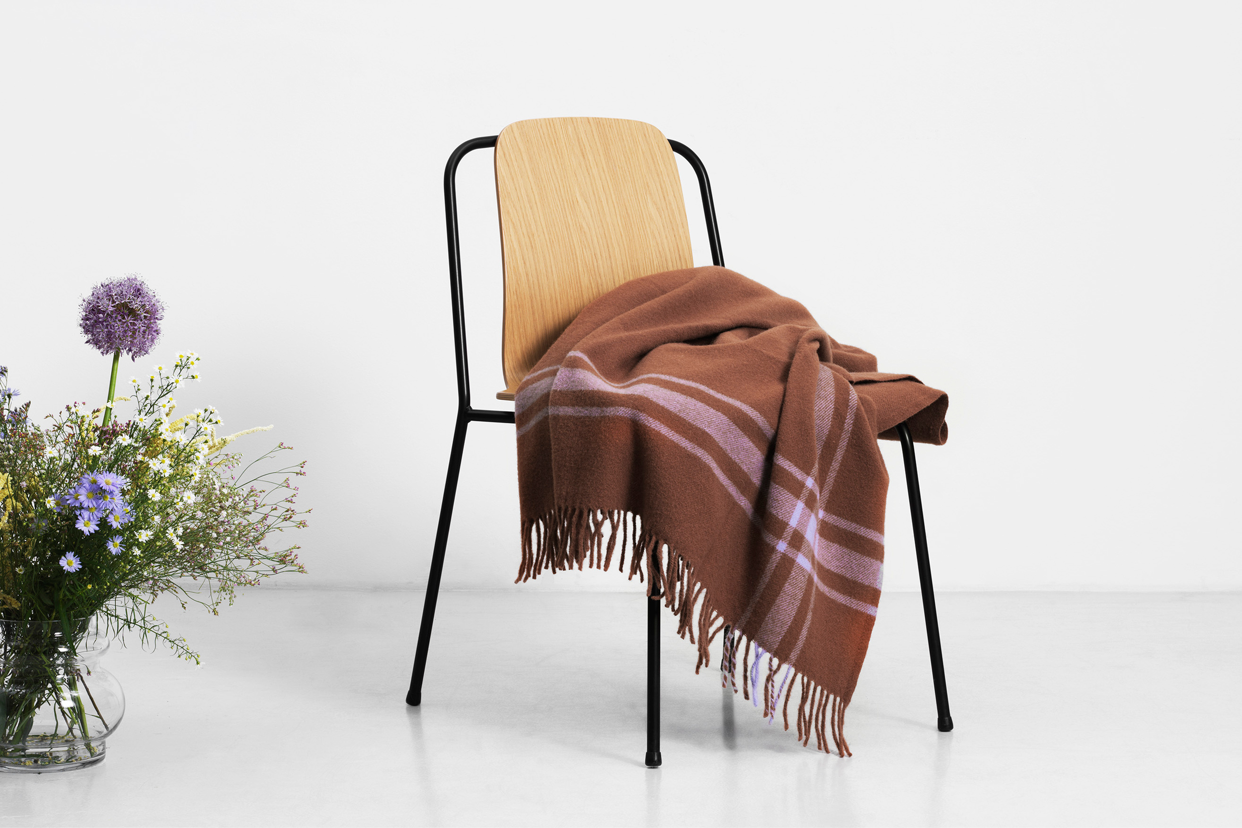
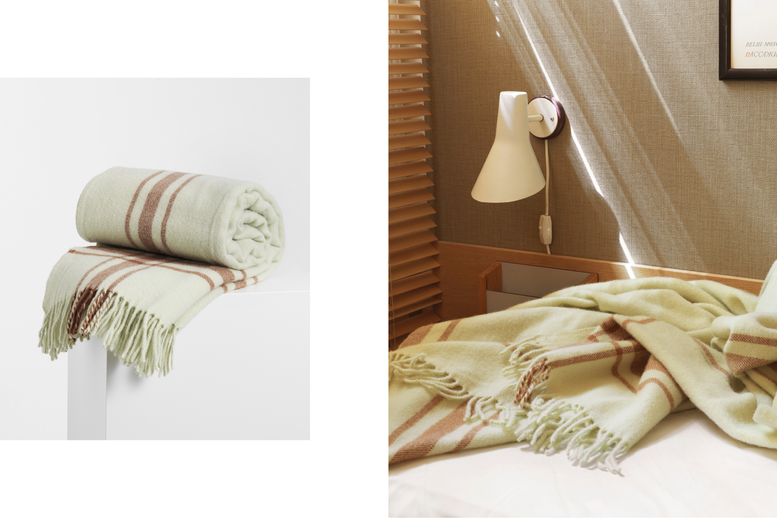
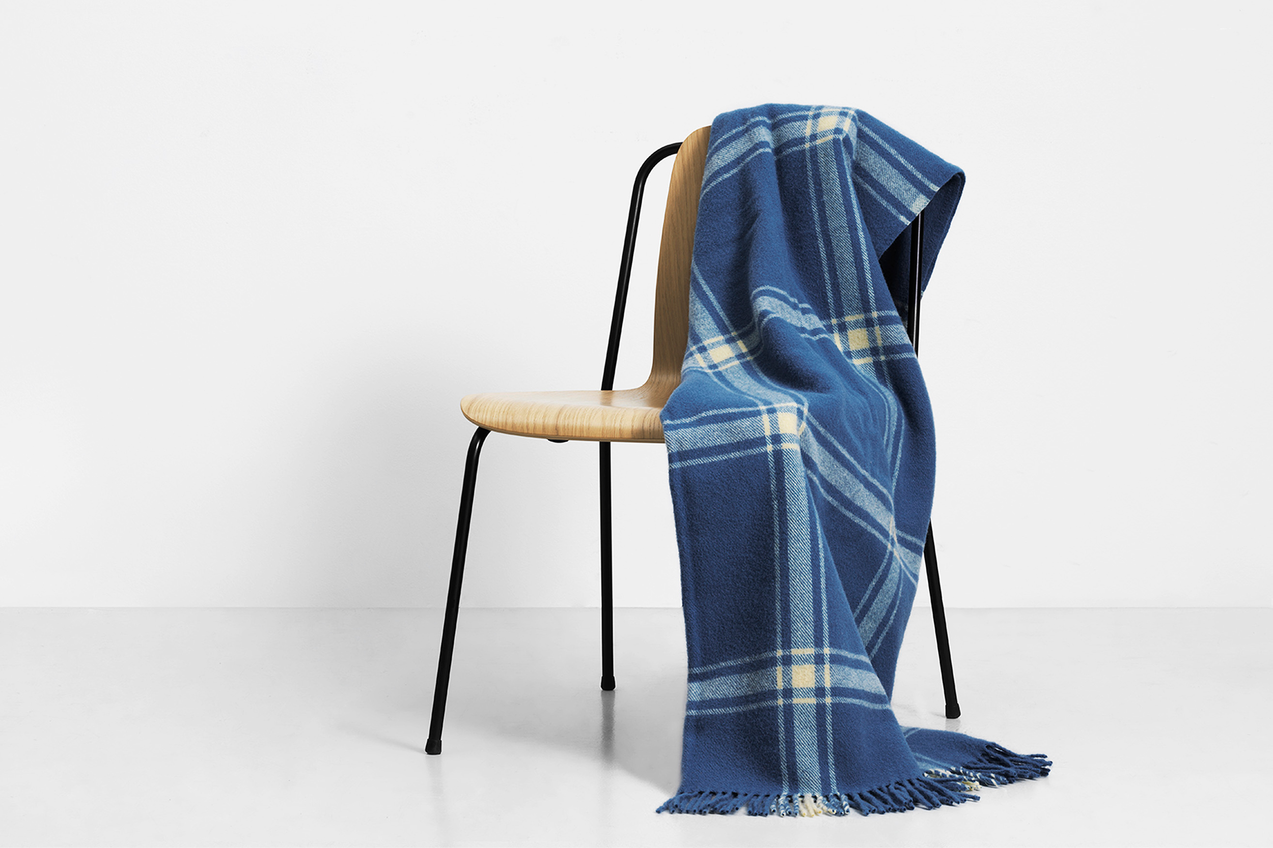
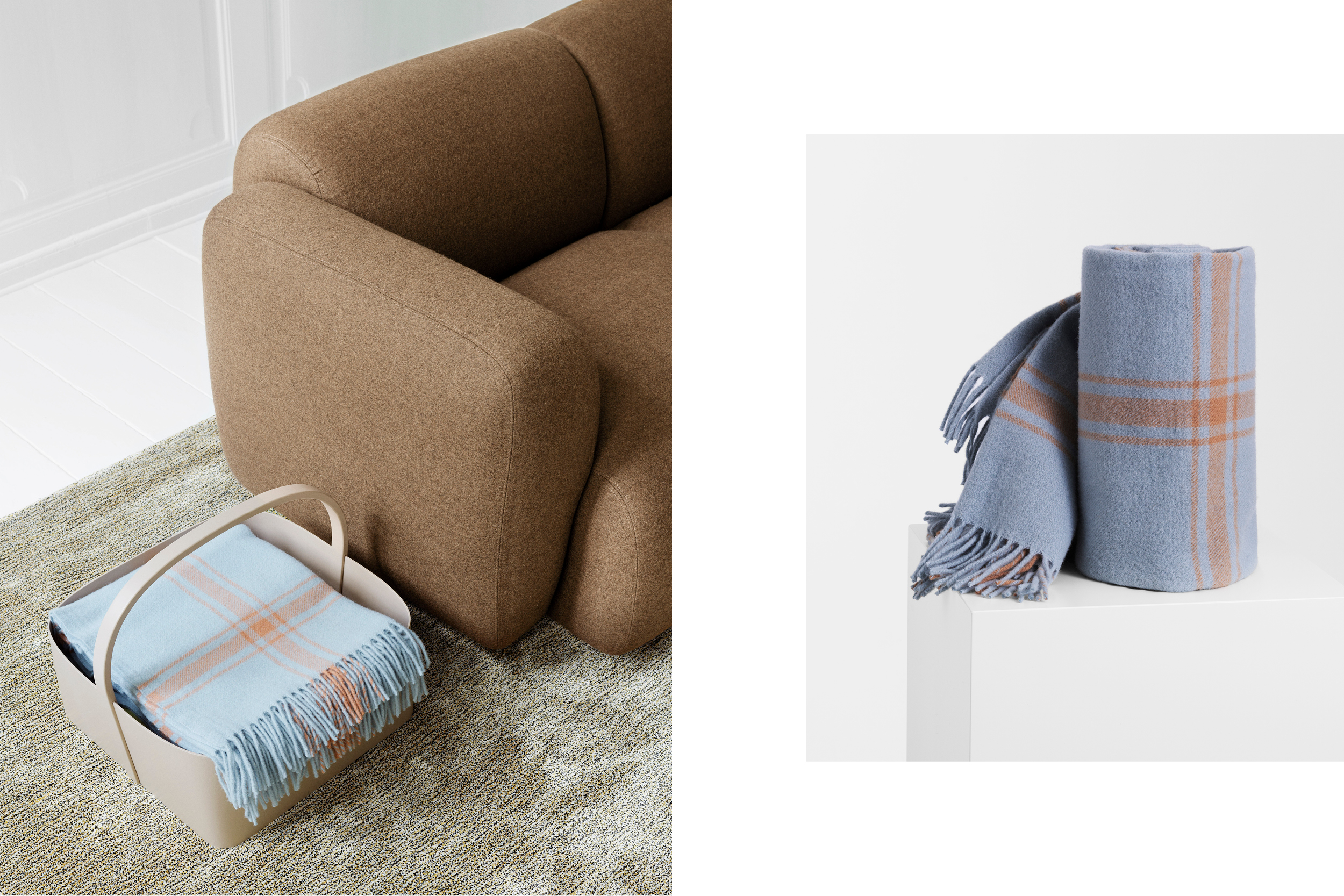
Normann Copenhagen Throw Blanket 2019
Project:
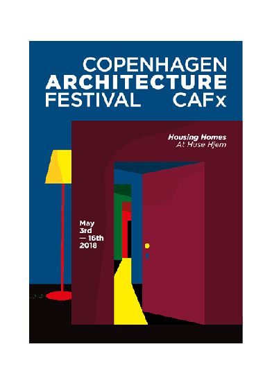
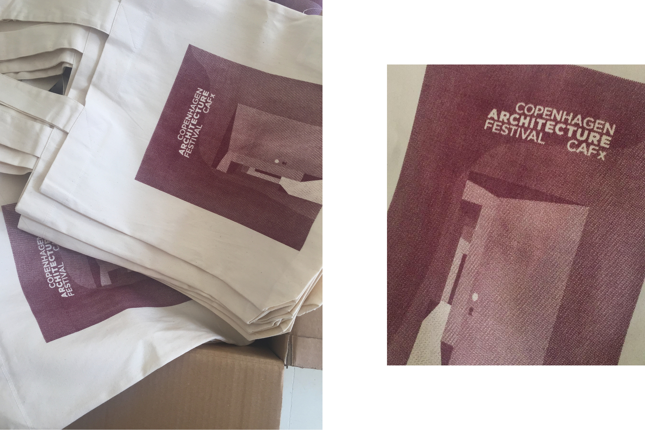
Copenhagen Architecture Festival 2018
Project:
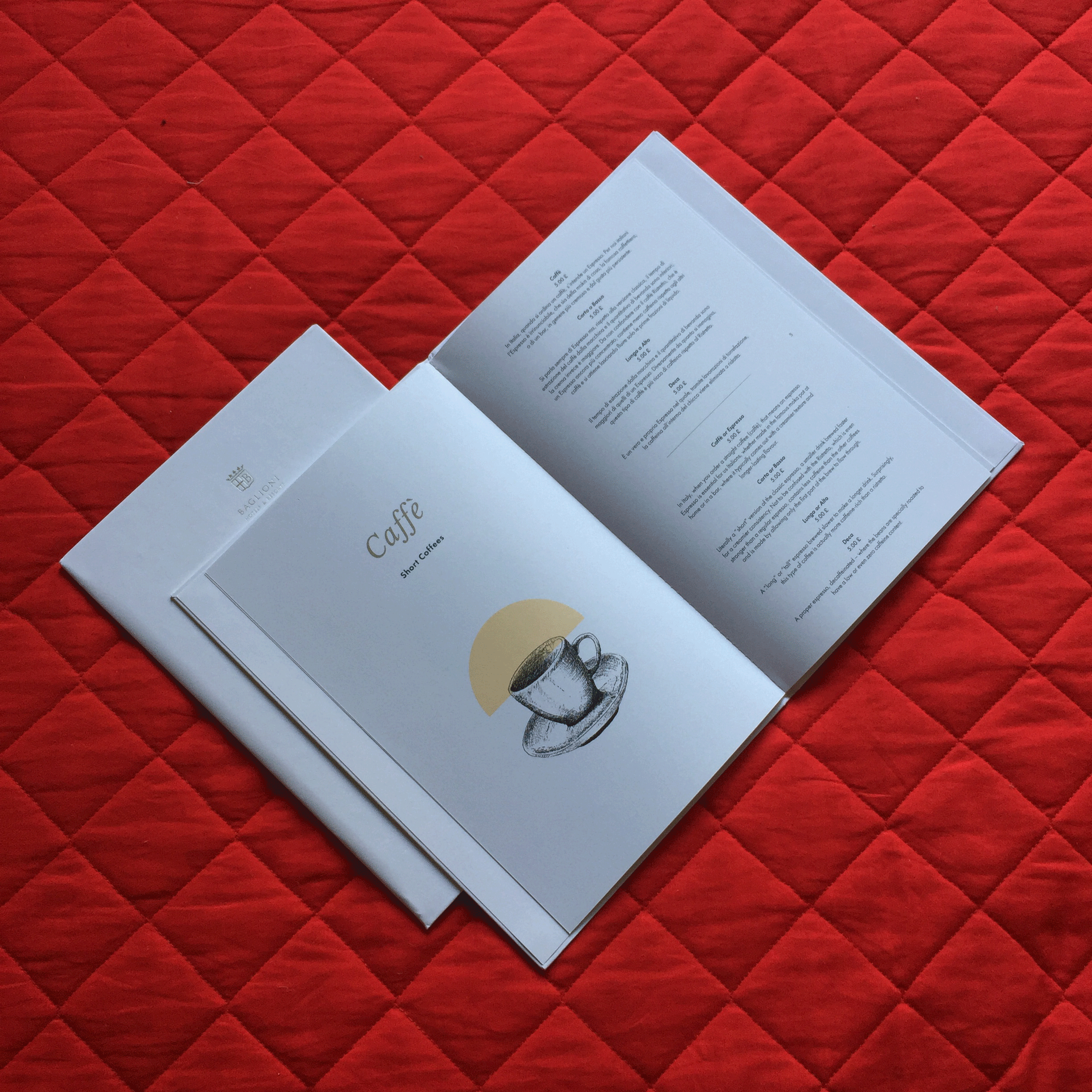
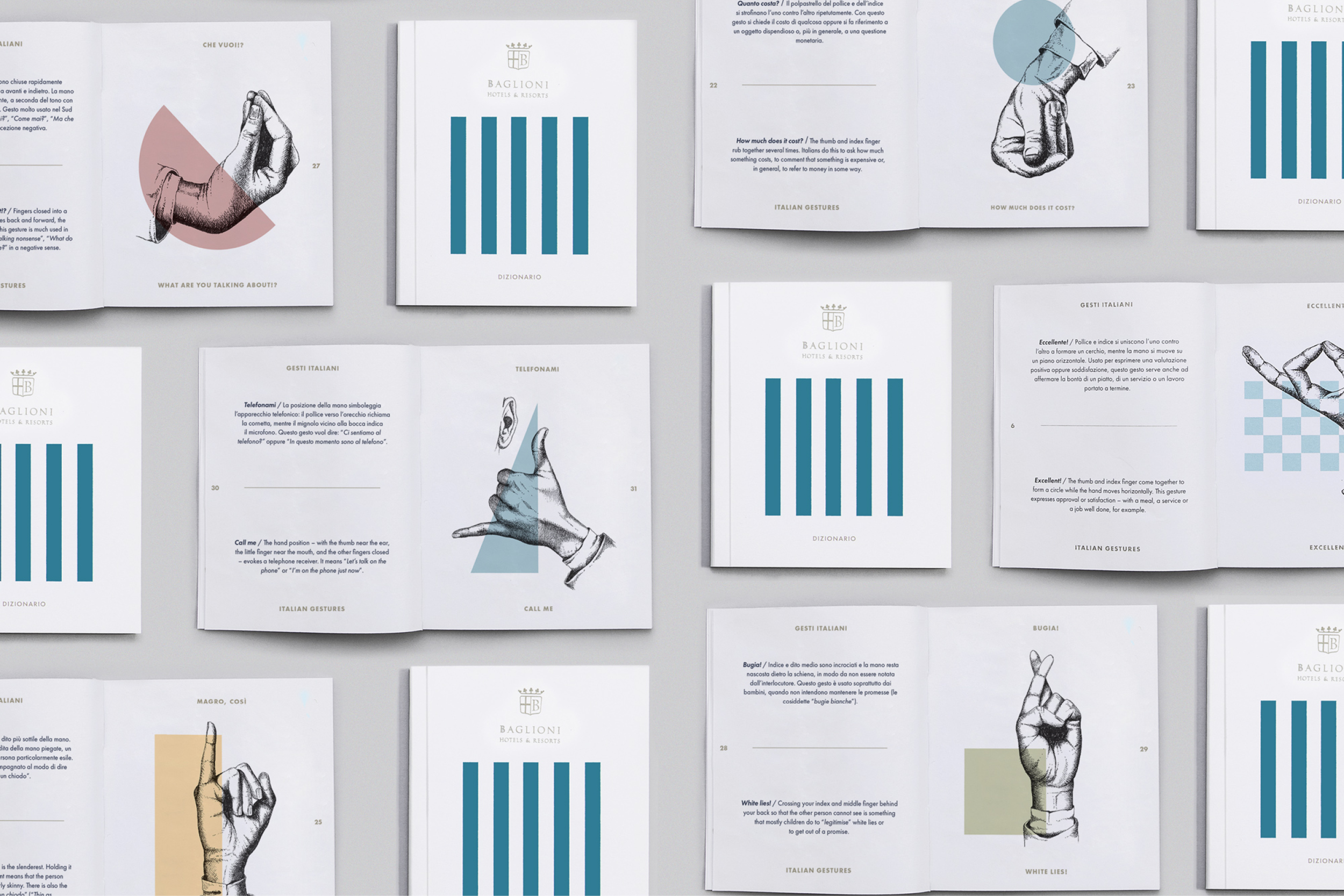
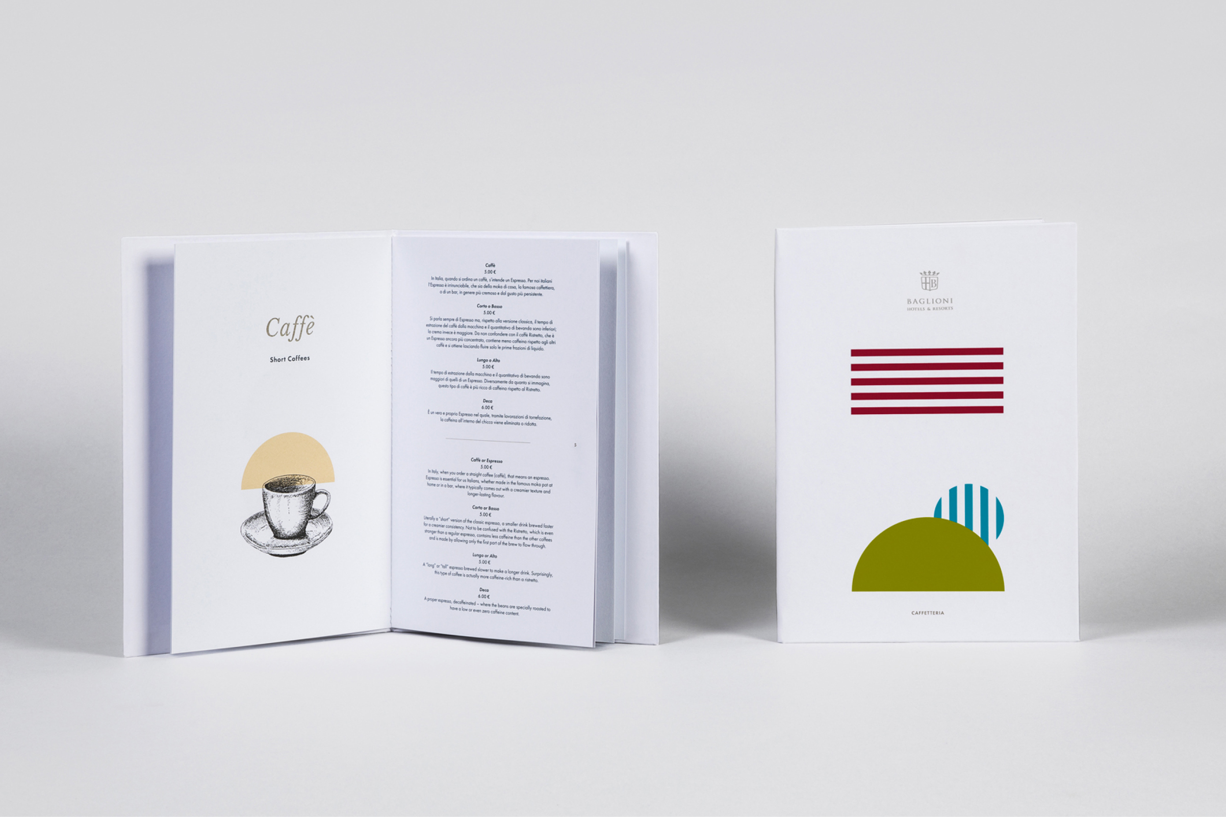
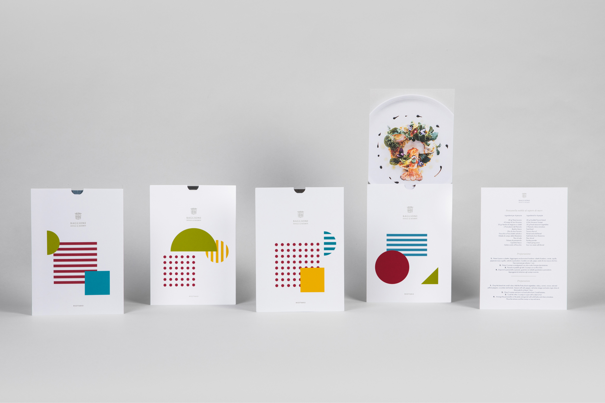
Baglioni Hotels 2018
Project:
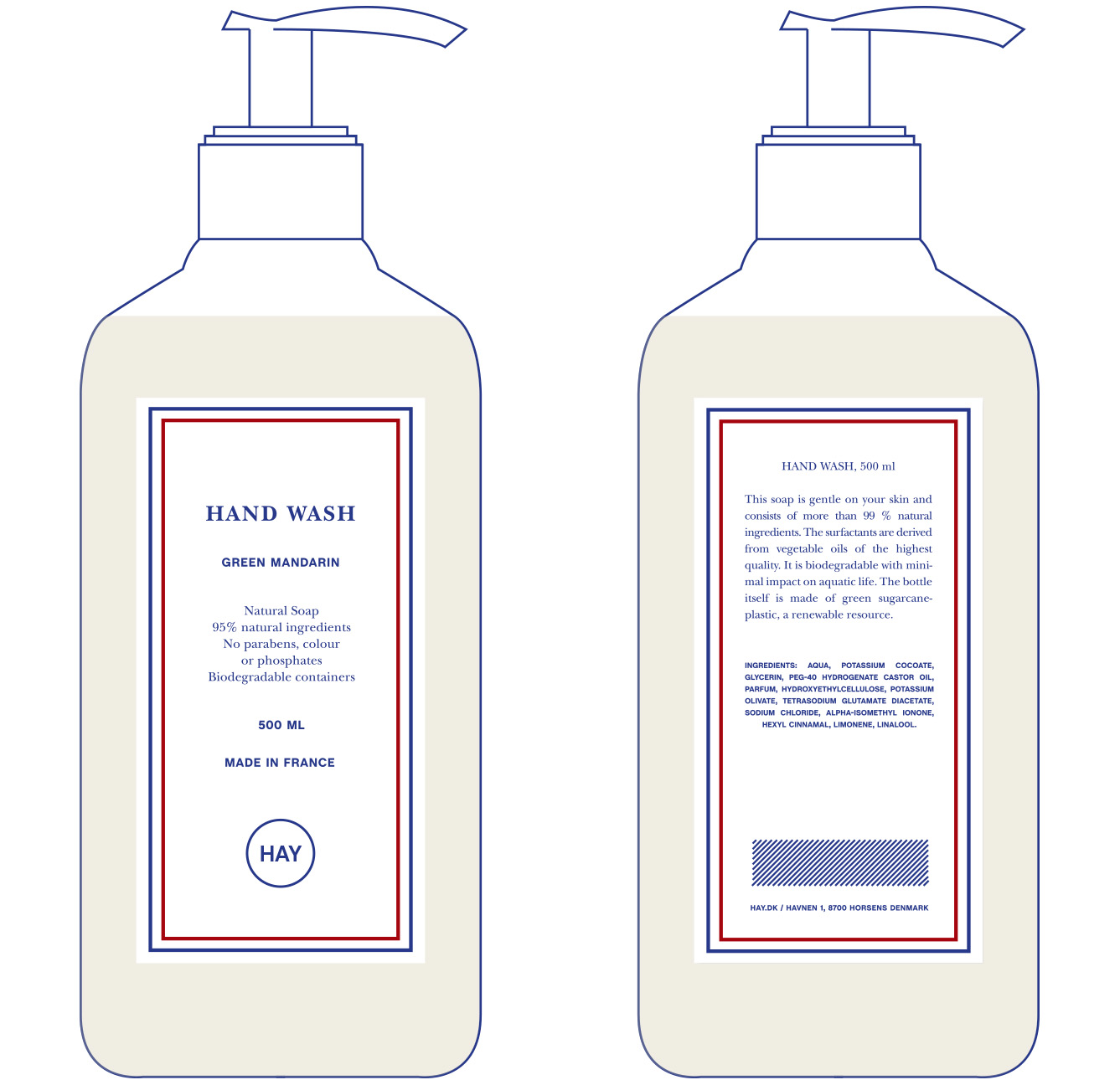
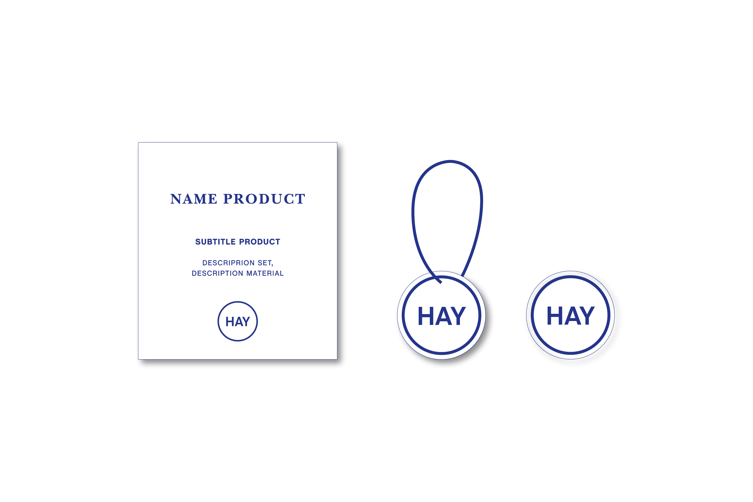
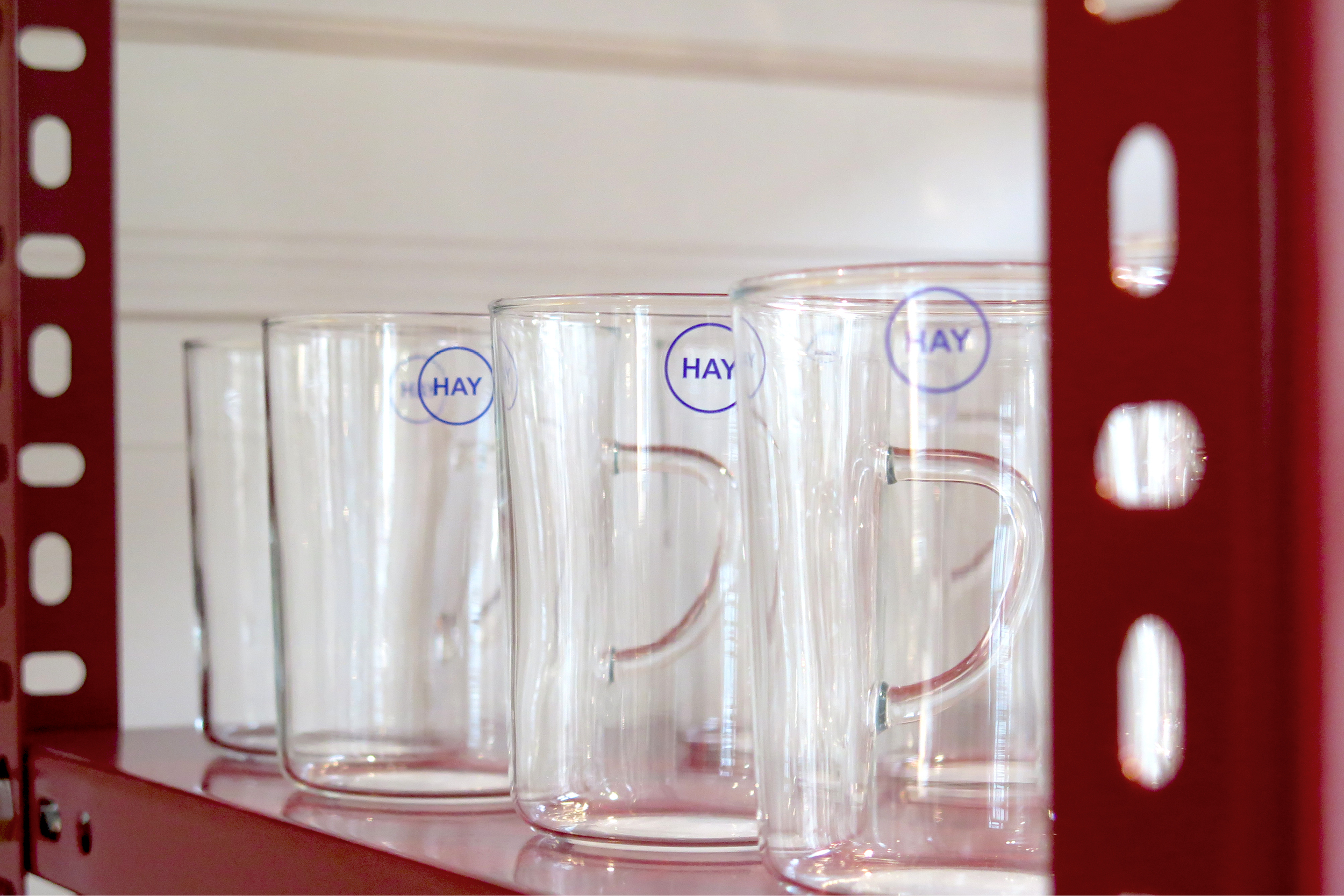
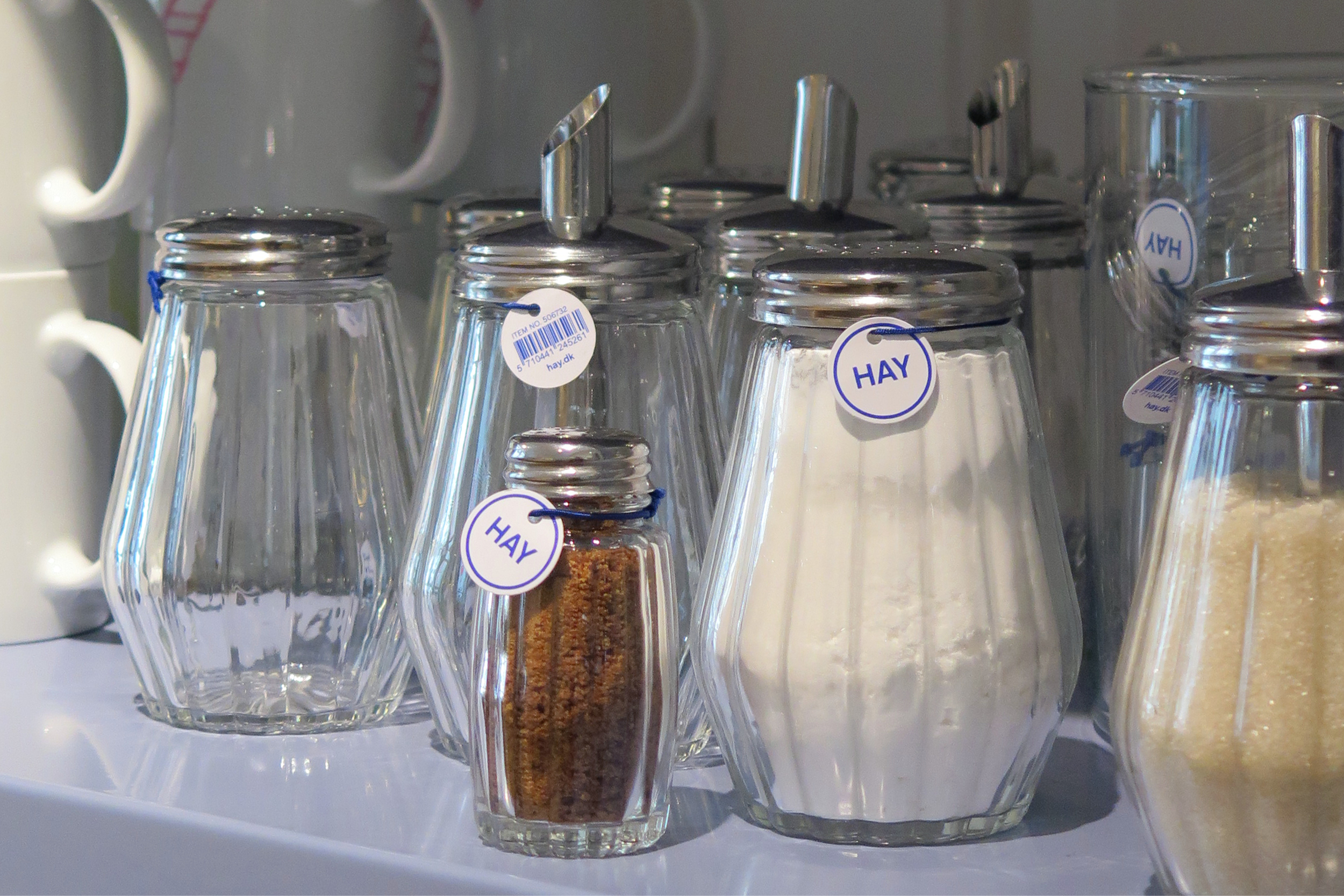
HAY Kitchen Market 2017
Project:
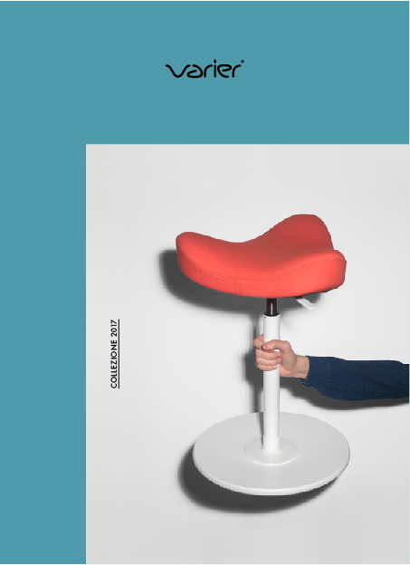
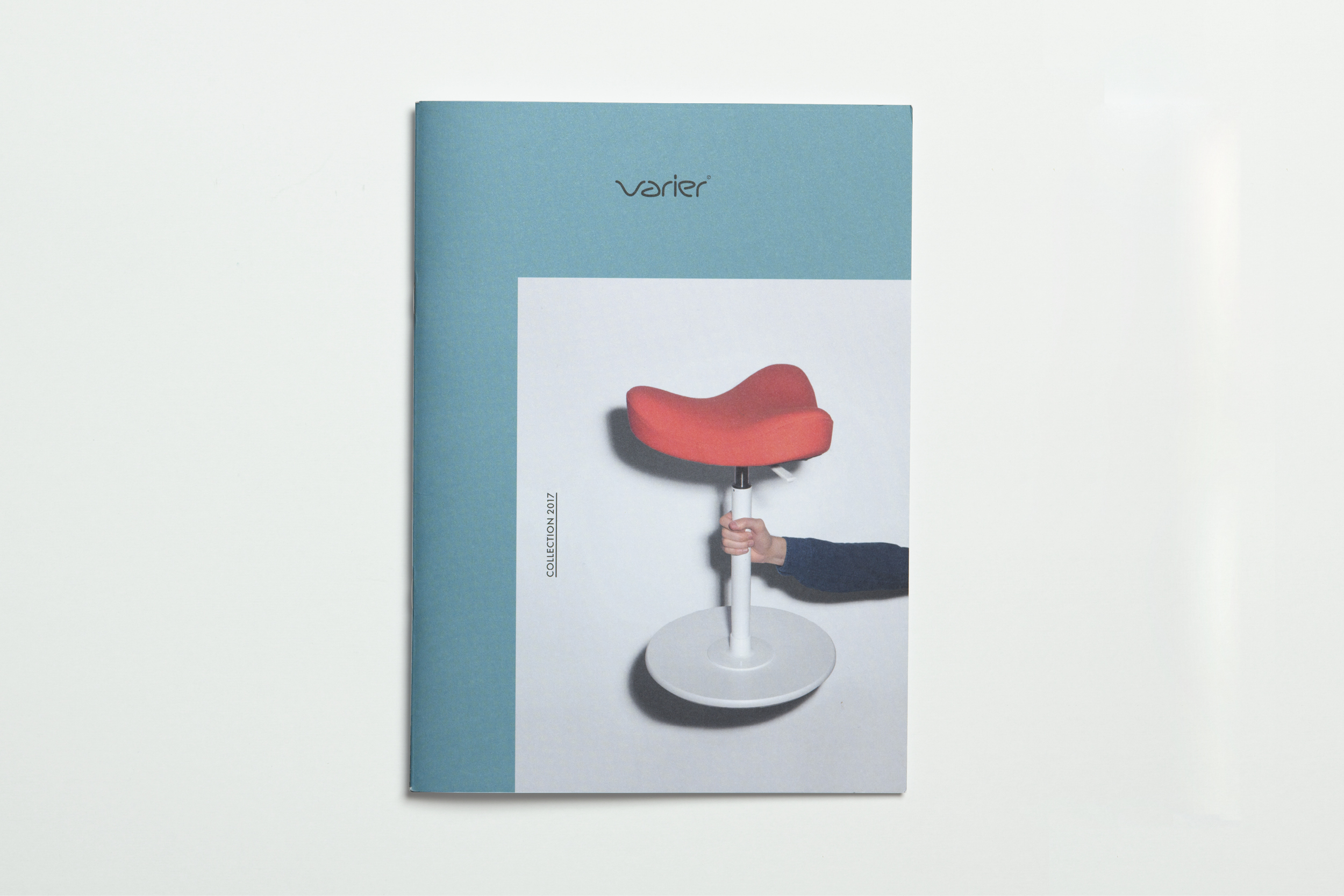
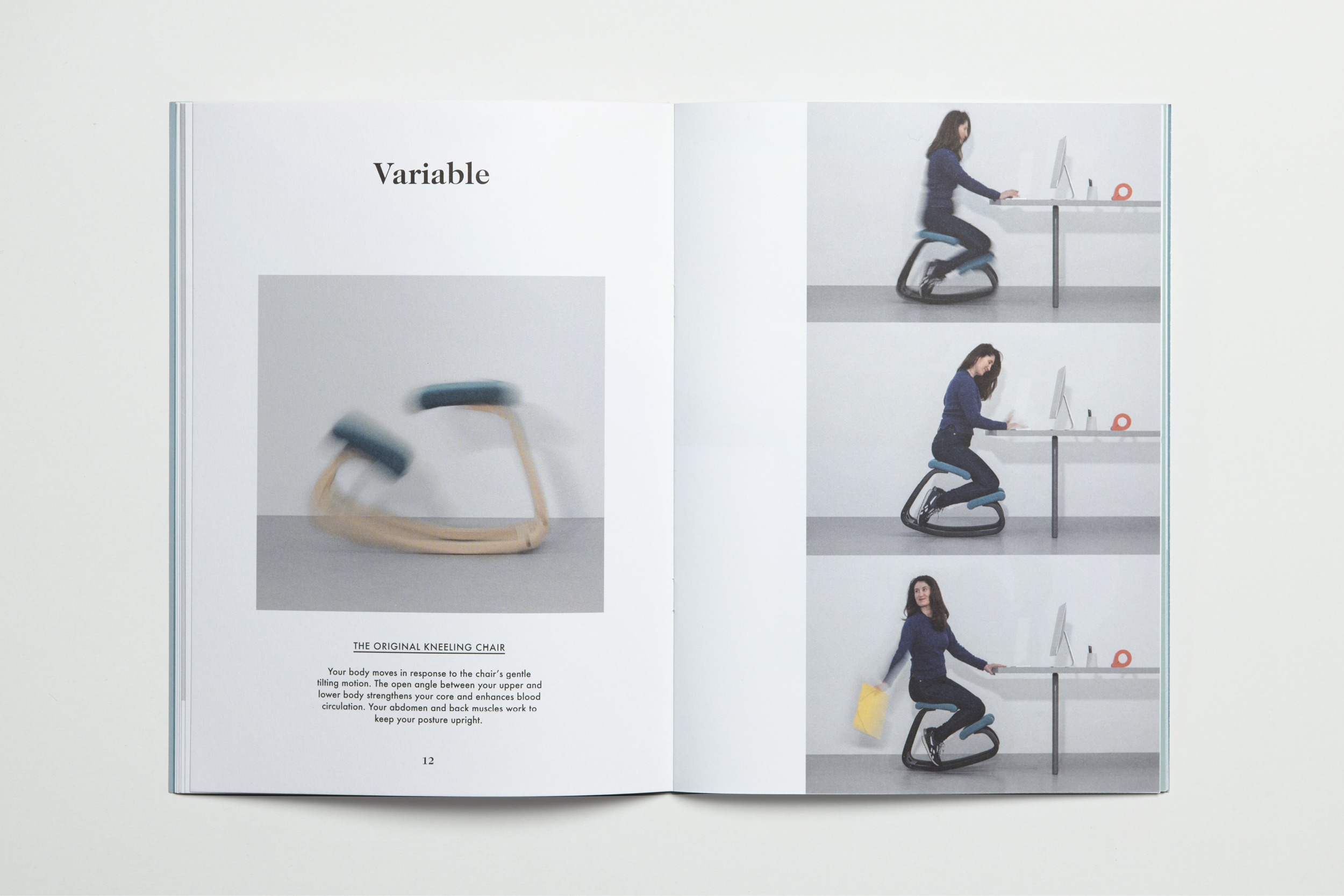
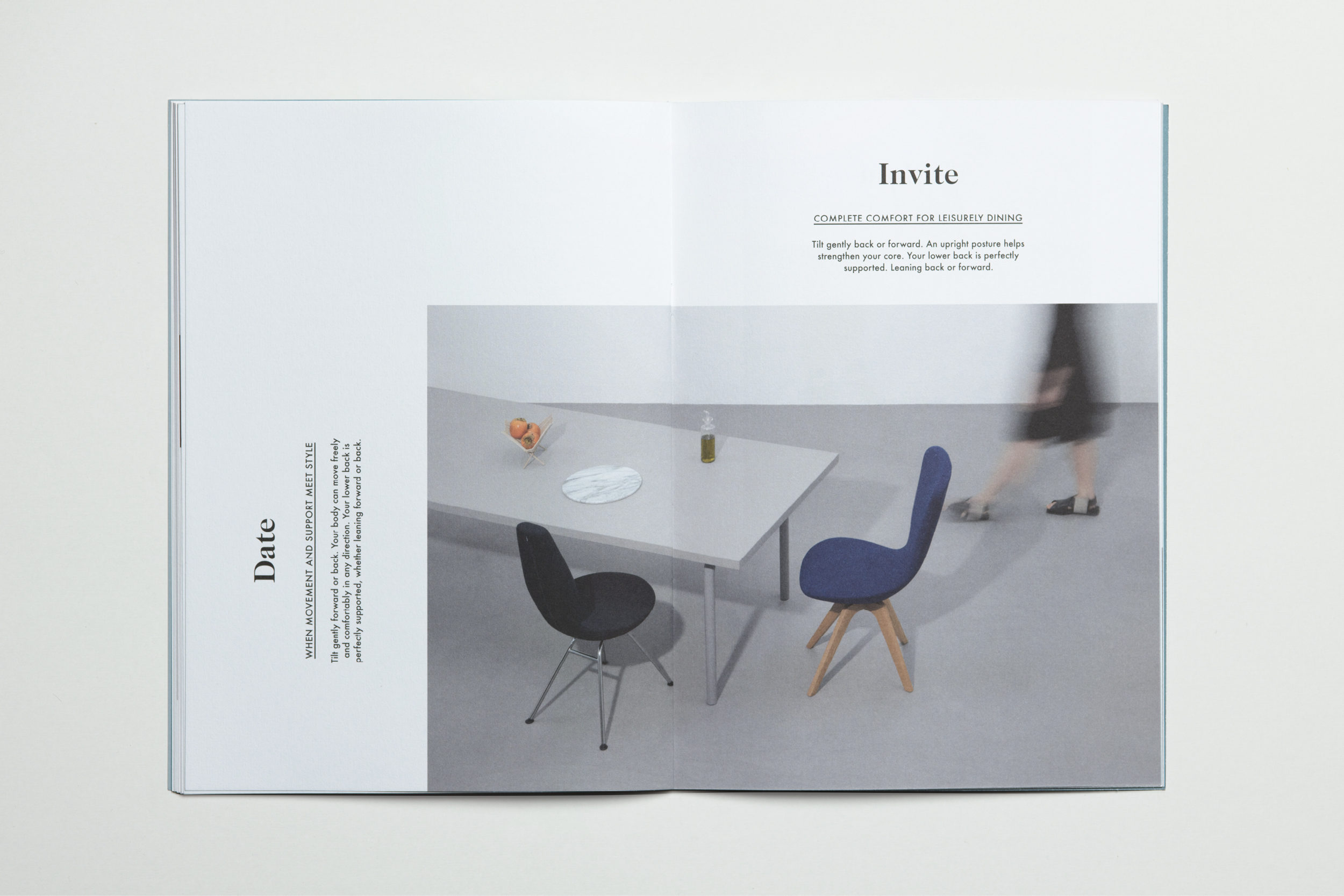
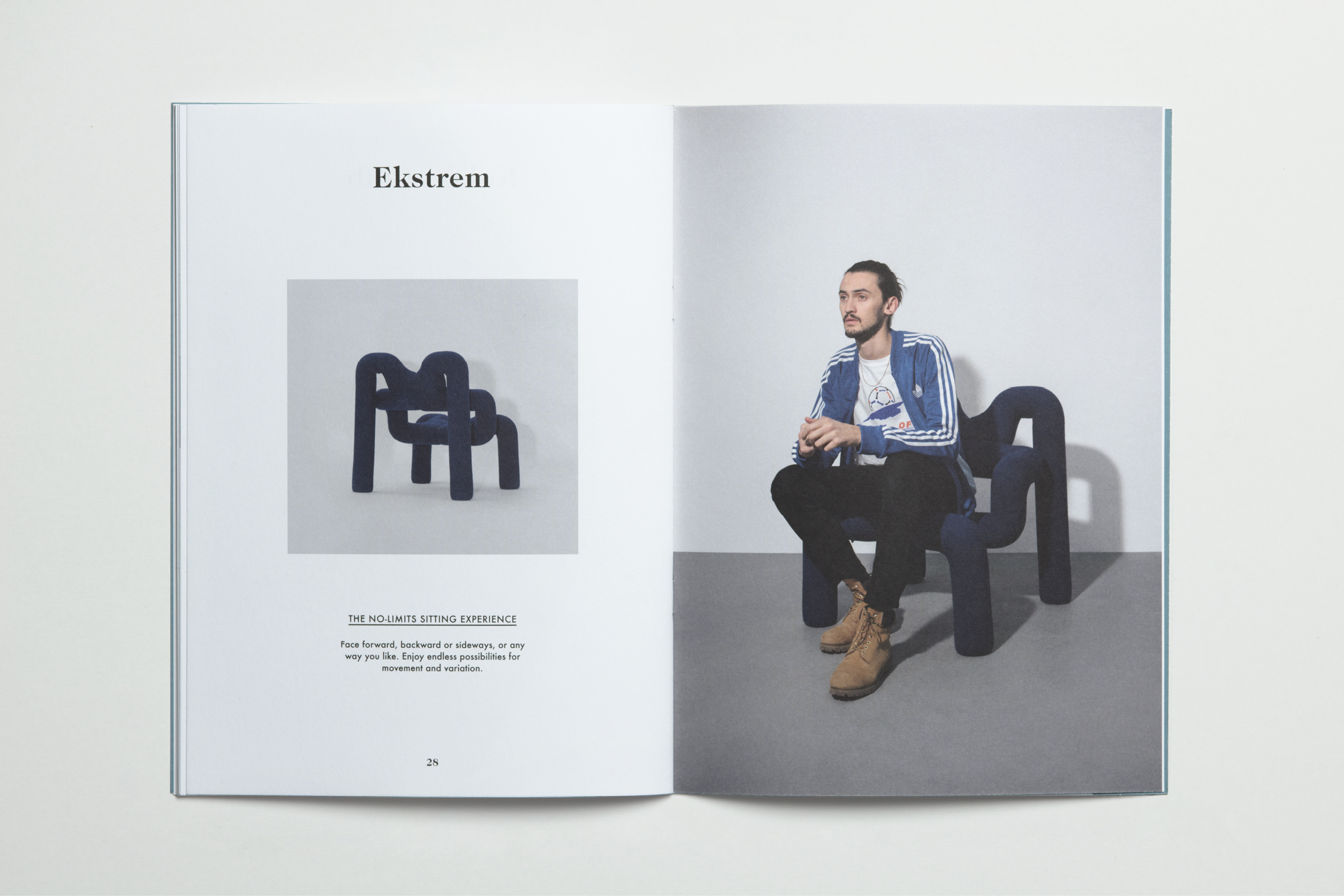
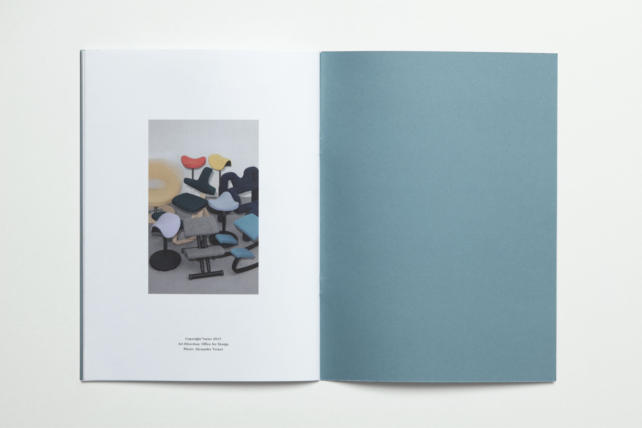
Varier Catalog 2017
Project:
Milano 4 You 2016
Project:
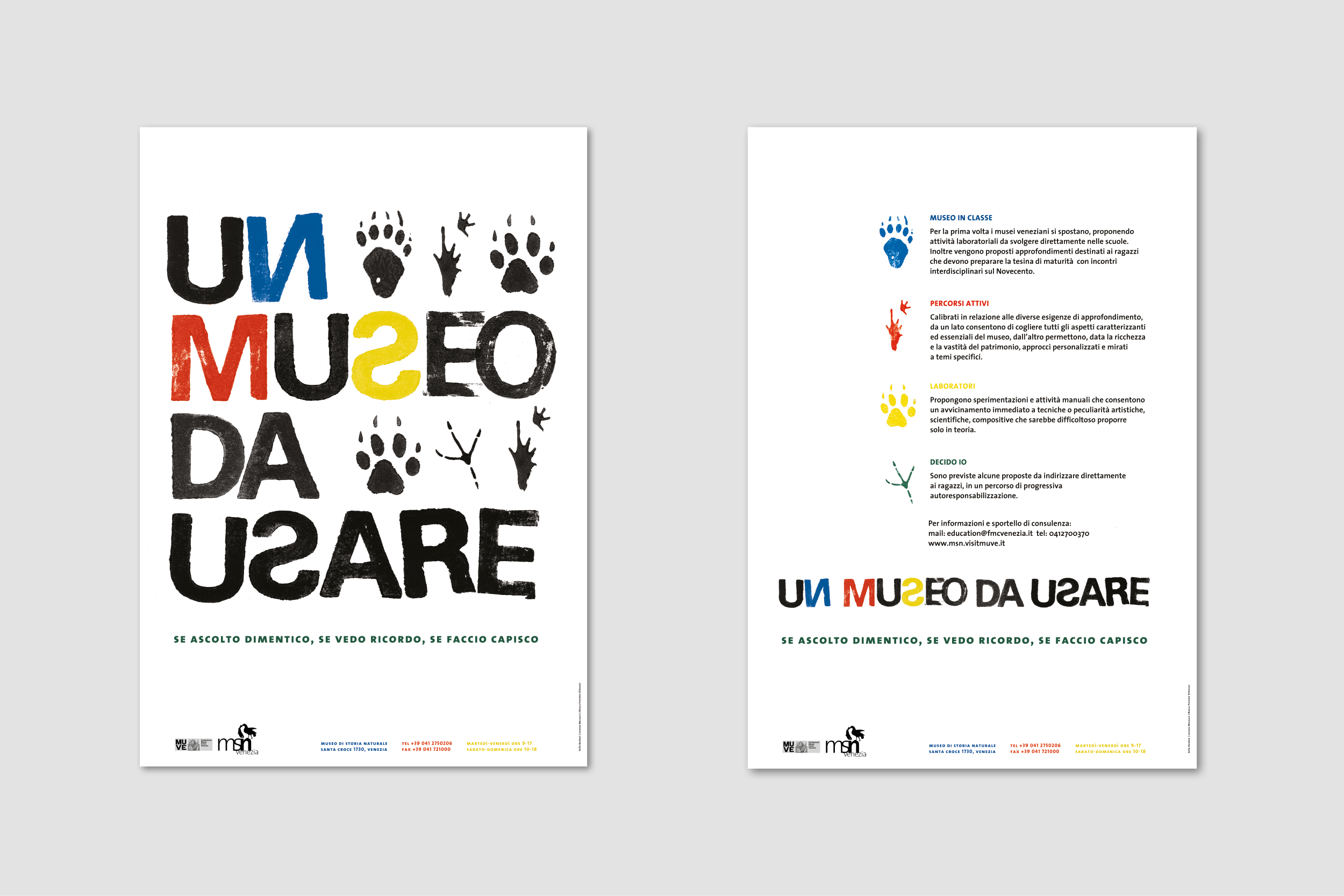
Natural History Museum of Venice 2016
Project:
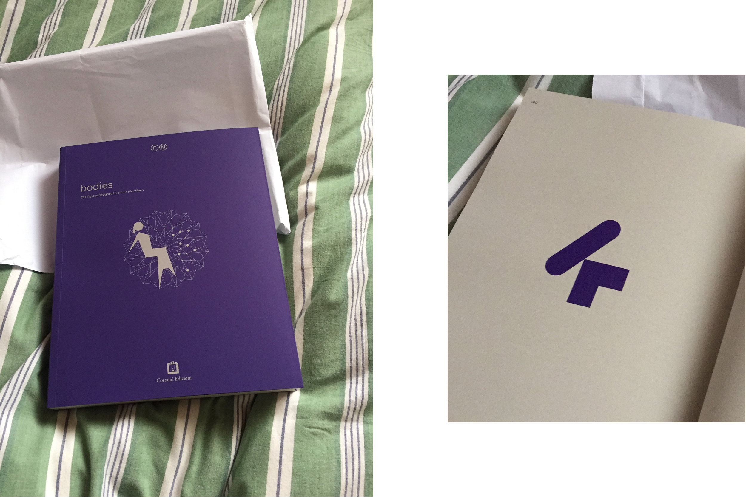
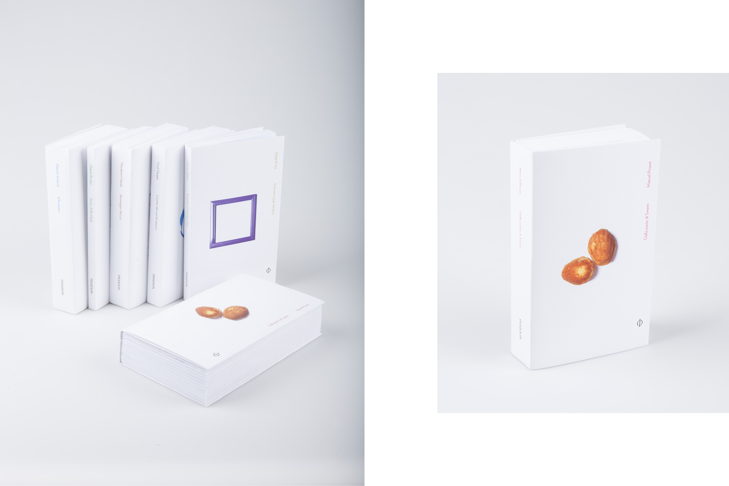
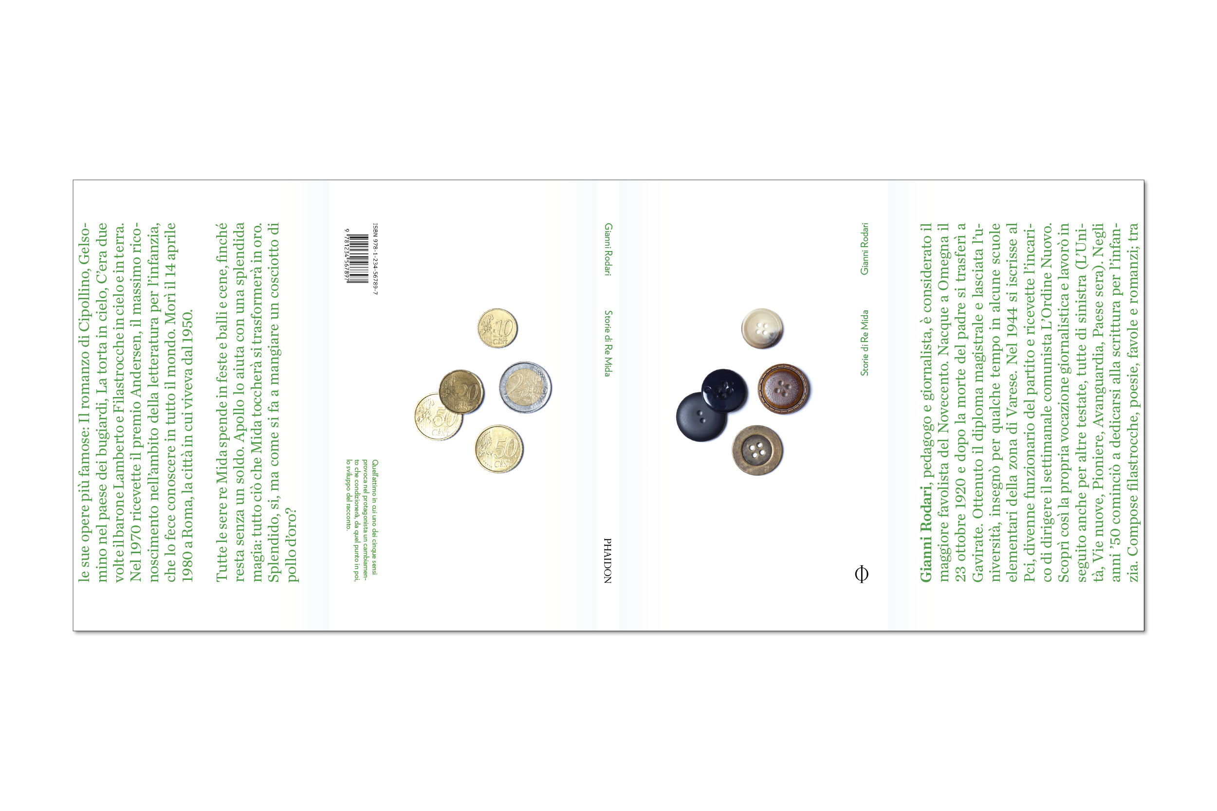
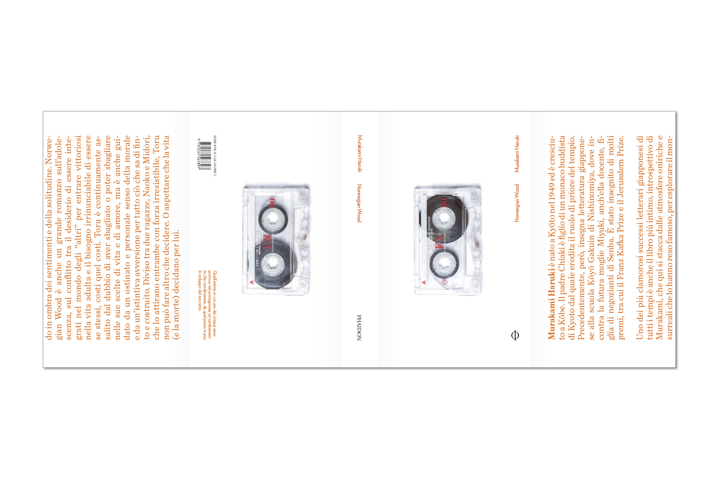
Book Series 5+1 2016
Project:
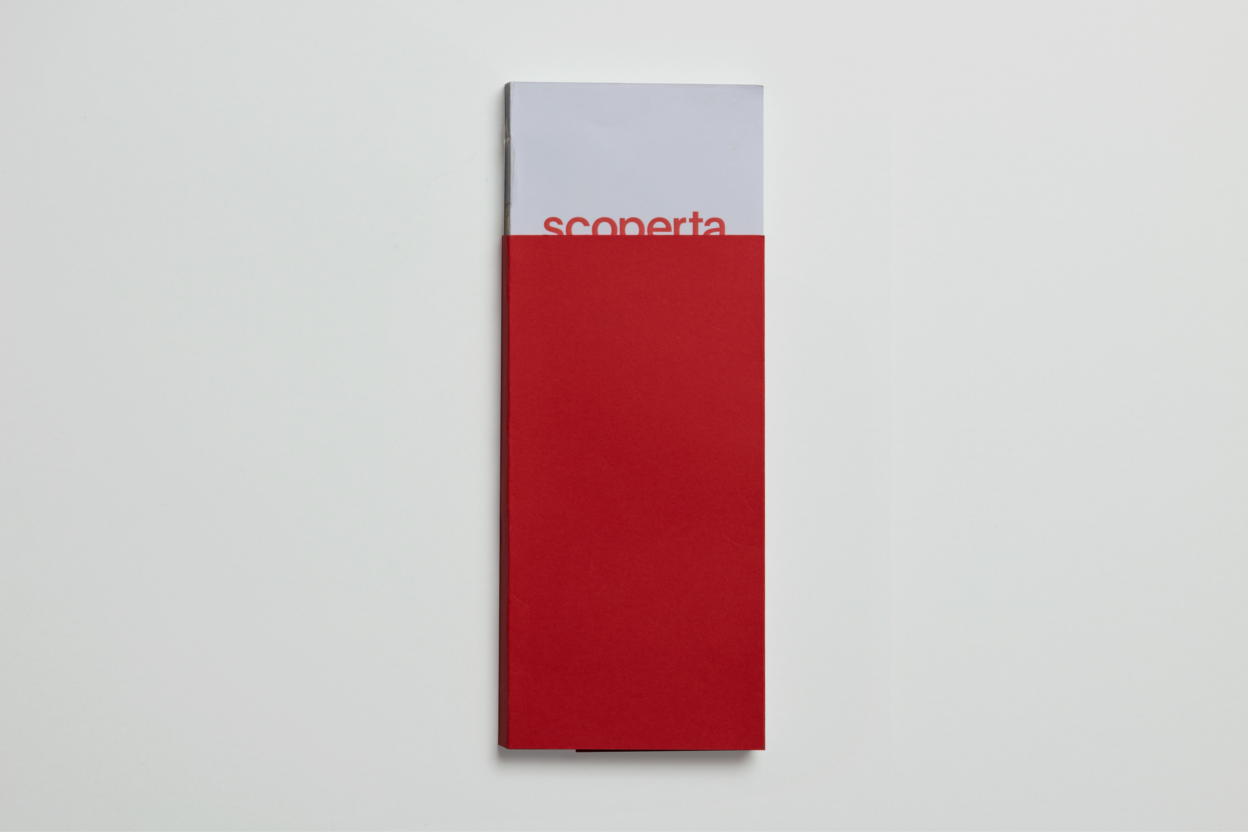
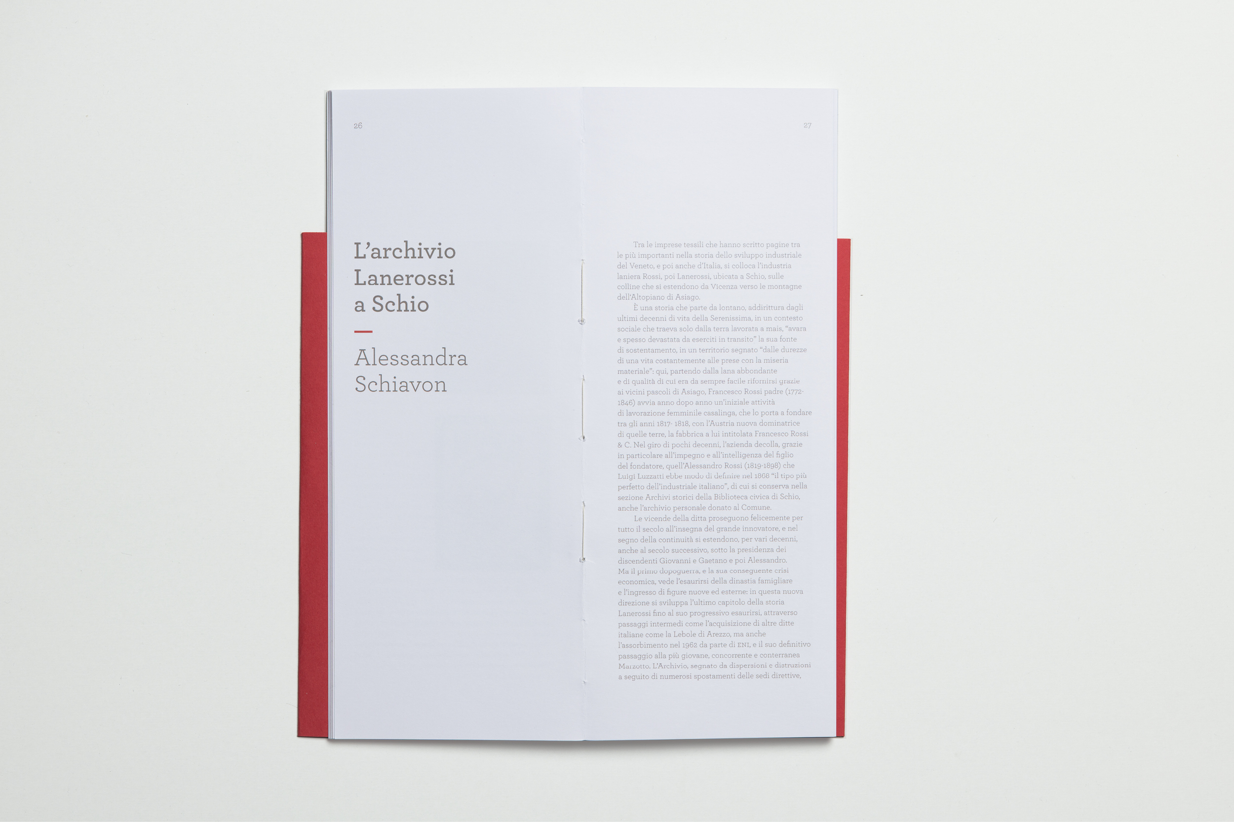
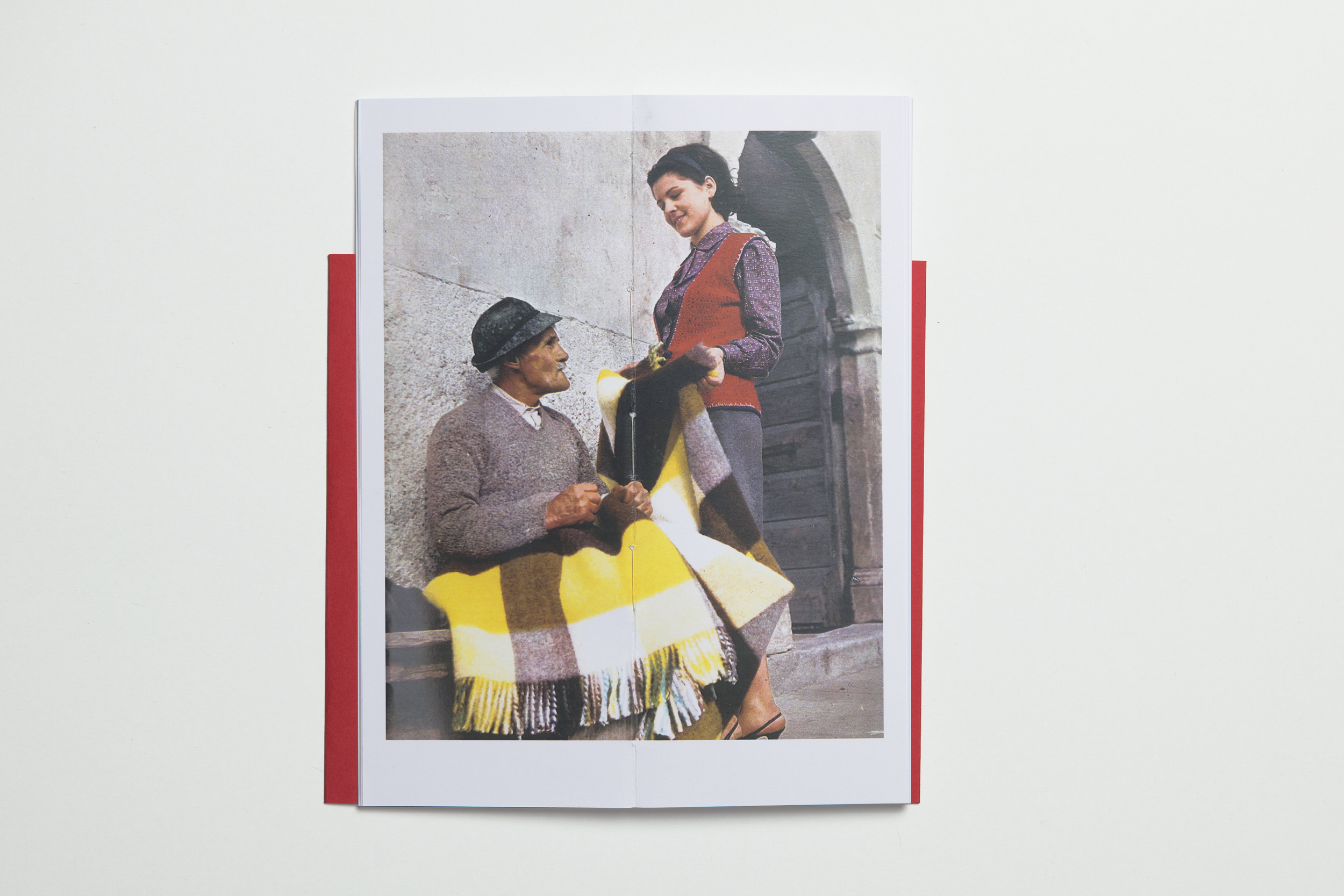
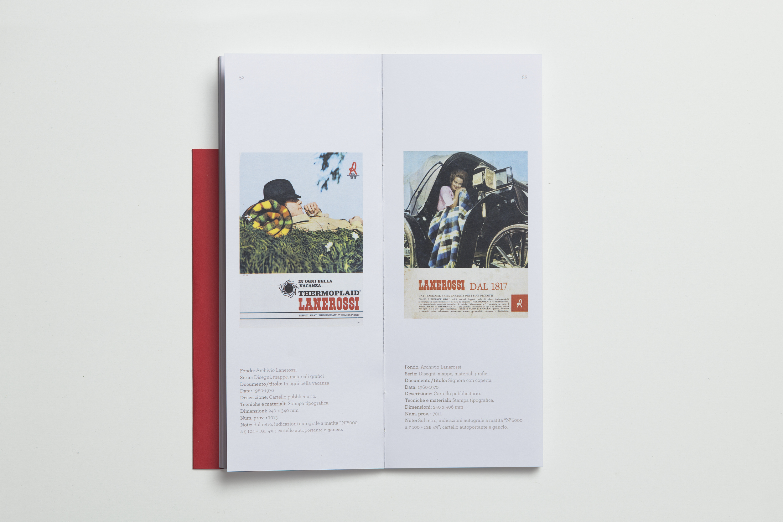
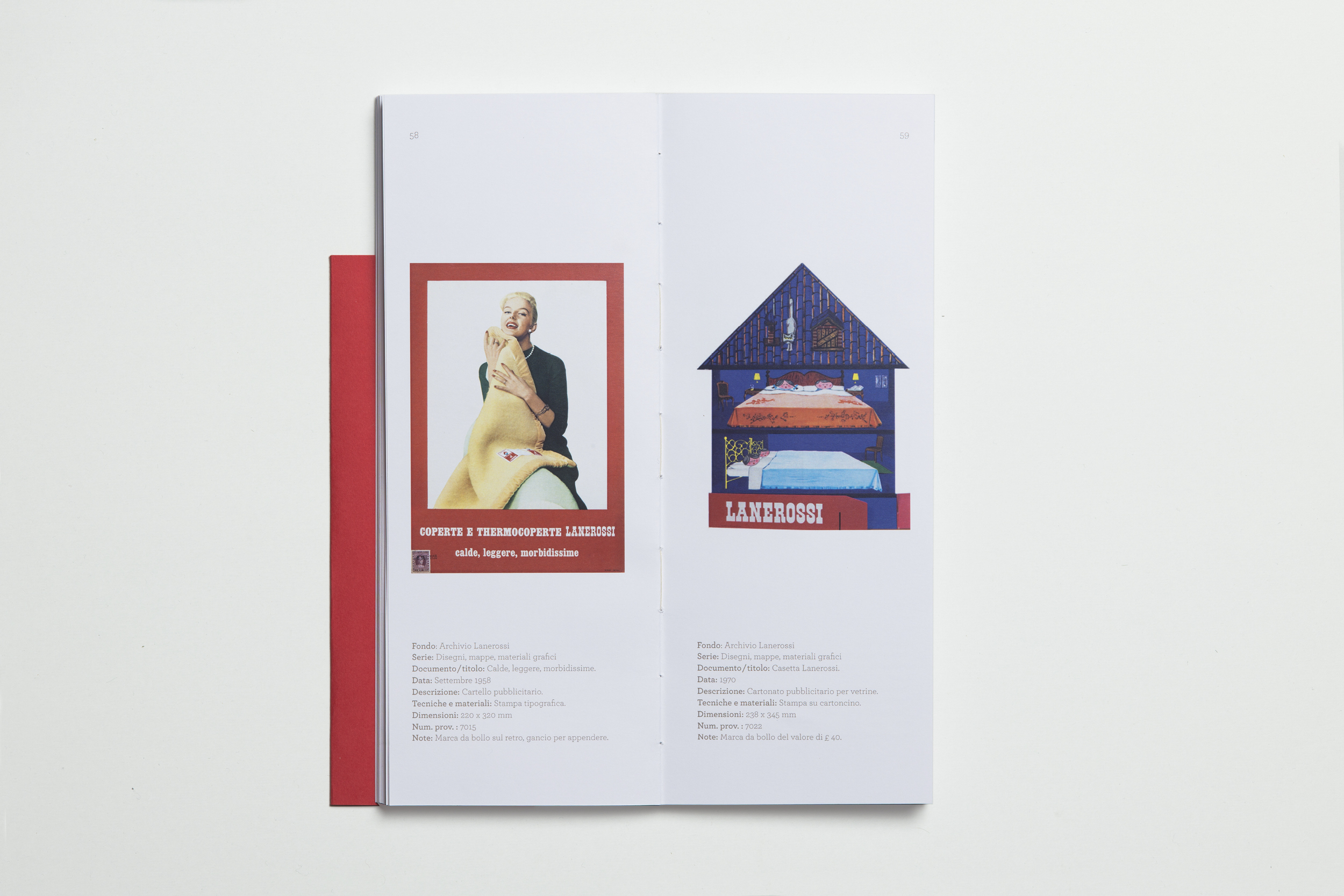
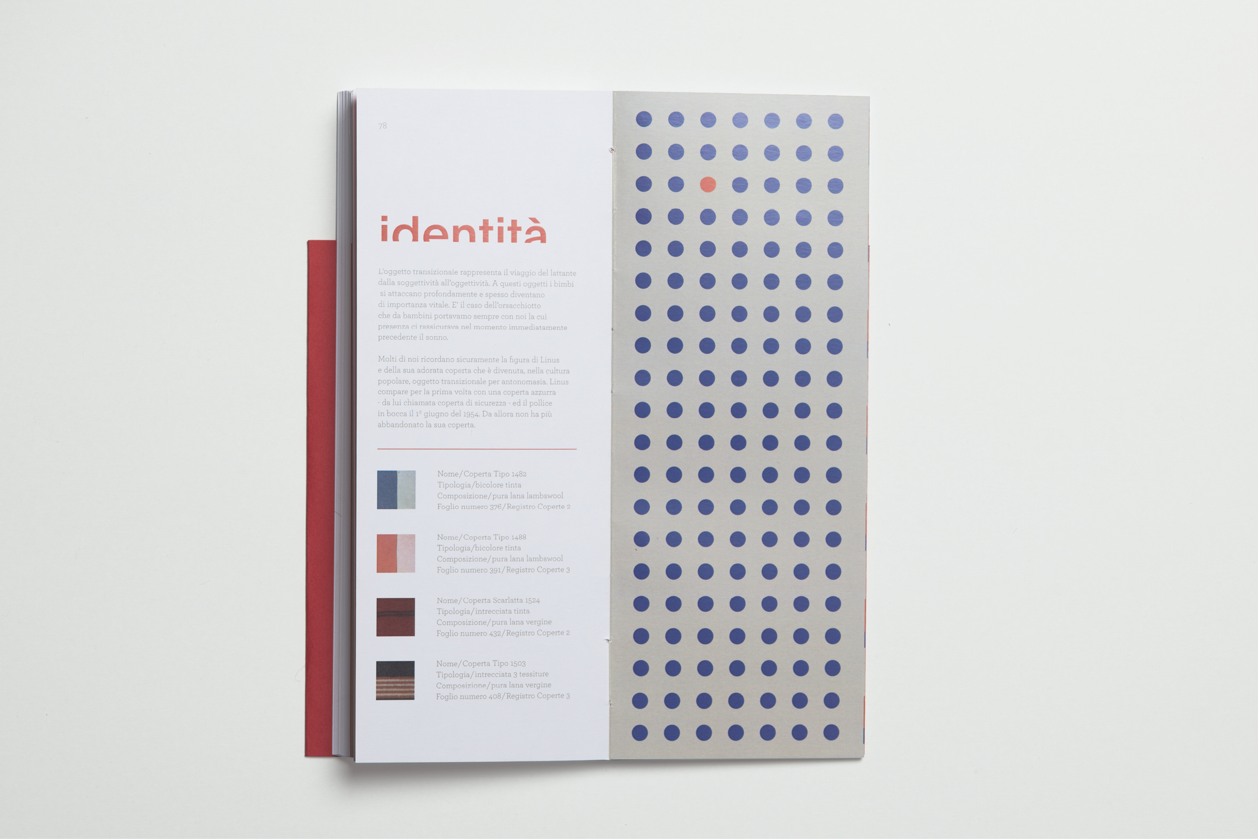
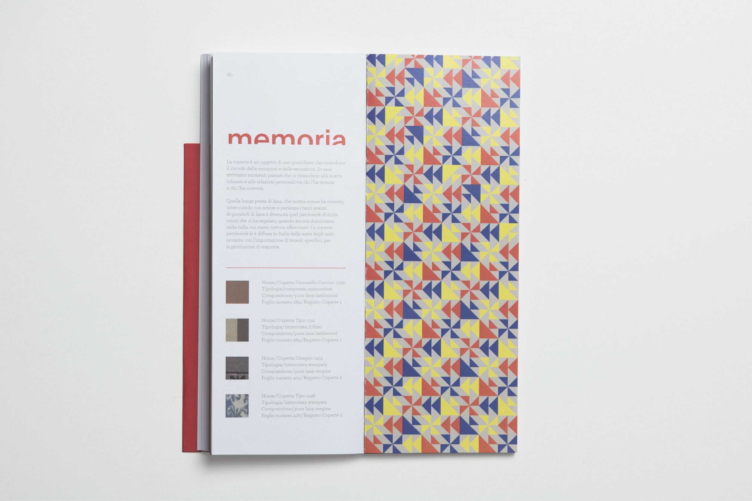
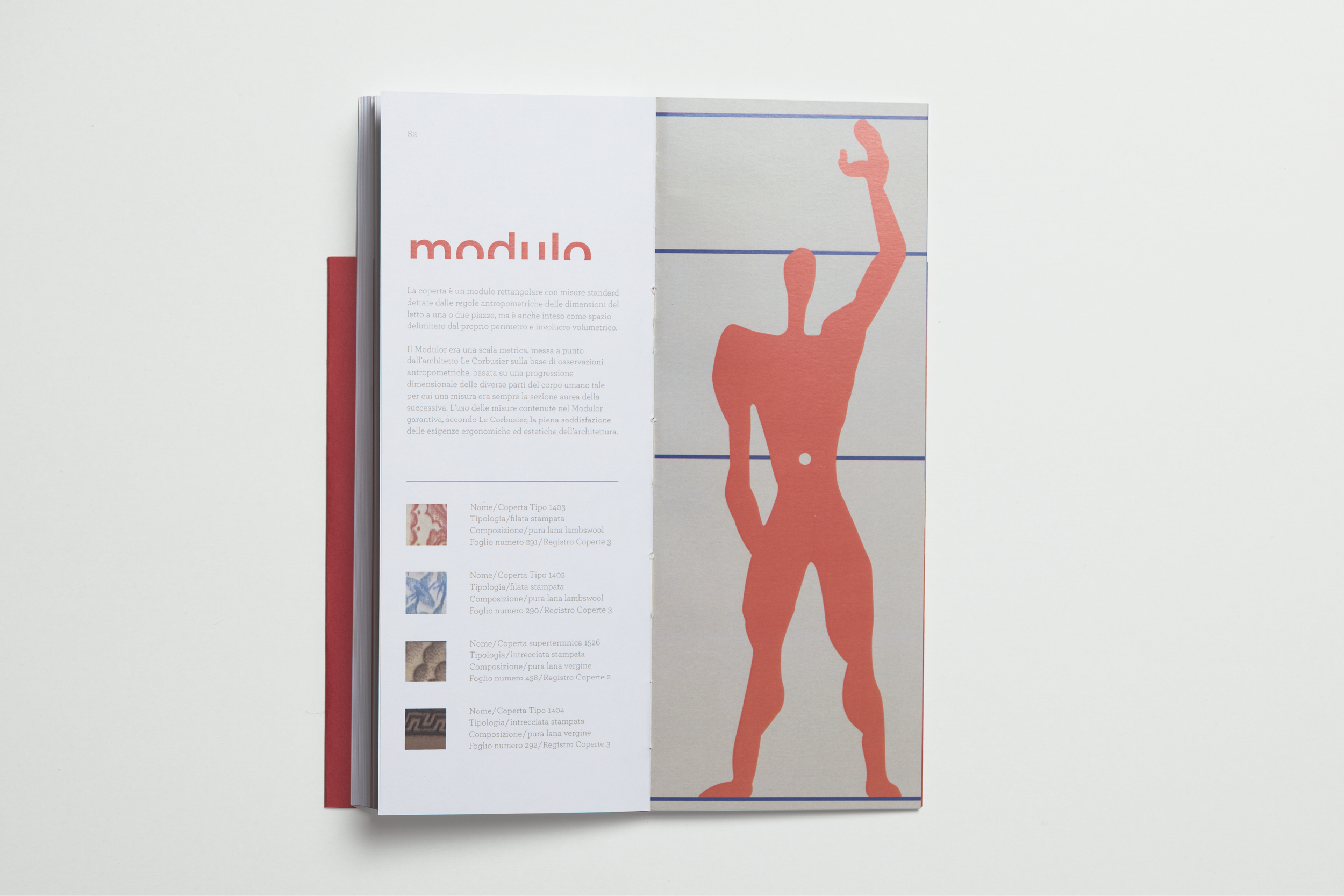
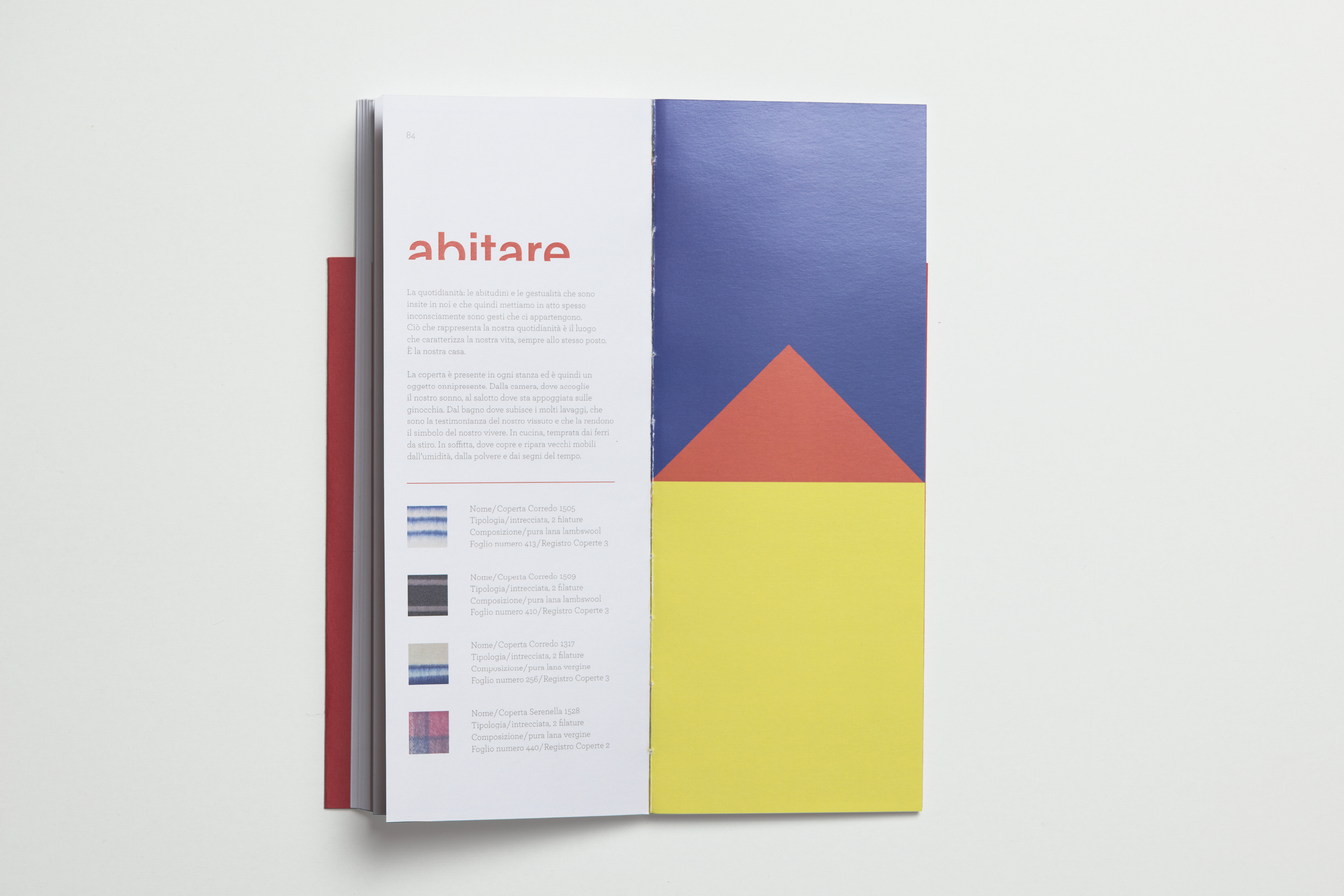
Scoperta, Lanerossi Blanket Exhibition 2016